 Try ShortPoint now
This article will demonstrate how to make a custom list in SharePoint using the File List Design Element. You'll also see the options available for you to customize.

TABLE OF CONTENTS
Prerequisites
- You have the latest ShortPoint public version installed for your environment
- You are a ShortPoint designer with an active license
Step-by-step Tutorial
Follow the steps below to learn how to customize the File List Design Element:
Step 1: Insert the File List Design Element
Click Get Started to learn how to insert a Design Element:
NOTE: Check out ShortPoint Basics: How to Insert a ShortPoint Design Element in Live Mode for more details.
Step 2: Add Content to the File List
Go to the Items tab (1), and click the cogwheel icon (2).

Add a Title (1), Subtitle (2), and a Description (3).

Specify the File Type (1) and add the file Link (2).

Once satisfied, click the back icon to customize other items on the File List.

Repeat the same steps for the other items.

(Optional) Click Add New to add new items.

(Optional) Click the Trash icon to delete an item.

(Optional) Click the Duplicate icon to duplicate an item.

(Optional) Drag and drop to arrange the order of the items.

Step 3: Customize the File List
Go to the Design tab and choose the Theme color.

(Optional) Customize File Icon Size, File Icon Style, Separator, Separator Color, and Separator size.

Step 4: Insert and Save
Once satisfied, click the green checkmark.

Click Save.

Then, click Republish.

Congratulations! You now know how to make a custom list SharePoint using the File List Design Element.
File List Features
There are many ways to customize the features of the File List Design Element. In the settings window, you will find the following tabs:
A. Items tab
The Items tab allows you to duplicate, delete, configure content, and add new items. It has the following options:

ITEMS ACTION ICONS
 | Duplicate | duplicates the item selected. |
 | Cogwheel | opens a new window that allows you to edit the content of each item. See the table below for the cogwheel icon settings. |
 | Trash | deletes the item selected. |
 | Add New | adds a new item. |
 | Drag and Drop | allows you to re-arrange the position of the item. |
COGWHEEL ICON SETTINGS
| Title | add item title. | |
| Subtitle | add item subtitle. | |
 | Description | add item description. |
 | File Type | add the file type of the document (doc, pdf, ppt, etc.). ShortPoint will show the file type icon automatically. |
 | Link | add the link to your file. |


B. Design Tab
You can modify the default design of the element in the Design Tab. Below are the settings you can configure:

 | Theme Color | customize the main color of your File List. |
 | File Icon Size | adjust the size of your icon. |
 | File Icon Style | choose from a list of icon styles including Normal, Square, Circle, Outline-Square, and Outline-Circle. |
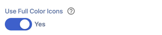 | Use Full Color Icons | when enabled, the appearance of the file icons will change into the Office document-branded icons. |
 | Separator | adds a separator in between items. You can choose from Line and None. |
 | Separator color | customize the color of the separator. |
 | Separator size | customize the size of the separator. |
 | Horizontal View | display items horizontally. |
 | Max Items Per Row | customize the number of items per row. |
C. Toolbar tab
The Toolbar tab allows you to add Smart Toolbar widgets. These Smart Toolbar widgets can help you search, sort, or filter data in your File List:
NOTEThe Toolbar tab is only available in SportPoint SPFx version 8.5.0.0 or later. For more information on the Toolbar tab, check out Getting Started: The Basics of the Smart Toolbar.

D. Metadata tab
This allows you to add metadata tags to organize and categorize your content. You can then filter, search, and group items using these custom labels in the Search & Filter Toolbar. For more details, check out How to Add SharePoint Metadata Tags to Organize Content.

E. Connect Tab
The Connect tab allows you to link the Design Element to SharePoint sources (List, Document Library, News, etc.) and other external sources (Microsoft Graph API, Teams, Outlook, etc.). For more details about ShortPoint Connect, check out Basic Tutorial: How to Establish Seamless SharePoint Connection with ShortPoint Connect.

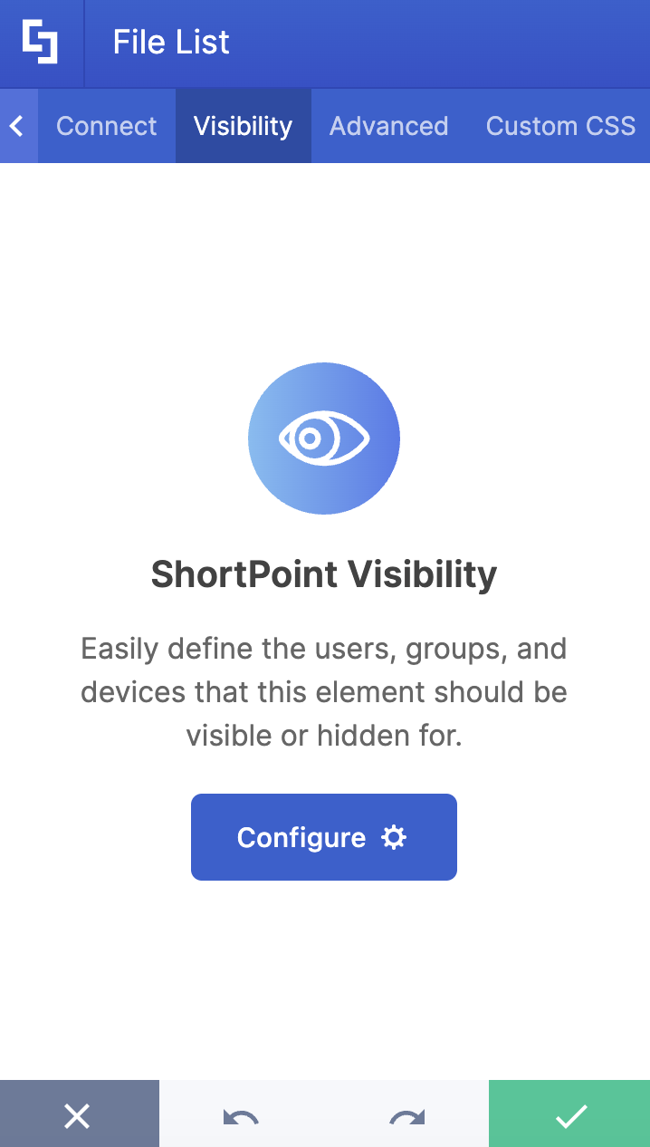
F. Visibility Tab
The Visibility tab allows you to specify who can see the Design Element and what type of devices it can be shown on. For more details, check out How to Use the ShortPoint Visibility Feature for Effective SharePoint Access Management.
G. Advanced Tab
This tab allows you to further customize the File List Design Element. Below are the options available:

MISCELLANEOUS
 | Text Alignment | set how the list item text is aligned on your page. Choose between, justified, left, center, or right alignment options. |
 | Vertical Alignment | set how the text will appear vertically on your page. Choose from Top, Middle, and Bottom. |
 | Spacing | control the overall spacing between list items |
FILE ICON STYLES
 | No Icon Style | modify what you want ShortPoint to do when there is no icon associated with an item. You can choose from:
|
 | Default icon | customize the icon you want to show for all items by default. |
 | Icon color | modify the color of the icon. |
 | Icon location | modify the location of the icon. Choose from Left or Right. |
TITLE STYLES
 | Title text size | modify the size of the title in px, em, or %. |
 | Bold title | bold the title of each item. |
 | Title color | customize the color of the title. |
 | Title hover color | customize the color of the title when a user hovers over it. |
 | Title max lines | allows you to set the maximum number of lines that can be displayed as the title. |
SUBTITLE STYLES
 | Subtitle text size | modify the size of the subtitle in px, em, or %. |
 | Subtitle color | customize the color of the subtitle. |
 | Subtitle location | customize the position of the subtitle. You can choose to show it Subtitle below or above the Title. |
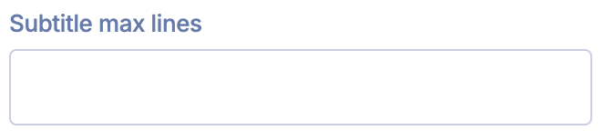 | Subtitle max lines | allows you to set the maximum number of lines that can be displayed as the subtitle. |
DESCRIPTION STYLES
 | Description text size | allows you to set the text size of the description. |
 | Description color | modify the color of the item Subtitle text. This is set to the primary color of your color palette by default. |
 | Description max lines | set the maximum lines of text of the Description to show in the list. This is set to show all text by default with no line limit. |
LINK SETTINGS
 | Linking options | select how item links will be opened. This is set to launch within the current window by default. You can choose between opening the link in a new window, a lightbox, or a dialog window. |
 | Link style | choose how users will access the link. By default, the Title of the item will be the link. You can choose to display your preferred Link text as the link by selecting the link option. |
 | Link text | set what text will show as a link on your list. This is set to “Read More” by default. |
ITEMS BACKGROUND STYLES
| Item background color | set the background color of your list items. This is set to the primary color of your color palette by default. | |
| Item background hover color | customize the background color of an item when your mouse is over it. This is set to the primary color of your color palette by default. |


H. Custom CSS Tab
This tab allows you to use your own CSS, HTML, and Javascript code to customize the File List Design Element.
NOTE: Check out our support article on How to Insert Custom CSS into a Page Builder Element? (Basic Tutorial) to know more about Custom CSS.

And you’re done! Start customizing your File List Design Element in Live Mode now.
Related articles:
- Introduction to File List Design Element
- Introduction to Button Design Element
- How to Customize the Button Design Element in Live Mode
