 Try ShortPoint now
If you're looking for a simple yet effective way to display important dates, events, and milestones on your SharePoint site, the ShortPoint Date List Design Element is your go-to tool. Whether you're managing company events, tracking project deadlines, or highlighting key dates for your team, this versatile element makes it incredibly easy to keep everyone informed and on the same page.
In this article, you will learn how to make a new list in SharePoint using the Date List Design Element. You will also learn more about the features you can modify using this Design Element.

TABLE OF CONTENTS
- Prerequisites
- What is the ShortPoint Date List Design Element?
- Interactive Tutorial
- Step-by-step Tutorial
- Date List Features
- Date List Styles
- Practical Use Cases for the Date List Design Element
- Start Designing with the Date List Design Element
- Frequently Asked Questions
- Do I need coding knowledge to use the Date List Design Element?
- Can I connect the Date List to my SharePoint calendar or Outlook?
- How many items can I add to a Date List?
- Can I control who sees my Date List?
- What date styles are available, and can I customize them?
- How do I handle recurring events with the Date List?
- Can users interact with the Date List items?
- Is the Date List mobile-friendly?
Prerequisites
- You must have the latest version of ShortPoint installed for your SharePoint environment.
- You must be a ShortPoint Designer with an active license.
What is the ShortPoint Date List Design Element?
The Date List Design Element is a powerful yet user-friendly component of the ShortPoint Page Builder that lets you create visually appealing dates and events on your SharePoint pages.

At its core, the Date List allows you to organize and display a series of important dates with corresponding titles, descriptions, and links. What makes it really shine is how customizable it is. You can adjust colors, date styles, text sizes, and even how items are aligned—all without touching a single line of code.

The element works seamlessly with SharePoint's ecosystem and can connect to various data sources through ShortPoint Connect, including SharePoint lists, Outlook calendars, and Microsoft Graph API. This means your date list can stay automatically updated as your data changes—no manual updates required.
Whether you prefer a clean, minimalist look or something more vibrant and eye-catching, the Date List gives you the tools to match your organization's branding and style. Plus, it's fully responsive, meaning it looks great on desktops, tablets, and mobile devices alike.

Interactive Tutorial
Click Get Started to easily add a Date List in SharePoint and enhance your users' experience:
NOTETo learn more about the features you can customize for Date List, check out Date List Features.
Step-by-step Tutorial
Let's get you started with adding a Date List to your SharePoint site. This guide breaks down the process into simple steps to create a new list using the Date List Design Element.
Step 1: Edit the ShortPoint Web Part
- Go to the SharePoint page you want to use and click Edit:

- Close the Toolbox:

- Click the Edit properties icon:

Step 2: Insert the Date List Design Element
- Choose where you want to add the Date List and click the plus icon:

- Use the search box to look for Date List and click it:

Step 3: Customize the Content
- Go to the Content tab.
- Click the cogwheel icon of the first event:

- Customize the content of the first event according to your preferences.
- Click the back icon:

- Repeat the steps for the other events.
NOTETo learn more about the features you can customize for Date List, check out Date List Features.
Step 4: Customize the Design
- Go to the Design tab.
- Customize the look of the Date List according to your preferences.
- Go to the Advanced tab.
- Modify the design even further.
- Once satisfied, click the green check mark.
NOTETo learn more about the features you can customize for Date List, check out Date List Features.
Step 5: Save
- Click the eye icon to see your page in real-time:

- Save your changes:

You've successfully added a Date List to SharePoint! Your page viewers can now easily access their important team events, new team calendar entries, and upcoming events.
Date List Features
Ready to start editing your Date List? Here are the options you can modify inside the settings window.
A. Items tab
The Items tab allows you to add, delete, arrange, edit, and duplicate the items on your Date List. It has the following functions:

 | Duplicate icon | allows you to duplicate an item in the list. |
 | Cogwheel icon | allows you to further edit an item. See the table below for the options you can customize under it. |
 | Trash icon | allows you to delete an item. |
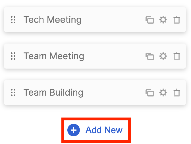 | Add New | allows you to add a new item. |
 | Drag and drop | allows you to arrange the order of the items in the list. |
COGWHEEL ICON (Content tab)
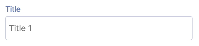 | Title | allows you to add an event title. |
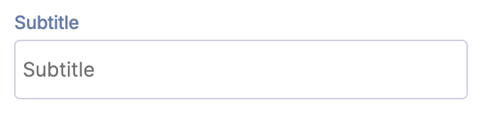 | Subtitle | allows you to add an event subtitle. |
 | Description | allows you to add an event description. |
 | Date | allows you to add a date. |
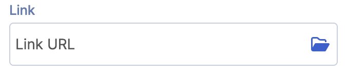 | Link | allows you to add a link. |
COGWHEEL ICON (Design tab)
Settings
 | Theme Color | allows you to change the color of the item you selected. |
Miscellaneous
 | Text Alignment | allows you to choose the text alignment of the item you selected. You can choose from Justify, Left, Center, or Right. |
 | Vertical Alignment | allows you to choose the vertical alignment of the item you selected. You can choose from Top, Middle, or Bottom. |
Date Styles
 | Date Bold | when enabled, the date of the selected item will be in bold. |
 | Date Color | allows you to choose the date color of the item you selected. |
 | Date Location | allows you to choose the date alignment of the item you selected. You can choose from Right or Left. |
 | Date Size | allows you to adjust the size of the date. |
Title Styles
 | Title Text Size | allows you to specify the title text size of the selected item. |
 | Bold Title | when enabled, the title of the selected item will be in bold. |
 | Title Color | allows you to choose the title color of the item you selected. |
 | Title Hover Color | allows you to choose the title hover color of the item you selected. |
 | Title max lines | allows you to specify the maximum number of lines to show. |
Subtitle Styles
 | Subtitle Text Size | allows you to specify the subtitle text size of the selected item. |
 | Subtitle Color | allows you to choose the subtitle color of the item you selected. |
 | Subtitle Location | allows you to choose the subtitle location of the item you selected. You can choose from Above or Below. |
 | Subtitle max lines | allows you to specify the maximum number of lines to show. |
Subtitle Styles
 | Description Text Size | allows you to specify the description text size of the selected item. |
 | Description Color | allows you to choose the description color of the item you selected. |
 | Description max lines | allows you to specify the maximum number of lines to show. |
Link Settings
 | Link style | allows you to choose the link style of the item you selected. You can choose from Title or link. |
 | Link Text | allows you to add a link text. |
 | Linking Options | allows you to choose how the link will be opened. You can choose from Same window, Lightbox, New window, or Dialog. |
Items Background Styles
 | Item Background color | allows you to choose the background color of the item you selected. |
 | Item Background hover color | allows you to choose the background hover color of the item you selected. |
COGWHEEL ICON (Custom CSS tab)
 | ID | allows you to add an ID attribute, which is useful for custom codes and JavaScript. |
 | Class | allows you to add CSS Class, which is useful for custom codes and JavaScript. |
B. Design tab
The Design tab allows you to customize how the Date List will appear on your page. It has the following options:
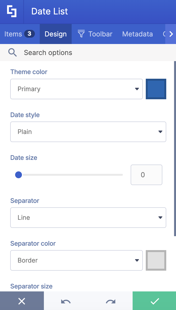
 | Theme color | allows you to customize the color of all the events in your Date List. |
 | Date Style | allows you to customize the style of the Date List. You can choose from Plain, Mini-bar, and Bar. Check out Date List Styles to learn more. |
 | Date Size | allows you to change the text size. You can adjust it by moving the slider or by typing the value you desire in the field provided. You can set the size in number or pixels (e.g., 7 or 140%). |
 | Separator | allows you to set or remove the line between each item in your Date List. |
 | Separator color | allows you to change the color of your separator line. |
 | Separator size | allows you to change the size of your separator line. |
 | Horizontal view | allows you to horizontally align the items on the list. Find out more about this feature in our solution article: Horizontal Alignment for ShortPoint Lists. |
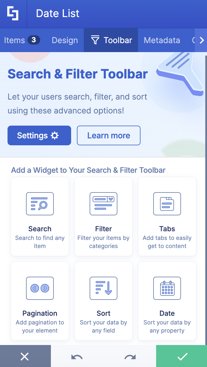
C. Toolbar tab
The Toolbar tab allows you to add Smart Toolbar widgets. These Smart Toolbar widgets can help you search, sort, or filter data in your Date List:
NOTEThe Toolbar tab is only available for SportPoint SPFx version 8.5.0.0 or later. For more information on the Toolbar tab, check out Getting Started: The Basics of the Smart Toolbar.
D. Metadata tab
This allows you to add metadata tags to organize and categorize your content. You can then filter, search, and group items using these custom labels in the Search & Filter Toolbar. For more details, check out How to Add SharePoint Metadata Tags to Organize Content.

E. Connect Tab
The Connect tab allows you to link the Design Element to SharePoint sources (List, Document Library, News, etc.) and other external sources (Microsoft Graph API, Teams, Outlook, etc.). For more details about ShortPoint Connect, check out Basic Tutorial: How to Establish Seamless SharePoint Connection with ShortPoint Connect.

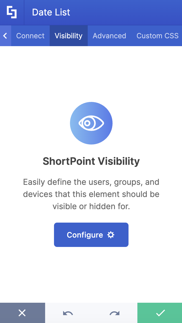
F. Visibility Tab
The Visibility tab allows you to specify who can see the Design Element and what type of devices it can be shown on. For more details, check out How to Use the ShortPoint Visibility Feature for Effective SharePoint Access Management.
G. Advanced tab
The Advanced tab provides more customization options for the Date List Design Element. It has the following features:

MISCELLANEOUS
 | Text alignment | allows you to customize the alignment of the items in the Date Lists. You can choose from justify, left, center, and right. |
 | Vertical alignment | allows you to change the vertical alignment of your event items in the Date List. You will only notice the change in vertical alignment if your subtitle or description field is empty. If all fields are filled in, the vertical alignment won't be visible. |
 | Spacing | allows you to change the space between the title, subtitle, and description. |
 | Fix date format related issues | allows you to fix any date format issues. |
DATE STYLES
 | Date bold | allows you to change the format of the date to bold. |
 | Date color | allows you to change the color of the date. |
 | Date location | allows you to adjust the position of your date. You can choose from left or right. |
TITLE STYLES
 | Title text size | allows you to change the text size of your events' titles. |
 | Bold title | allows you to change the title format to bold. |
 | Title color | allows you to customize the title color. |
 | Title hover color | allows you to customize the color of the title whenever a user hovers over it. |
 | Title max lines | allows you to control the number of lines your title covers. |
SUBTITLE STYLES
 | Subtitle text size | allows you to change the size of the subtitle text. |
 | Subtitle color | allows you to change the color of the event's subtitle. |
 | Subtitle location | allows you to adjust the position of your subtitle. You can choose from above or below. |
 | Subtitle max lines | allows you to control the number of lines your subtitle covers. |
DESCRIPTION STYLES
 | Description text size | allows you to change the size of the description text. |
 | Description color | allows you to change the color of the event's description. |
 | Description max lines | allows you to control the number of lines your description covers. |
LINK SETTINGS
 | Linking Options | allows you to choose how the link will be opened. |
 | Link style | allows you to customize the style of your link. |
 | Link text | allows you to add a link text. By default, the link text is Read More. |
ITEM BACKGROUND STYLES
 | Items background color | allows you to change the background color of an item. |
 | Items background hover color | allows you to change the background color of an item whenever a user hovers over it. |
H. Custom CSS tab
The Custom CSS tab allows you to create your own CSS for the Date List Element.
NOTE: Check out the basic and advanced Custom CSS tutorial in case you need additional information on the Custom CSS tab

Date List Styles
The Date List Design Element has three styles to choose from: Plain, Mini-bar, and Bar. Each style serves a different purpose depending on how prominent you want your dates to be and the overall aesthetic you're aiming for in your layout. Here's how they look on your page:
- Plain
This is the most basic date list style. It offers a clean, minimalist approach where the date appears in a simple numerical format with the month abbreviated below. There's no background color. It’s just the text, creating an uncluttered, straightforward look that keeps the focus on the event details themselves.

- Mini-bar
This style adds a subtle visual cue with a thin vertical red line positioned to the left of each date. This creates a gentle visual hierarchy that helps guide the eye down the list while maintaining an elegant, understated appearance. It's perfect when you want just a touch more structure without overwhelming the design.

- Bar
This style makes the boldest statement with full, rounded rectangular backgrounds behind each date. The solid blocks create strong visual anchors that make dates immediately scannable at a glance. This style works wonderfully when you want your events to really pop and make it easy for viewers to quickly identify important dates.

Practical Use Cases for the Date List Design Element
Ready to use the Date List Design Element? Here are some practical use cases you can apply to your own SharePoint sites:
- Company Events and Celebrations
Keep your team in the loop about upcoming company events, team-building activities, and celebrations. Whether it's a holiday party, a quarterly all-hands meeting, or employee birthdays, the Date List makes it easy to showcase what's coming up. The visual date display helps employees quickly scan the events without having to dig through emails or other channels.
- Project Milestones and Deadlines
Project managers love the Date List for tracking important milestones and deadlines. Instead of buried project timelines in lengthy documents or a spreadsheet, create a clean, accessible view that everyone on the team can reference. To top it off, the element's ability to connect to SharePoint lists means updates to your project timeline automatically reflect on your page, keeping everyone aligned without manual maintenance.
- Training and Professional Development Schedule
HR departments can use the Date List to promote upcoming training sessions, workshops, and professional development opportunities. This is especially valuable for organizations with regular learning initiatives. You can also make use of the Search & Filter Toolbar, which will allow employees to filter training by department, topic, or date range, making it easy to find relevant learning opportunities. You can even connect it to your learning management system for real-time updates and detailed information.
- Content Publication Calendar
Marketing and communications teams can leverage the Date List as an editorial calendar to showcase upcoming content releases, blog posts, newsletters, and social media campaigns. The horizontal view option is particularly useful for displaying multiple content pieces side-by-side, giving teams a comprehensive view of their publishing schedule.
Start Designing with the Date List Design Element
The ShortPoint Date List Design Element is more than just a simple date display tool—it's a comprehensive solution for keeping your SharePoint users informed, organized, and engaged with important dates and events. Its combination of ease of use, powerful connectivity options, and extensive customization capabilities makes it an essential component for any SharePoint site looking to improve communication and organization through a well-structured date list.
Ready to get started? With just a few clicks, you can have your first Date List up and running, keeping your team informed and on track with all the important dates that matter to your organization. Just follow our interactive tutorial.
New to ShortPoint? No worries—we'd love to have you try out all the features with a FREE 15-day trial. Zero commitment required! You can also book a one-on-one demo with our team to see the Date List in action, plus everything else ShortPoint can do.
Frequently Asked Questions
Do I need coding knowledge to use the Date List Design Element?
Not at all! The Date List is designed with non-technical users in mind. The intuitive interface allows you to add, edit, and customize items through simple point-and-click actions. Everything from changing colors to adjusting text sizes can be done through the settings panel—no coding required. That said, if you're technically inclined, there's a Custom CSS tab available for advanced customizations.
Can I connect the Date List to my SharePoint calendar or Outlook?
Absolutely! One of the most powerful features of the Date List is its integration capability through ShortPoint Connect. You can link it to SharePoint lists, document libraries, Outlook calendars (including My Events, Shared Events, and Group Events), and other data sources. This means your Date List can dynamically pull in events and dates from your existing list and systems, keeping information current without manual updates. The connection process is straightforward and can be set up through the Connect tab in the element settings.
How many items can I add to a Date List?
There's no strict limit on the number of items you can add to a Date List. You can add as many events, dates, and milestones as you need. However, for optimal user experience and page performance, we recommend keeping your lists focused and manageable. If you have a very large number of events, consider using the Search & Filter Toolbar widgets to help users navigate the content more easily. You can also create multiple Date Lists organized by category or time period for better organization.
Can I control who sees my Date List?
Yes! The Date List includes a Visibility tab that gives you granular control over who can view the element. You can specify which users or groups should see the Date List based on SharePoint permissions, and you can also control visibility by device type (desktop, tablet, or mobile). This is particularly useful if you have events or dates that are only relevant to specific departments or roles within your organization. The visibility settings ensure that everyone sees the information that's most relevant to them.
What date styles are available, and can I customize them?
The Date List offers three main date styles: Plain, Mini-bar, and Bar. Each provides a different visual aesthetic, from minimal to more prominent. Beyond these preset styles, you have extensive customization options. You can adjust the date size, color, location (left or right), and formatting. You can also make dates bold, change their background colors, and control hover effects. The Advanced tab provides even more fine-tuning options for creating a look that perfectly matches your brand and design preferences.
How do I handle recurring events with the Date List?
For recurring events like weekly team meetings or monthly training sessions, you have a few options. You can manually add each occurrence as a separate item in the Date List, which gives you full control over descriptions and links for each instance. Alternatively, and more efficiently, you can connect the Date List to a SharePoint calendar or Outlook that already has the recurring events set up. When connected, the Date List will automatically display all instances of recurring events based on your calendar settings, saving you considerable time and effort.
Can users interact with the Date List items?
Yes! Each item in the Date List can include a clickable link that takes users to related content, registration pages, or additional information. You have control over how these links open—in the same window, a new tab, or even as a dialog box. If you've added the Search & Filter Toolbar, users can also search, sort, and filter through your date list items to quickly find what they're looking for. This interactivity makes the Date List more than just a static display; it becomes a functional tool for your users.
Is the Date List mobile-friendly?
Absolutely! The Date List is designed to be fully responsive and looks great on all devices and screen sizes. Whether your team is accessing the page from their desktop computers, tablets, or smartphones, the Date List will automatically adapt to provide an optimal viewing experience. You can even configure specific mobile device settings if you want certain elements to appear differently on smaller screens. This ensures that important date information is accessible to your team, no matter how they choose to connect.
Related articles:
- Create All Day Events in ShortPoint
- Create Recurring Events in ShortPoint
- How to Connect SharePoint Announcements to ShortPoint Design Elements
- Adding, Duplicating, Moving and Deleting Items in ShortPoint Design Elements
- ShortPoint Connect: Basic Tutorial
- How to Connect Events to a SharePoint Calendar
- Connection Types: Group Events (Outlook)
- Connection Types: Shared Events (Outlook)
- Connection Types: My Events (Outlook)
