Try ShortPoint now
TL;DR: You can add a shadow to some ShortPoint Design Elements to make them stand out on your page. Open the element’s settings, go to the Design tab, and expand the Shadow section. For Button, Image, Text and Panel, pick a style from the Preset list. For Gradient Text, Hero Caption, Dual Button, Flipboxes and CTA Card, switch Enabled to Yes. Then adjust the distance, blur, spread and color, and save and publish the page.
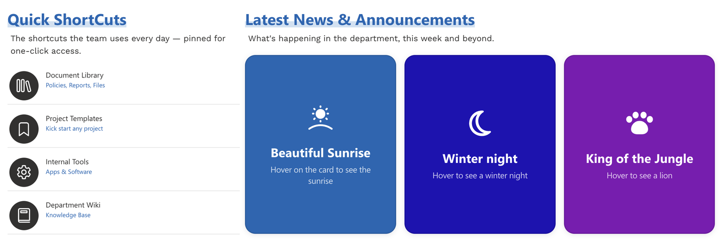
Want a button, image, or card to stand out from the rest of your page? A shadow gives your Design Elements depth, so they look like they're lifting off the page. This article shows you how to add a shadow to a Design Element in ShortPoint Page Builder, how to customize it, and how to remove it.
BEFORE
AFTER
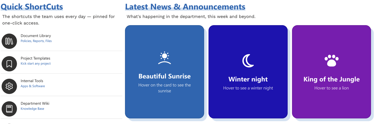
TABLE OF CONTENTS
- Prerequisites
- What is the Shadow Section?
- Interactive Tutorial
- Step-by-step Tutorial
- How to Remove a Shadow
- Adding a Gradient Effect
- Frequently Asked Questions
Prerequisites
- You have the latest version of ShortPoint SPFx installed on your SharePoint environment.
- You are a ShortPoint Designer with an active license.
- You must have any of these Design Elements added to your page: Button, Image, Text, Panel, Gradient Text, Hero Caption, Dual Button, Flipboxes, or CTA Card.
What is the Shadow Section?
Found in the Design tab, the Shadow section expands to show Shadow settings. These settings are used to enable and customize the drop shadow added to a Design Element. The Shadow section is available to the following Design Elements: Button, Image, Text, Panel, Gradient Text, Hero Caption, Dual Button, Flipboxes, and CTA Card.
Ways to Add a Shadow
While shadow options live in the Shadow section of a Design Element's Design, how you enable the shadow depends on the Design Element you're using. There are two options:
| OPTION 1: PRESET STYLES | OPTION 2: SHADOW TOGGLE | |
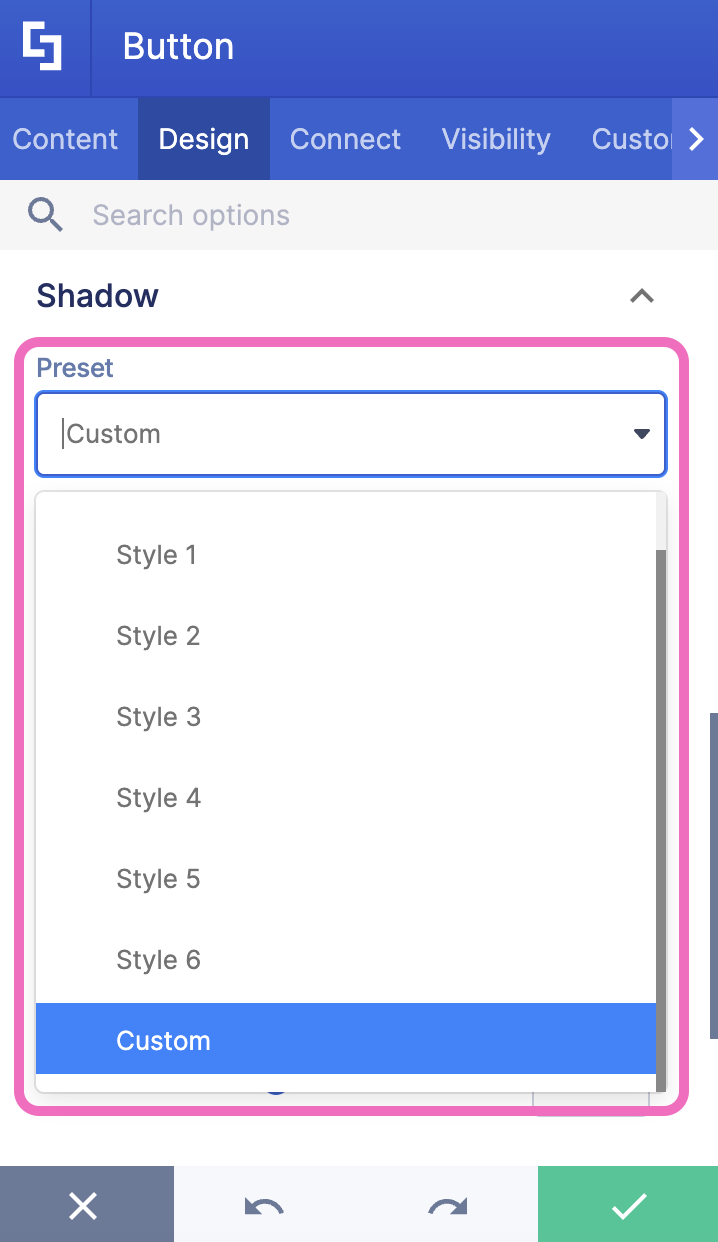 | 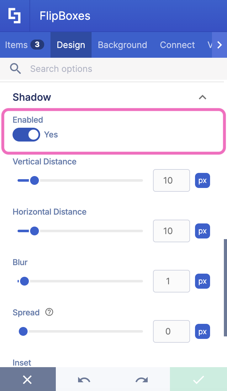 | |
Design Elements | Button, Image, Text, and Panel | Gradient Text, Hero Caption, Dual Button, Flipboxes, and CTA Card |
How to turn it on | Choose a style from the Preset drop-down | Switch the Enabled toggle to Yes |
IMPORTANTCheck which Design Element you're using before you start. If you open the Shadow section and don't see a Preset drop-down, your Design Element may have the Enabled toggle instead, and the other way around.
Shadow Settings
Once the shadow is on, both options let you fine-tune it with the same settings:
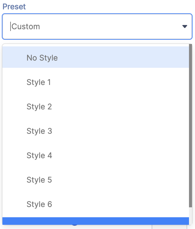 | Preset (Option 1 only) | pick one of six ready-made shadow styles (Style 1 to Style 6), or No Style for no shadow. |
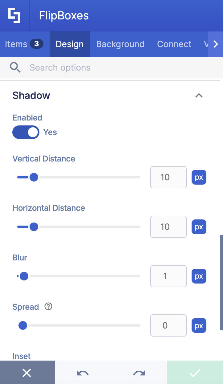
 | Enabled (Option 2 only) | turns the shadow on (Yes) or off (No). |
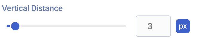 | Vertical Distance | moves the shadow down (positive value) or up (negative value). |
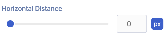 | Horizontal Distance | moves the shadow to the right (positive value) or to the left (negative value). |
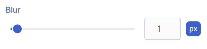 | Blur | controls how soft the shadow looks. The higher the value, the softer the shadow. |
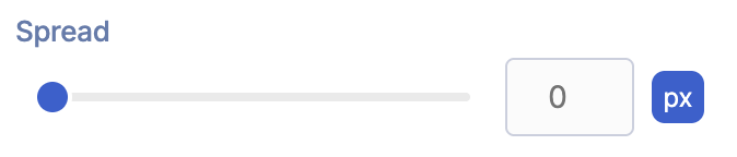 | Spread | makes the shadow bigger (positive value) or smaller (negative value). |
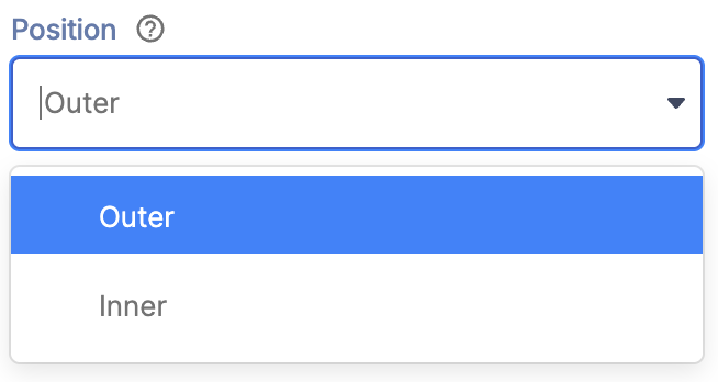 | Position (Option 1 only) | places the shadow outside the Design Element's edges or inside them. |
 | Inset (Option 2 only) | places the shadow outside the Design Element's edges or inside them. |
 | Color | sets the shadow color. Choose a theme color from the drop-down, type a HEX code, or click the color swatch to use the color picker. |
Interactive Tutorial
Click Get Started to try it yourself:
Step-by-step Tutorial
Step 1: Open ShortPoint Page Builder
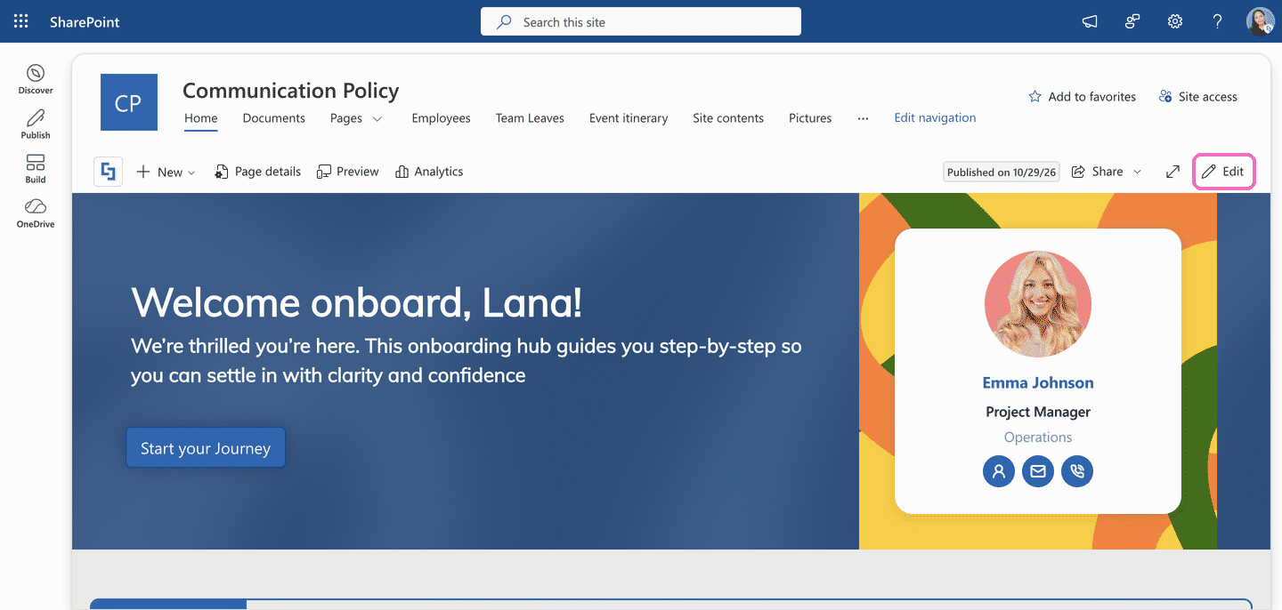
- Go to the SharePoint page you want to use and click Edit.
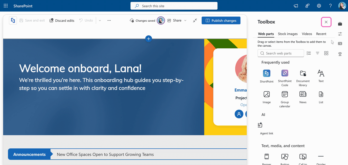
- Close the SharePoint Toolbox by clicking the X icon.
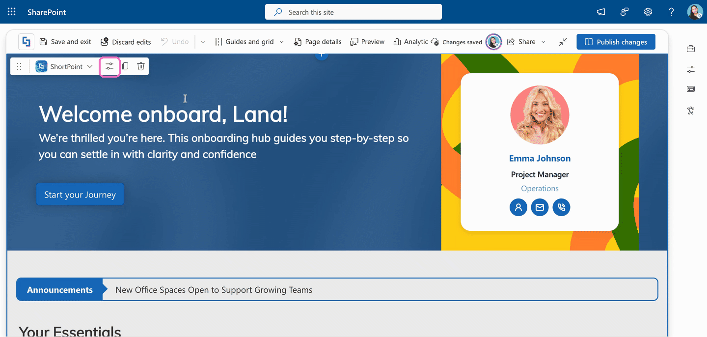
- Click the Edit properties icon on the ShortPoint web part toolbar. This opens ShortPoint Page Builder.
Step 2: Turn On the Shadow
Depending on the Design Element you're using, follow the option that matches yours:
Option 1: Preset Styles (Button, Image, Text, and Panel)
If you're using Button, Image, Text, or Panel, use this option.
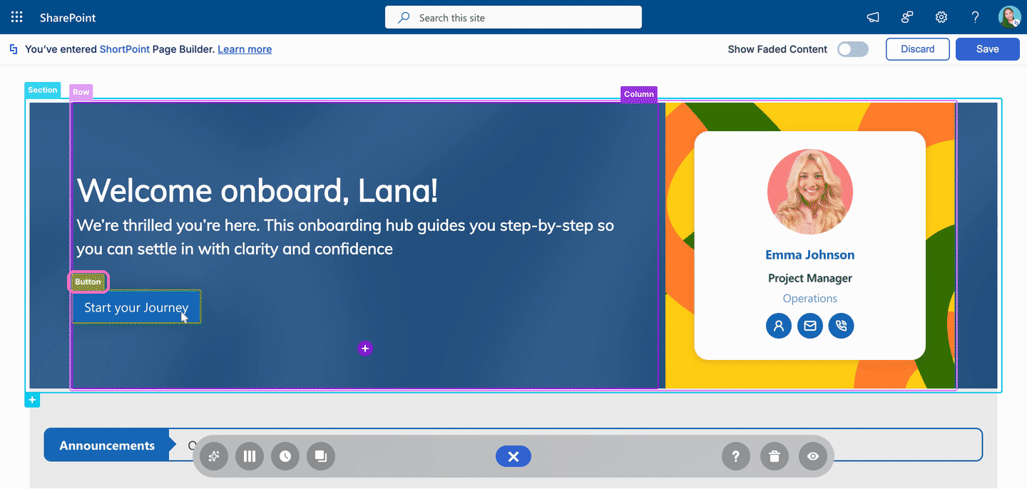
- Click the EasyPass tag of the Design Element you want to add a shadow to. In this example, we're using a Button.
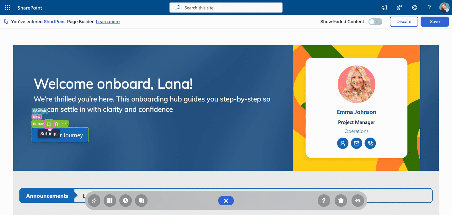
- Click the cogwheel icon. This opens the Design Element's settings window.
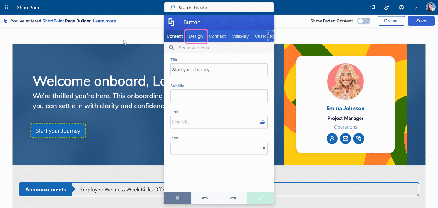
- Go to the Design tab.
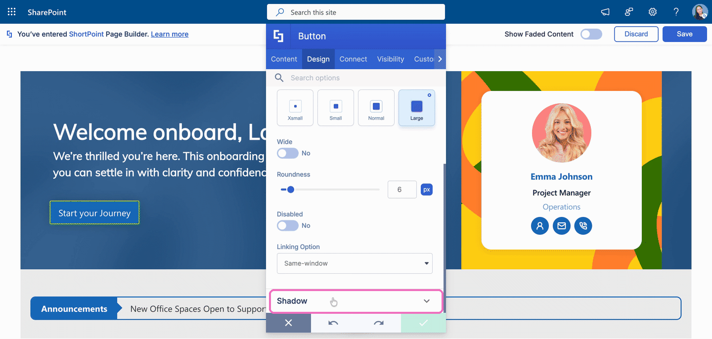
- Scroll down and click Shadow to expand the section.
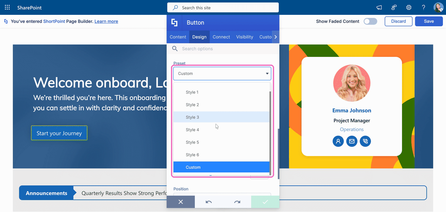
- Open the Preset drop-down and choose a shadow style. The shadow shows up on your Design Element right away.
Option 2: Shadow Toggle (Gradient Text, Hero Caption, Dual Button, Flipboxes, and CTA Card)
If you're using Gradient Text, Hero Caption, Dual Button, Flipboxes, or CTA Card, use this option.
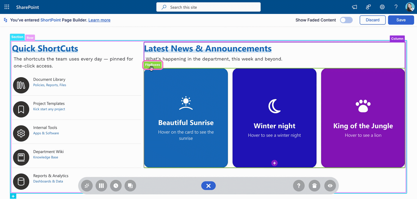
- Click the EasyPass tag of the Design Element you want to add a shadow to. In this example, we're using Flipboxes.
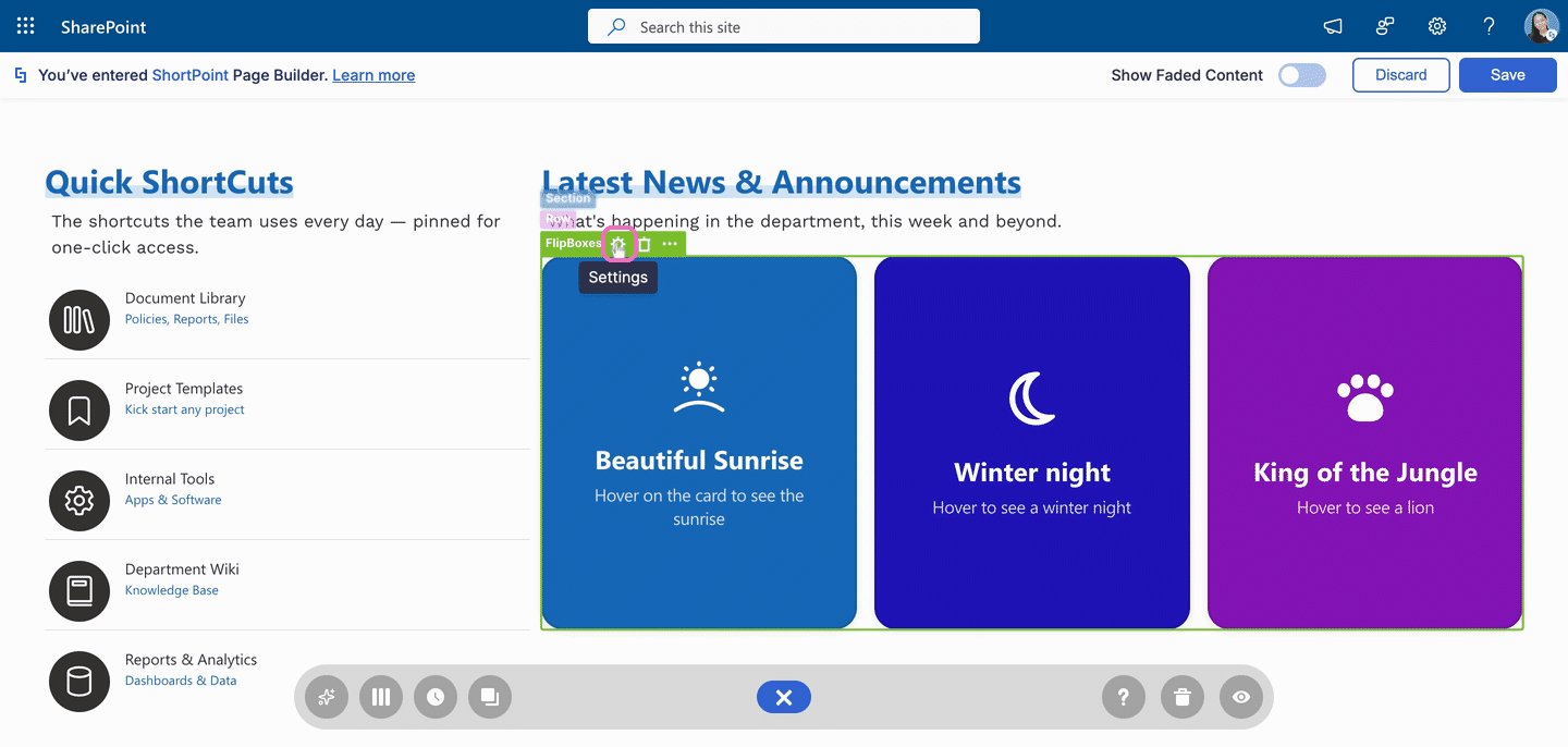
- Click the cogwheel icon. This opens the Design Element's settings window.
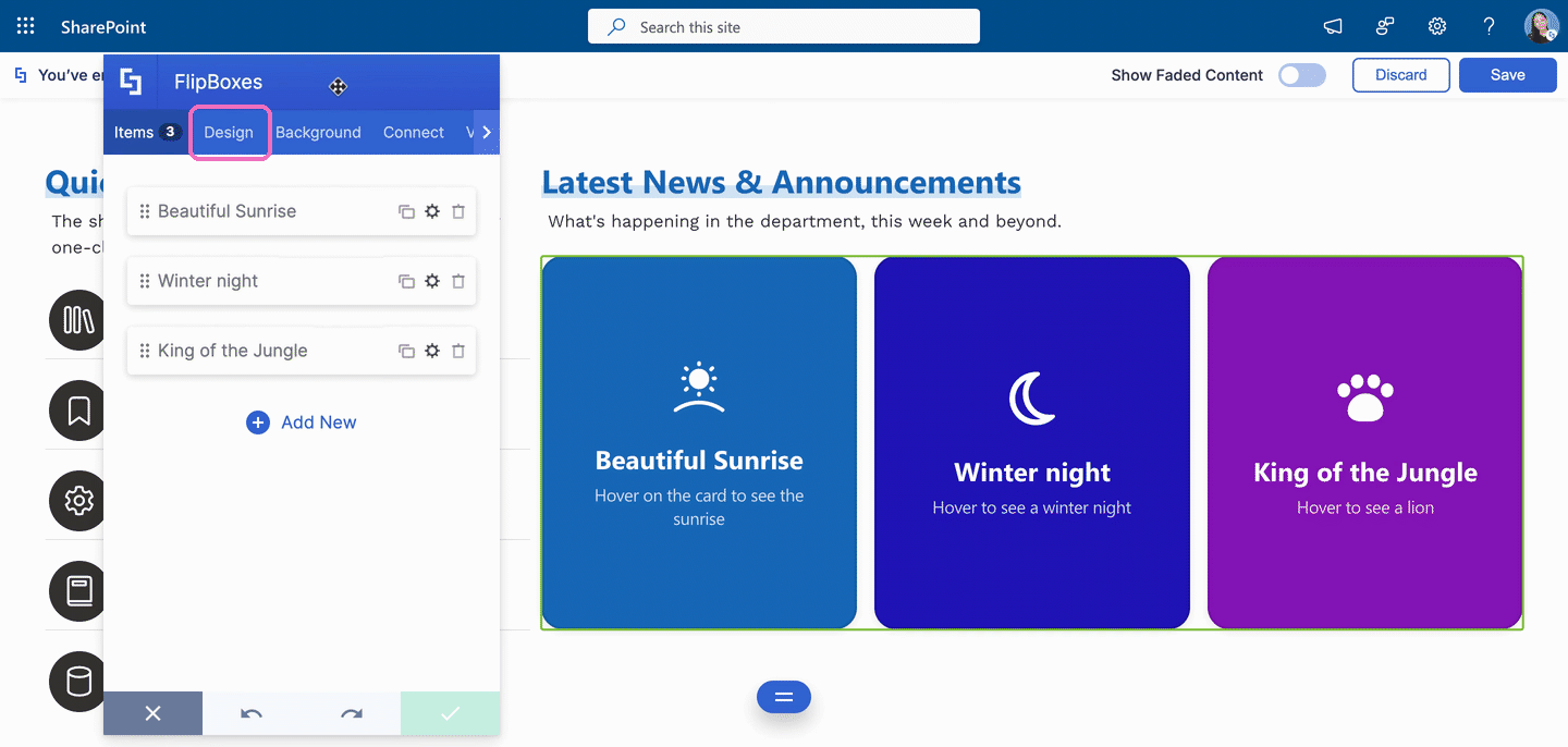
- Go to the Design tab.
- Scroll down and click Shadow to expand the section.
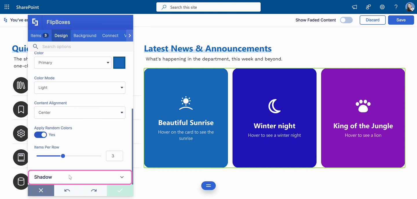
- Switch the Enabled toggle to Yes. The shadow shows up on your Design Element right away.
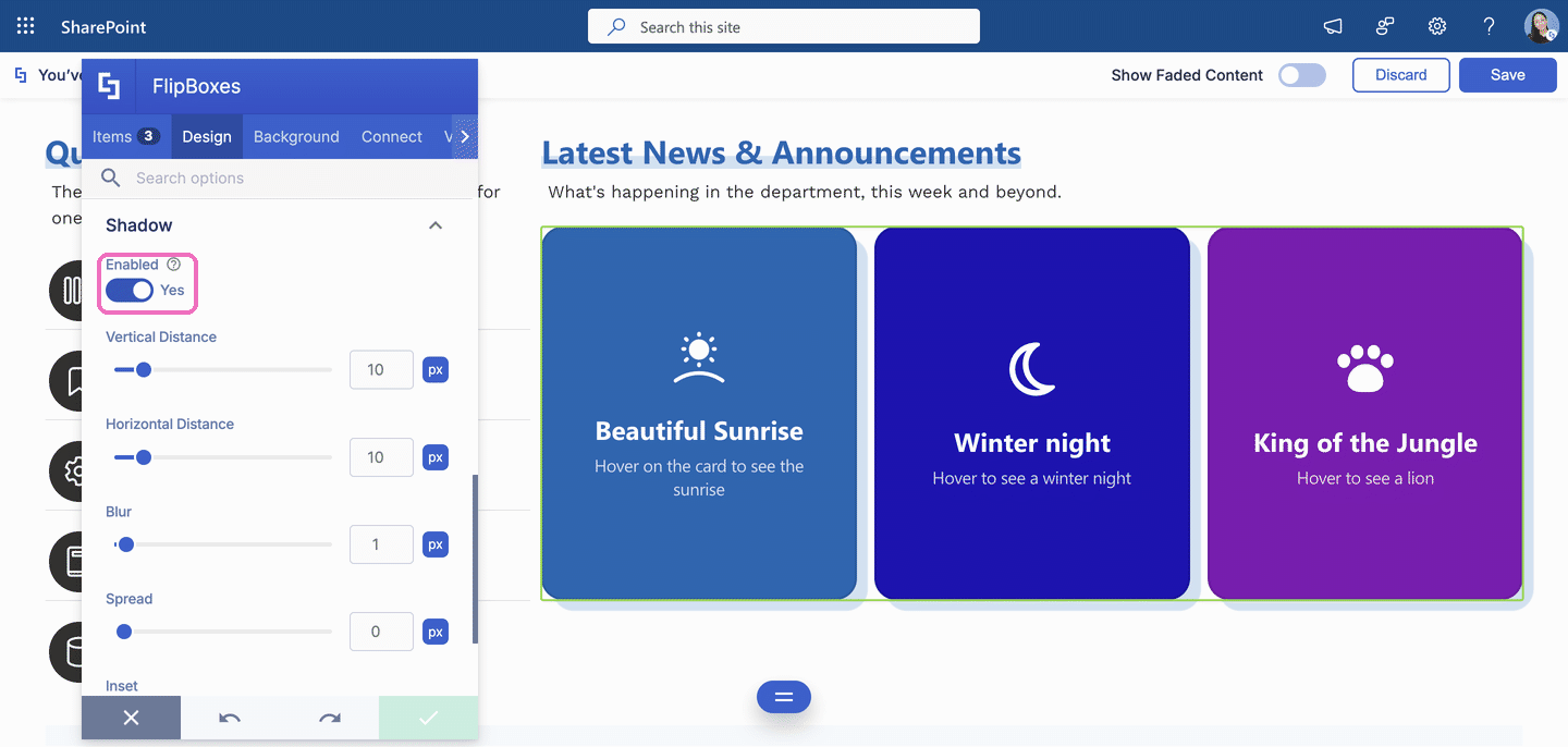
Step 3: Customize the Shadow
- Adjust the shadow settings until you like the result. Every change shows up on the page instantly. To learn what each setting does, see Shadow Settings.
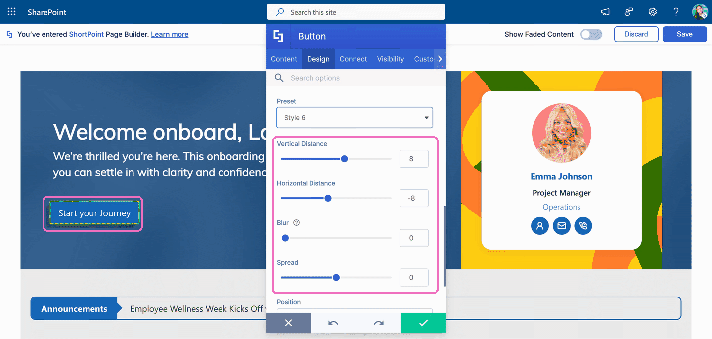
TIPThe shadow is light gray by default, so it can be hard to see on light backgrounds. Try a darker Color or a higher Blur value to make it stand out.
Step 4: Apply, Save, and Publish
- When you're happy with the result, click the green checkmark to apply your changes.
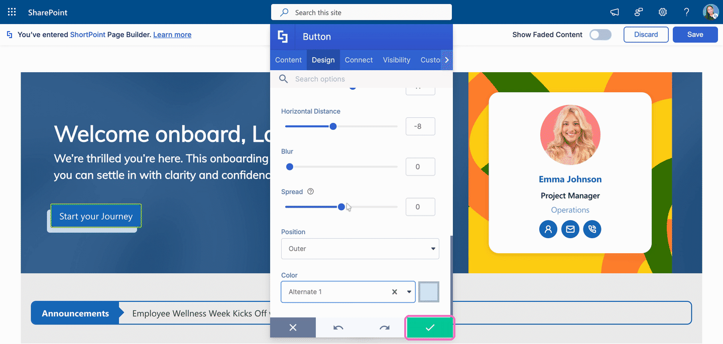
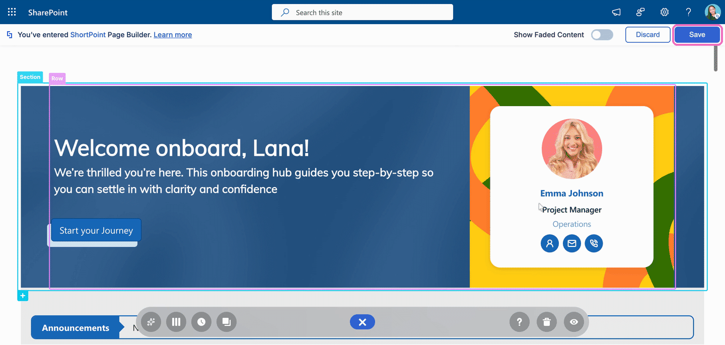
- Click Save to save your changes and leave Page Builder.
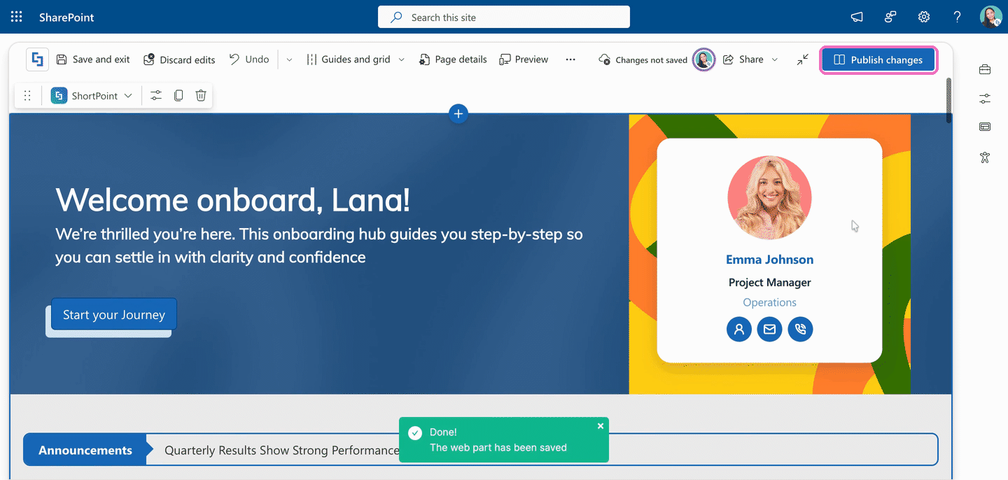
- Click Publish changes to publish your page.
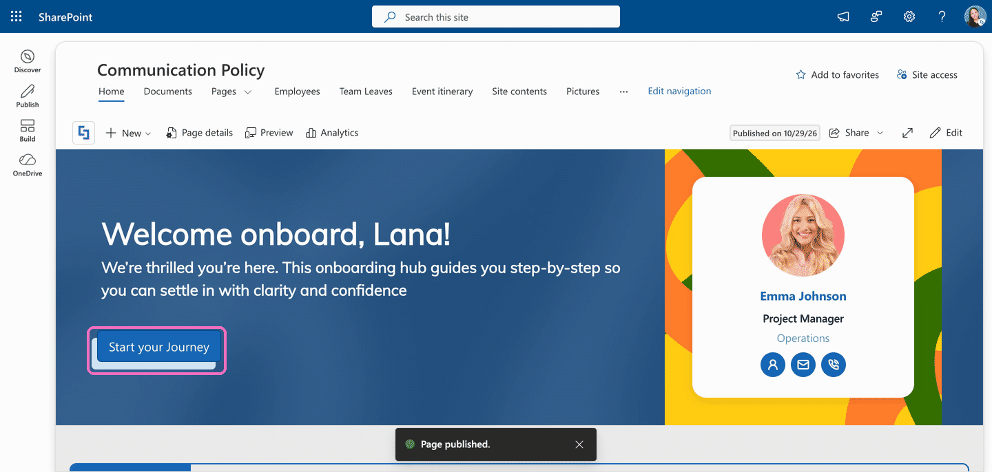
Amazing! You've successfully added a shadow to your Design Element.
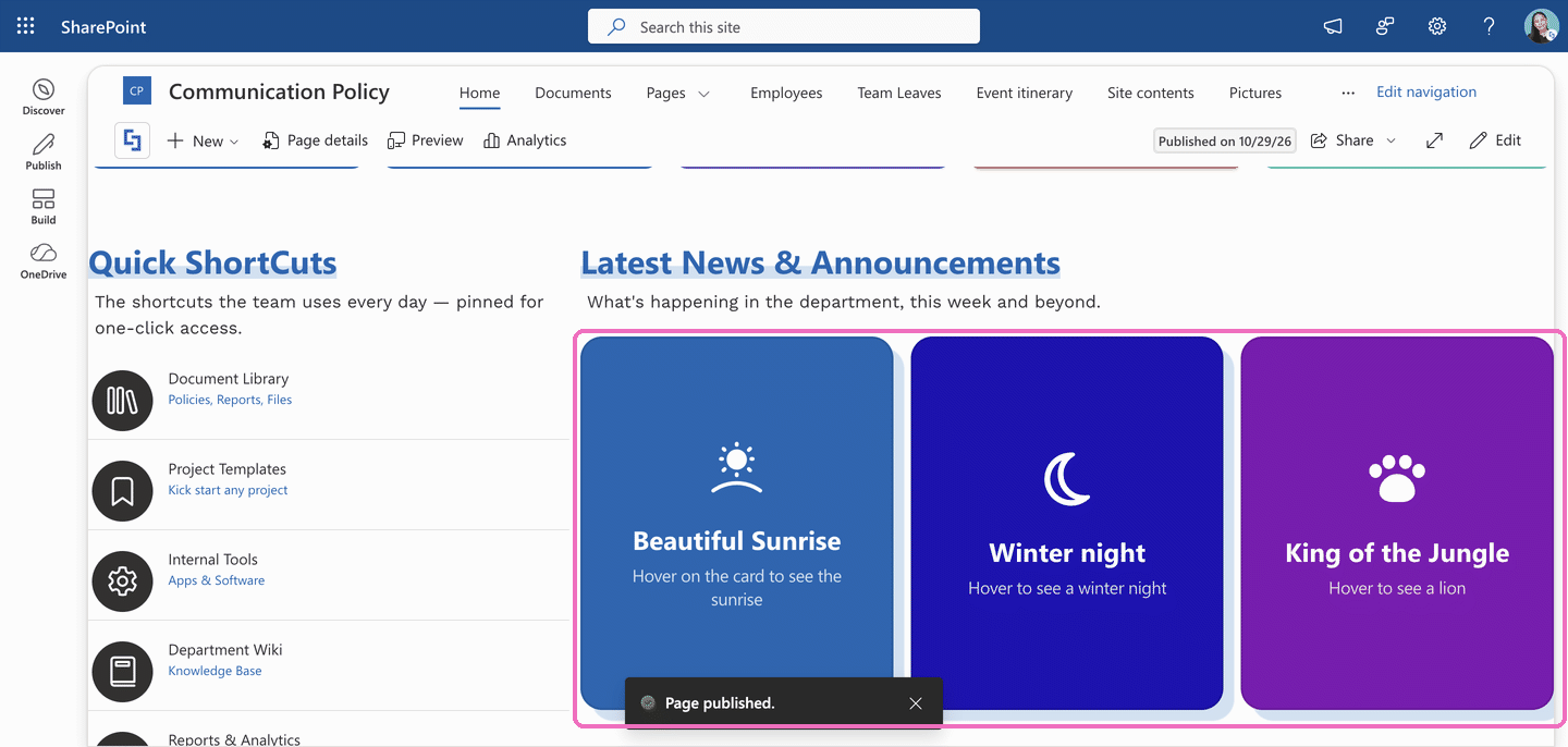
Here's the same shadow effect on Flipboxes, added with the Enabled toggle:
How to Remove a Shadow
Changed your mind? You can remove a shadow at any time. Just like adding one, the way you remove it depends on the Design Element you're using.
Click Get Started to try it yourself:
- Follow Step 1 and Step 2 to open the settings of the Design Element that has the shadow.
- In the Design tab, scroll down and click Shadow to expand the section.
- Remove the shadow:
Option 1 (Button, Image, Text, and Panel): open the Preset drop-down and select No Style.
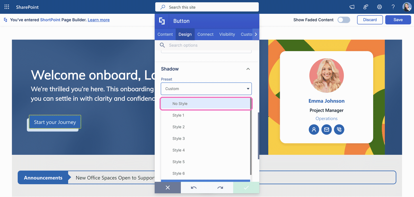
- Option 2 (Gradient Text, Hero Caption, Dual Button, Flipboxes, and CTA Card): switch the Enabled toggle to No.
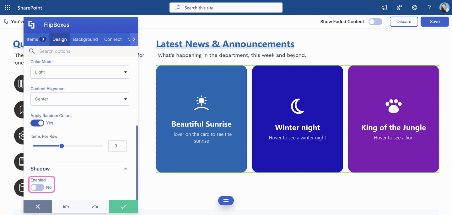
- Click the green checkmark, then Save, then Publish changes.
Great! You've successfully removed the shadow.
Adding a Gradient Effect
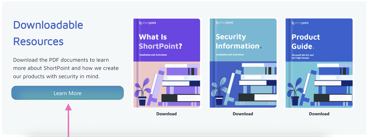
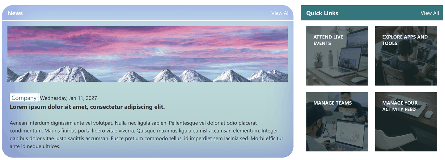
The Shadow feature isn't just for drop shadows. When you place the shadow inside a Design Element instead of behind it, the shadow color blends into the Design Element's background and creates a smooth gradient. It's an easy way to make Buttons and Panels stand out, with no Custom CSS needed.
Sample Button with gradient
Sample Panel with gradient
For a full walkthrough with screenshots, see How to Add a Gradient Effect to Design Elements Using the Shadow Feature.
Frequently Asked Questions
Which Design Elements can have a shadow?
Button, Image, Text, Panel, Gradient Text, Hero Caption, Dual Button, Flipboxes, and CTA Card. The first four use the Preset drop-down (Option 1). The rest use the Enabled toggle (Option 2).
I can't find the Shadow section. Where is it?
Make sure you're in the Design tab, then scroll all the way down. The Shadow section is at the bottom and is collapsed by default. Click Shadow to expand it. If your Design Element isn't on the list above, it doesn't have a built-in shadow option yet. You can still add one with Custom CSS.
Why don't I see a Preset drop-down?
Your Design Element uses the Enabled toggle instead (Option 2). Switch it to Yes to turn the shadow on. The Preset drop-down is only available for Button, Image, Text, and Panel.
I added a shadow, but I can't see it. What should I check?
- The default shadow color is light gray, which is hard to see on light backgrounds. Choose a darker Color.
- Increase the Vertical Distance, Horizontal Distance, or Spread so the shadow peeks out from behind the Design Element.
- Check that Position isn't set to inside, or that Inset is set to No. An inner shadow is much more subtle.
Can I use a shadow to add a gradient effect?
Yes. See How to Add a Gradient Effect to Design Elements Using the Shadow Feature to learn more.
Will removing the shadow change anything else about my Design Element?
No. Selecting No Style or switching Enabled to No only removes the shadow. All your other design settings stay the same.
Related articles:
- How to Add a Gradient Effect to Design Elements Using the Shadow Feature
- Introducing the Roundness Feature: What It Is and How to Use It
- Managing Visibility of ShortPoint Design Elements
- ShortPoint Page Builder Live Mode Feature: EasyPass