 Try ShortPoint now
With the Settings feature of the Search & Filter Toolbar, you can further customize the look of active widgets:

You can change the size, theme color, spacing, and color mode of active widgets. Follow the interactive tutorial or the step-by-step guide to learn how to make the most out of this feature.
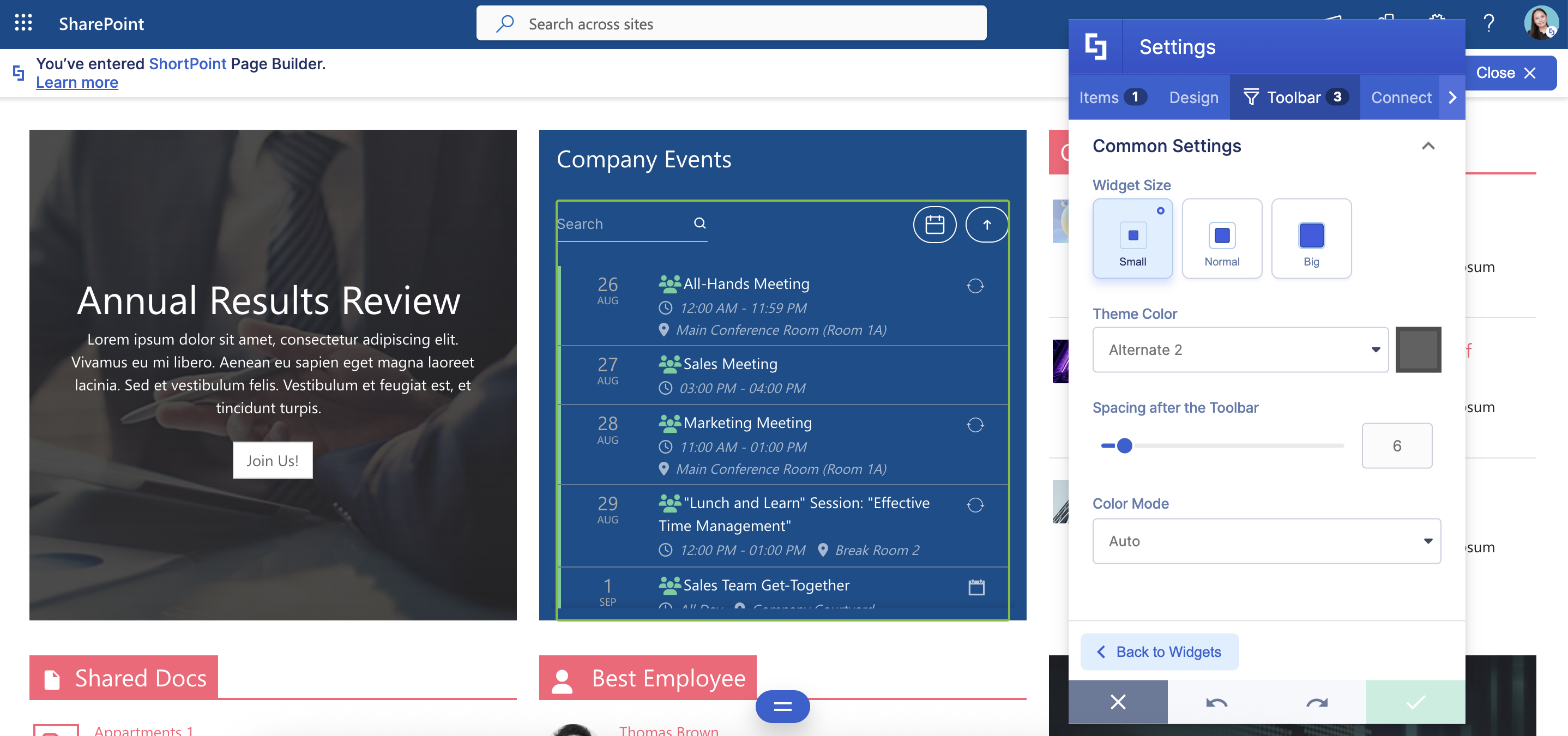
TABLE OF CONTENTS
Prerequisites
- You must have ShortPoint SPFx version 8.7.0.0 or later installed on your SharePoint environment.
- You must be a ShortPoint Designer with an active license.
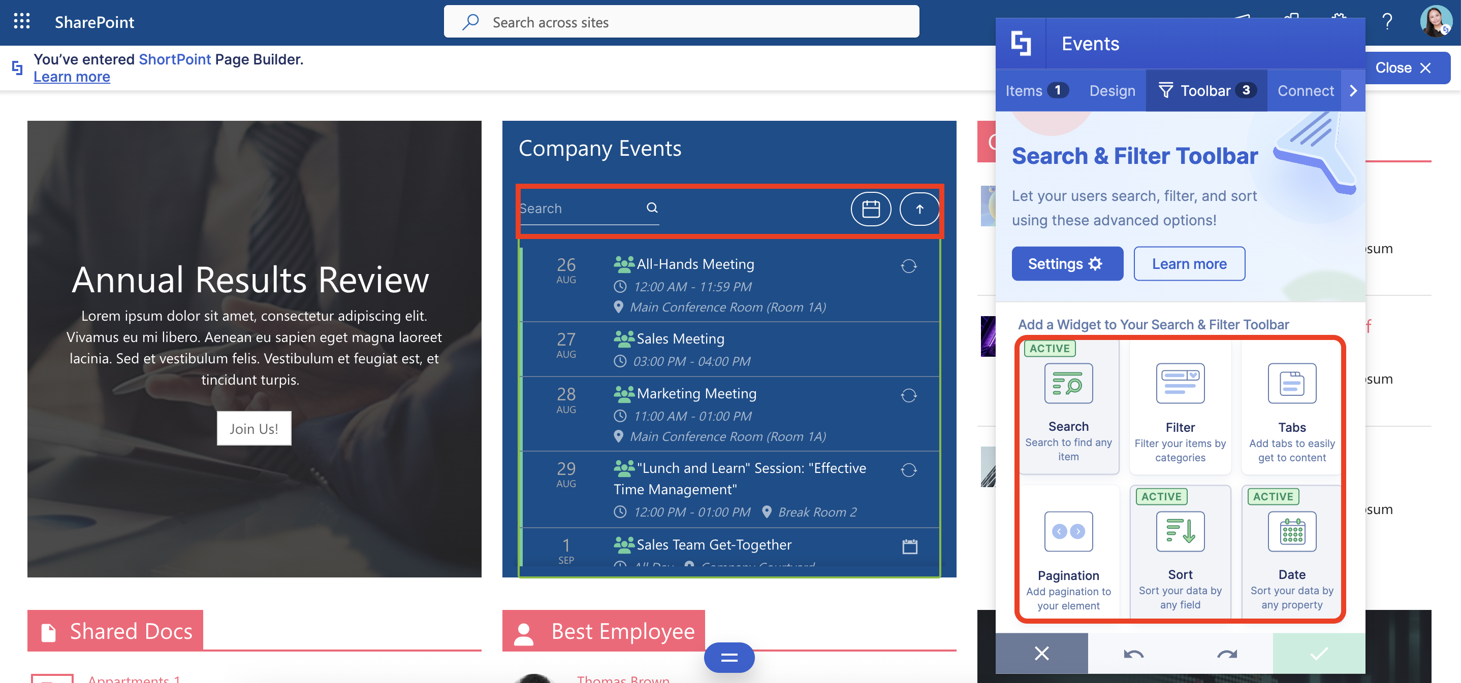
- You must have active Search & Filter Toolbar Widgets:
Interactive Tutorial
Click Get Started to learn how to customize active widgets:
NOTEThe customizations you make inside Settings will affect all active widgets. Check out Settings Features to learn more about the changes you can make.
Step-by-step Tutorial
Follow the detailed guide below to customize active widgets further:
Step 1: Edit the ShortPoint Web Part
- Go to the SharePoint page you want to use and click Edit:

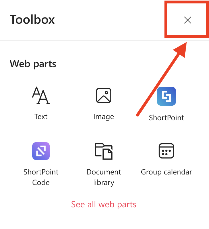
- Close the Toolbox:
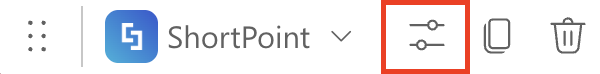
- Click the Edit Properties icon:
Step 2: Edit the Design Element
NOTEBefore proceeding, make sure you have a Design Element with active widgets. To learn how to activate widgets, check out Getting Started: The Basics of the Search & Filter Toolbar.

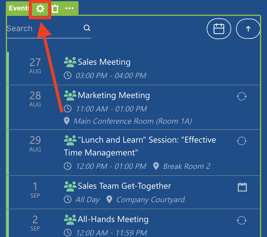
- Click the EasyPass tag of the Design Element with active widgets. In our case, we’ll be using Events:

- Select the cogwheel icon:
Step 3: Open Settings
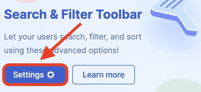
- Go to the Toolbar tab.
- Select Settings:
Step 4: Customize the Look of Active Widgets
- Customize the widget according to your preferences:

NOTEThe customizations you make inside Settings will affect all active widgets. Check out Settings Features to learn more about the changes you can make.
Step 5: Save
- Once satisfied, click the green check mark.
- Click the eye icon to see your page in real-time:

- Save your changes:

Settings Features
Below are the features you can modify when you open Settings:
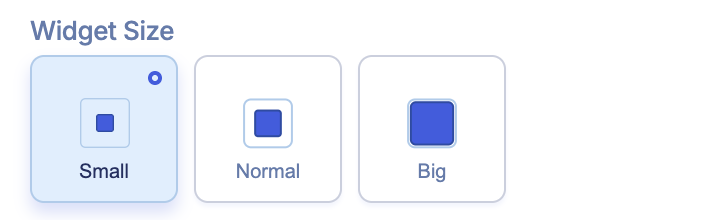 | Widget Size | allows you to modify the size of active widgets. You can choose from Small, Normal, and Big. |
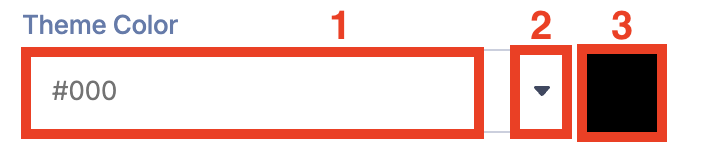 | Theme Color | allows you to choose the color of the active widgets when in use. You can write the [1] HEX Code, use the [2] drop-down, or use the [3] color picker to change the color. |
 | Spacing after the Toolbar | allows you to adjust the space between the active widgets and the Design Element. The value is in pixels. |
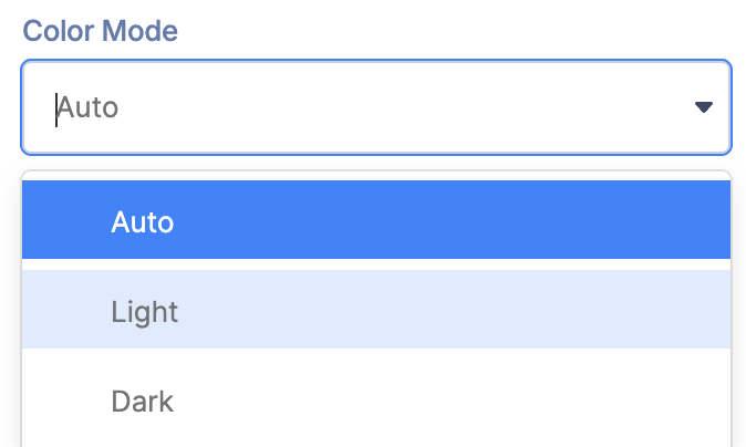 | Color Mode | allows you to change the styling of the active widgets based on the background color. Use Light or Dark for manual control. |
Related articles:
- Search & Filter Toolbar: How to Use the Search Widget
- Search & Filter Toolbar: How to Use the Filter Widget
- Search & Filter Toolbar: How to Use the Sort Widget
- Search & Filter Toolbar: How to Use the Pagination Widget
- Search & Filter Toolbar: How to Use the Tabs Widget
- Search & Filter Toolbar: How to Use the Date Filter Widget
- How to Activate Multiple Search & Filter Toolbar Widgets
- How to Deactivate Active Search & Filter Toolbar Widgets
