 Try ShortPoint now
Want to showcase your team in SharePoint effectively? ShortPoint's Person Cards Design Element is the perfect solution for you! It provides a creative and functional way to feature your team members on any SharePoint team site or page.
This article shows you how to use the Person Cards Design Element. It will cover what it is, how to use it, and list all its features, helping site owners and users enhance team productivity and collaboration within their Microsoft 365 group environment.

NOTEThe Person Cards Design Element is currently not available for SharePoint classic pages. To use it, you can switch to SharePoint modern pages. TABLE OF CONTENTS
- Prerequisites
- What are Person Cards?
- Video Tutorial
- Interactive Tutorial
- Step-by-step Tutorial
- Person Cards Features
- Person Cards Style
- 4 Practical Use Cases for Person Cards
- Start Designing with the Person Cards Design Element
- Frequently Asked Questions
- Do I need coding knowledge to use Person Cards?
- Can I connect Person Cards to a live data source?
- How many Person Cards can I add?
- Can I control who sees the Person Cards on a page?
- Can I customize how the cards look?
- Is Person Cards available for SharePoint classic pages?
- What version of ShortPoint do I need?
Prerequisites
- You must have the ShortPoint SPFx version 8.6.2.0 or later installed in your SharePoint environment.
- You must be a ShortPoint Designer with an active license.
What are Person Cards?
The Person Cards Design Element allows you to feature team members directly on your SharePoint modern pages. Think of it as a ready-made, visually appealing profile card system that you can drop onto any page without writing a single line of code. It is available from ShortPoint SPFx version 8.6.2.0 or later.

Each card can display a team member's photo, role, email address, phone number, department, and even their LinkedIn profile. It shows everything a colleague or visitor would need to connect with the right person, all in one place.

What makes it especially practical is its flexibility. You can add as many Person Cards as you wish, allowing you to feature all members of your team in SharePoint. On the design side, you can customize the colors, size, background, and more in ShortPoint to match your organization's branding and enhance your SharePoint team site experience.

Video Tutorial
Watch the video below for a quick guide on how to use Person Cards:
Interactive Tutorial
Click Get Started to learn how to create a SharePoint organizational chart using Person Cards:
NOTETo learn more about the features you can customize for Person Cards, check out Person Cards Features.
Step-by-step Tutorial
Follow the detailed guide below to start using Person Cards:
Step 1: Edit the ShortPoint Web Part
- Go to the SharePoint page you want to use and click Edit.

- Close the Toolbox:

- Click the Edit properties icon:

Step 2: Insert the Person Cards Design Element
- Choose where you want to add Person Cards and click the plus icon:

- Use the search box to look for Steps and click it:

Step 3: Edit content
- Go to the Items tab.
- Select the cogwheel icon:

- Customize the content according to your preferences.
- Click the back icon:

- Repeat the same steps if you need to add more steps.
NOTEYou can also connect the Person Cards Design Element to external or internal sources to create dynamic content. To learn how, check out ShortPoint Connect: Basic Tutorial.
Step 4: Customize the Design
- Go to the Design tab.
- Customize the look of the Person Cards according to your preferences.
- Go to the Advanced tab.
- Modify the Person Boxes even more.
- Once satisfied, click the green check mark.
NOTETo learn more about the features you can customize for Person Cards, check out Person Cards Features.
Step 5: Save
- Click the eye icon to see your page in real-time:

- Save your changes:

That's it! You can now use the Person Cards Design Element to feature your team members.
Person Cards Features
Below are the options you can find in the Person Cards Settings window
A. Items Tab
The Items tab allows you to add new items and organize the content inside the Person Cards. It has the following options:

 | Add New | allows you to add a new item. |
 | Drag icon | allows you to rearrange the items. |
 | Duplicate icon | allows you to copy an item. |
 | Cogwheel icon | allows you to edit the content of an item. See the table below to see the options you can find inside. |
 | Trash icon | allows you to remove an item. |
COGWHEEL ICON OPTIONS
 | Image URL | allows you to choose the image to be shown. To do this, you can add the URL or click the folder icon. |
 | Name | allows you to add the employee's name. |
 | Position | allows you to add the role title. |
 | Linking Option | allows you to specify how the link will be opened. You can choose from the following:
|
 | Department | allows you to add a Department. |
 | allows you to add an email. | |
 | Phone | allows you to add a phone number. |
 | Profile | allows you to add a LinkedIn profile. |
B. Design Tab
The Design tab allows you to customize how the Person Cards will look. It has the following options:

SETTINGS
 | Styles | allows you to choose the style of the Person Cards.. |
 | Color | allows you to modify the primary color of the Person Cards. You can change the color by [1] adding a hex code, [2] using the drop-down, or [3] using the color picker. |
 | Color Mode | allows you to choose from Light or Dark color mode. |
 | Image Height | allows you to adjust the height of the image in px. |
 | Items Per Row | allows you to specify the number of Person Cards to be shown per row. |
C. Toolbar tab
The Toolbar tab allows you to add Smart Toolbar widgets. These Smart Toolbar widgets can help you search, sort, or filter data in your Person Cards:
NOTEThe Toolbar tab is only available for SportPoint SPFx version 8.5.0.0 or later. For more information on the Toolbar tab, check out Getting Started: The Basics of the Smart Toolbar.

D. Metadata tab
This allows you to add metadata tags to organize and categorize your content. You can then filter, search, and group items using these custom labels in the Search & Filter Toolbar. For more details, check out How to Add SharePoint Metadata Tags to Organize Content.

E. Connect Tab
The Connect tab allows you to link the Design Element to SharePoint sources (List, Document Library, News, etc.) and other external sources (Microsoft Graph API, Teams, Outlook, etc.). For more details about ShortPoint Connect, check out Basic Tutorial: How to Establish Seamless SharePoint Connection with ShortPoint Connect.

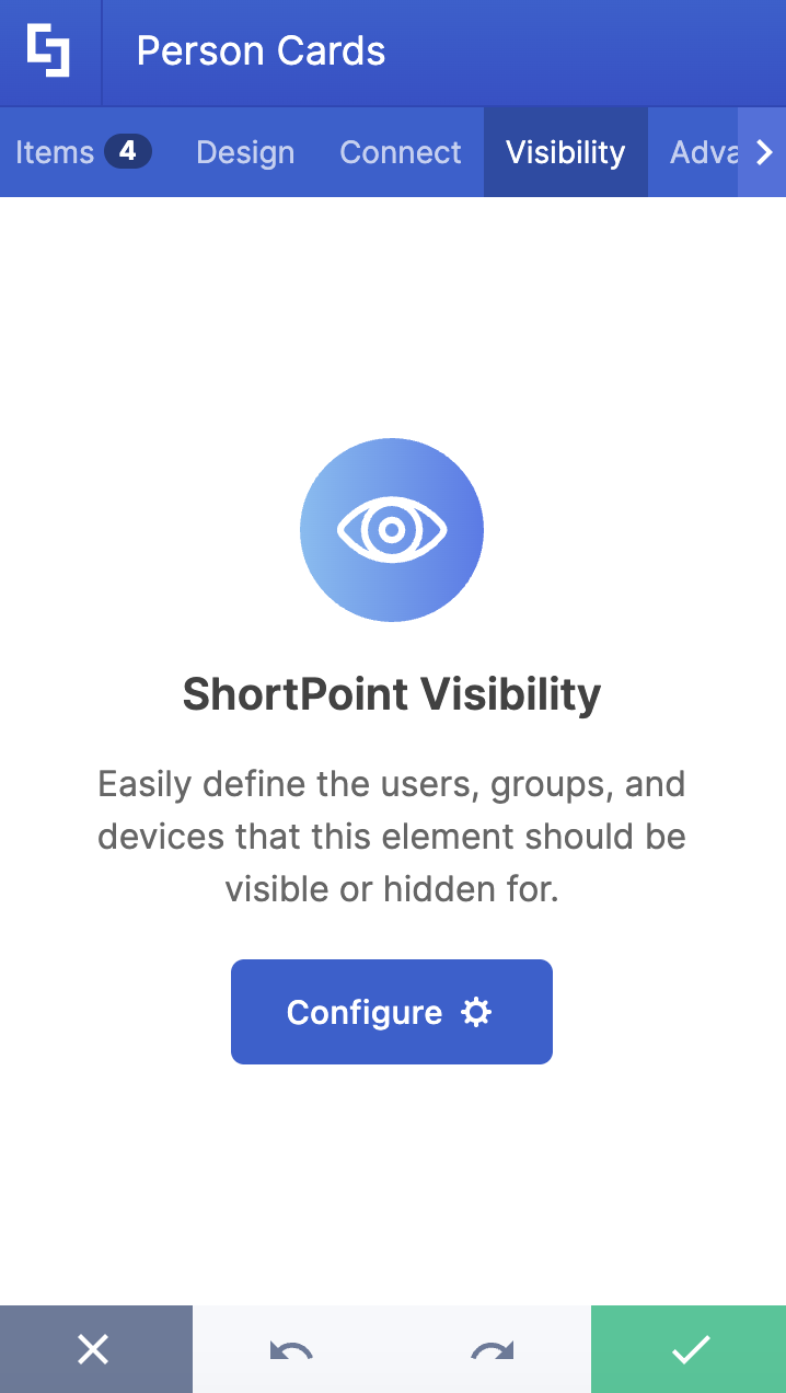
F. Visibility Tab
The Visibility tab allows you to specify who can see the Design Element and what type of devices it can be shown on. For more details, check out How to Use the ShortPoint Visibility Feature for Effective SharePoint Access Management.
G. Advanced Tab
The Advanced tab allows you to further customize how the Person Cards Design Element looks. It has the following options:

SETTINGS
 | Container Width | allows you to adjust the width of the container. |
CUSTOM PROPERTIES
NOTECheck out How to Add Custom Properties to the Person Cards Design Element to learn more.
 | Custom Property 1 Title | allows you to add a title to the 1st custom property |
 | Custom Property 1 Icon | allows you to add an icon to the 1st custom property |
 | Custom Property 2 Title | allows you to add a title to the 2nd custom property |
 | Custom Property 2 Icon | allows you to add an icon to the 2nd custom property |
 | Custom Property 3 Title | allows you to add a title to the 3rd custom property |
 | Custom Property 3 Icon | allows you to add an icon to the 3rd custom property |
SPACING
 | Margin Top | allows you to adjust the top margin value in px, %, or em. |
 | Margin Bottom | allows you to adjust the bottom margin value in px, %, or em. |
 | Margin Left | allows you to adjust the left margin value in px, %, or em. |
H. Custom CSS Tab
This tab allows you to use your own CSS, HTML, and JavaScript code to customize the Person Cards Element.
NOTECheck out our support article on How to Insert Custom CSS into a Page Builder Element? (Basic Tutorial) to know more about Custom CSS.

Person Cards Style
The Person Cards Design Element gives you 4 creative styles to choose from, each designed to enhance your SharePoint team site:
- The Brief style presents each team member in a clean, centered card layout that feels warm and approachable. This style is perfect for a friendly first impression. It's visually light and easy to scan.

- The Detailed style takes a more informative approach while keeping the same welcoming feel. This style is ideal for onboarding pages, ensuring that new hires have everything they need to reach out.

4 Practical Use Cases for Person Cards
The Person Cards Design Element is a versatile tool that can improve team collaboration and communication on your SharePoint team site. Here are some practical ways you can use it:
- Company-Wide Employee Directory
The most straightforward use case is building a searchable, browsable employee directory on your SharePoint team site. Instead of a flat, hard-to-navigate list, Person Cards give each employee a visual profile with all the key contact details at a glance. Enhanced discoverability helps users locate team members, contacts, and experts quickly, which is especially valuable in larger organizations where employees may not know who to reach out to.
You can take it even further by using ShortPoint's Smart Toolbar to let visitors search, sort, and filter cards by name, department, or role. For more information on how to create a team employee directory, go to How to Create an Employee Directory in SharePoint Using the Person Cards Design Element.
- Department or Team Pages
Every department has its own identity, and a team page is a great place to reflect that. With Person Cards, you can create a dedicated "Meet the Team" section on your department's group connected team site, featuring each member's photo, title, and contact info. It gives the page a human touch and makes it easier for people across the organization to know who's who on any given standard channel or team.
- Leadership and Executive Showcases
Person Cards work especially well for highlighting your organization's leadership. Professional layouts are designed specifically for showcasing individual profiles, making it easy to create a clean, polished executive page that reflects the credibility and professionalism of your leadership team. You can customize the style and color scheme to match your brand, and even link each card to a full bio page for more context.
- Onboarding Pages for New Hires
Starting a new job can be overwhelming. One simple way to ease the transition is to feature key contacts (like an HR business partner, IT helpdesk lead, or direct manager) front and center on an onboarding page. New employees benefit from having direct access to key contacts from day one, and Person Cards make it easy to set that up without any design expertise. Pair them with ShortPoint Connect to pull data dynamically, so the cards stay current even as teams change.
Start Designing with the Person Cards Design Element
Whether you're building a company-wide people directory, a department team page, or a welcoming onboarding hub, Person Cards is one of those tools that delivers real value without requiring a big lift. It's a simple but meaningful way to make your SharePoint intranet feel less like a file storage system and more like a place where people actually connect.
Person Cards are just a few clicks away. If you're already a ShortPoint Designer, grab the latest ShortPoint SPFx update and go through our interactive tutorial above.
New to ShortPoint? Explore everything Person Cards has to offer with a FREE 15-day trial, or book a personalized demo with one of our experts.
Frequently Asked Questions
Do I need coding knowledge to use Person Cards?
Not at all. Person Cards is a no-code Design Element built into the ShortPoint Page Builder for SharePoint sites. You configure everything through a visual settings panel, including adding photos, filling in contact details, and adjusting the design. If you want to go further, there is a Custom CSS tab available for those who prefer hands-on styling.
Can I connect Person Cards to a live data source?
Yes! You can connect the Person Cards Design Element to external or internal sources to create dynamic content. Using ShortPoint Connect, you can link Person Cards to a SharePoint list, Microsoft Graph API, or other data sources, so your directory updates automatically instead of requiring manual edits every time someone joins or changes roles.
How many Person Cards can I add?
As many as you need. There is flexibility to add as many Person Cards as you wish, making it suitable for small teams and large organizations alike.
Can I control who sees the Person Cards on a page?
Yes. The Visibility tab allows you to specify who can see the Design Element and what type of devices it can be shown on. This is great for scenarios where you want to show different contact cards to different audiences. For example, showing regional HR contacts only to employees in that region.
Can I customize how the cards look?
Absolutely. The Design tab lets you choose a style, modify the primary color, switch between light and dark color modes, adjust the image height, and control how many cards appear per row. For more advanced tweaks, the Advanced tab and Custom CSS tab give you even deeper control over the layout and appearance.
Is Person Cards available for SharePoint classic pages?
No, the Person Cards Design Element is currently not available for SharePoint classic pages. You'll need to switch to SharePoint modern pages to use it.
What version of ShortPoint do I need?
You must have ShortPoint SPFx version 8.6.2.0 or later installed in your SharePoint environment, and you must be a ShortPoint Designer with an active license.
Related articles:
