 Try ShortPoint now
Looking for an easy way to create breadcrumb navigation in SharePoint? Follow this guide to master the Breadcrumb Design Element and create beautiful, customized navigation for your pages.
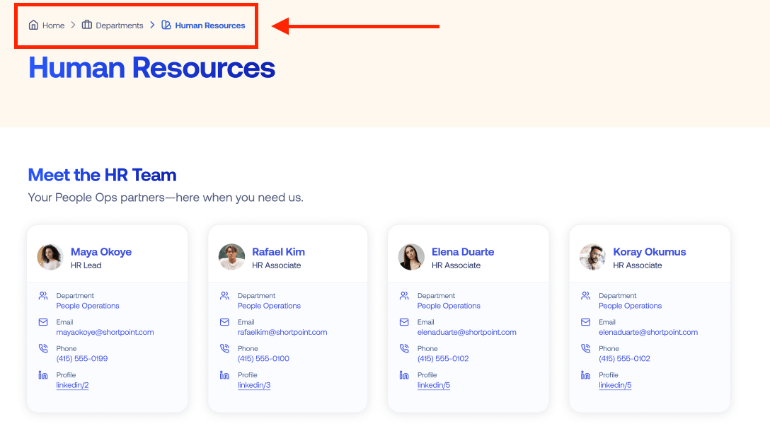
TABLE OF CONTENTS
- Prerequisites
- What Is the Breadcrumb Design Element?
- Interactive Tutorial
- Step-by-step Tutorial
- Breadcrumb Features
- Breadcrumb Styles
- Practical Use Cases for the Breadcrumb Design Element
- Start Designing with the Breadcrumb Design Element
- Frequently Asked Questions
- What is breadcrumb navigation, and why is it important?
- How does the Breadcrumb Design Element work?
- What are the benefits of using breadcrumb navigation on my SharePoint site?
- Can breadcrumb navigation be customized in SharePoint using ShortPoint?
- Where should breadcrumb navigation be placed on a SharePoint page?
- Is breadcrumb navigation suitable for all SharePoint sites?
- How can I add breadcrumb navigation to my SharePoint site using ShortPoint?
- Can breadcrumb navigation help with multi-step processes in SharePoint?
Prerequisites
- You must have the ShortPoint SPFx version 8.8.4.0 or later installed in your SharePoint environment.
- You must be a ShortPoint Designer with an active license.
What Is the Breadcrumb Design Element?
You can begin using the Breadcrumb Design Element with ShortPoint SPFx version 8.8.4.0 or later.

This handy feature brings sleek, helpful navigation right to your SharePoint page! It automatically picks up your site's current URL and displays all the related pages in an easy-to-follow breadcrumb trail. Your visitors will always know exactly where they are in your site and can effortlessly hop back to any previous page with just a click. It's a simple way to keep everyone oriented and make navigating your site a breeze.

It has full customization capabilities. Adjust font size, style, and colors to your heart's content for a polished, professional appearance.
Interactive Tutorial
Click Get Started to easily add a Breadcrumb to your SharePoint site:
NOTETo learn more about the features you can customize for Breadcrumb, check out Breadcrumb Features.
Step-by-step Tutorial
Learn how to add a Breadcrumb navigation in SharePoint.
Step 1: Edit the ShortPoint Web Part
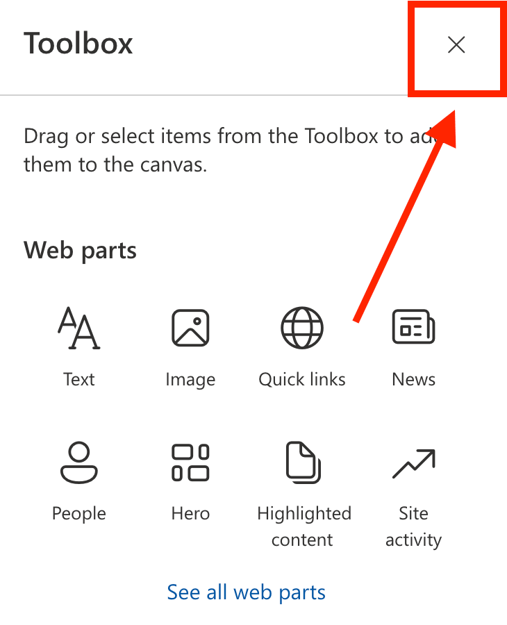
- Go to the SharePoint page you want to use and click Edit.

- Close the Toolbox:
- Click the Edit properties icon:

Step 2: Insert the Breadcrumb Design Element
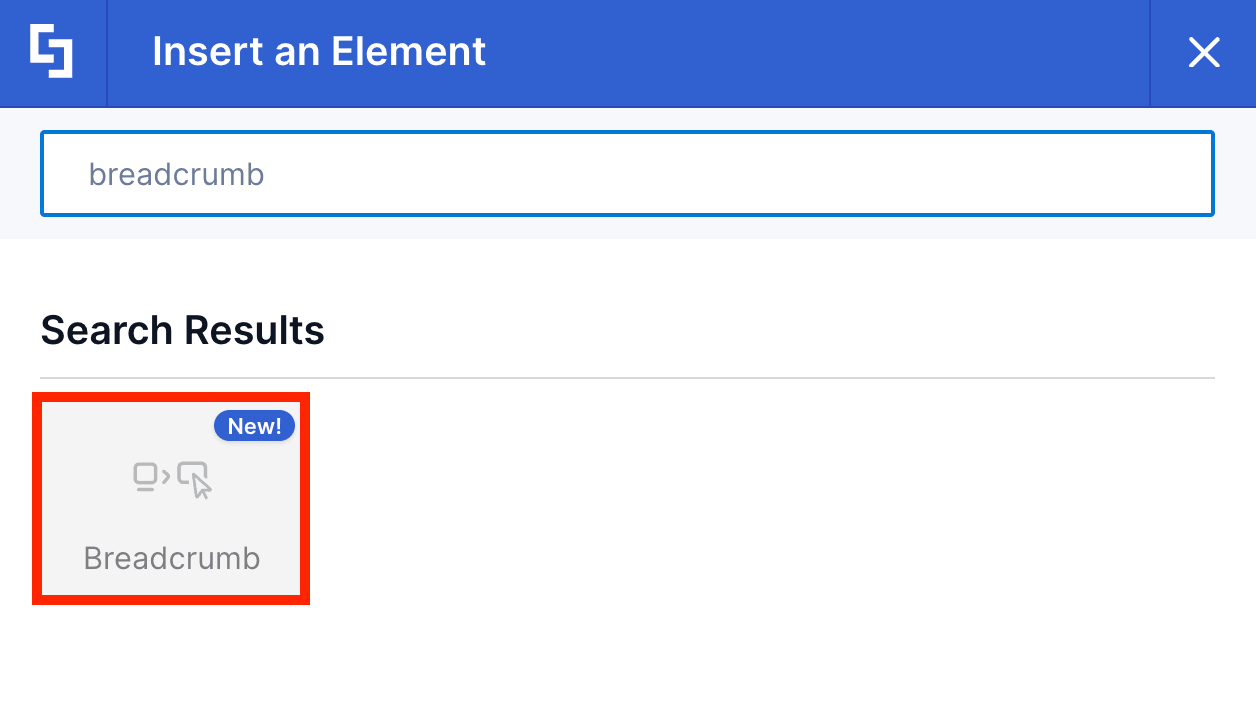
- Choose where you want to add the Breadcrumb and click the plus icon:
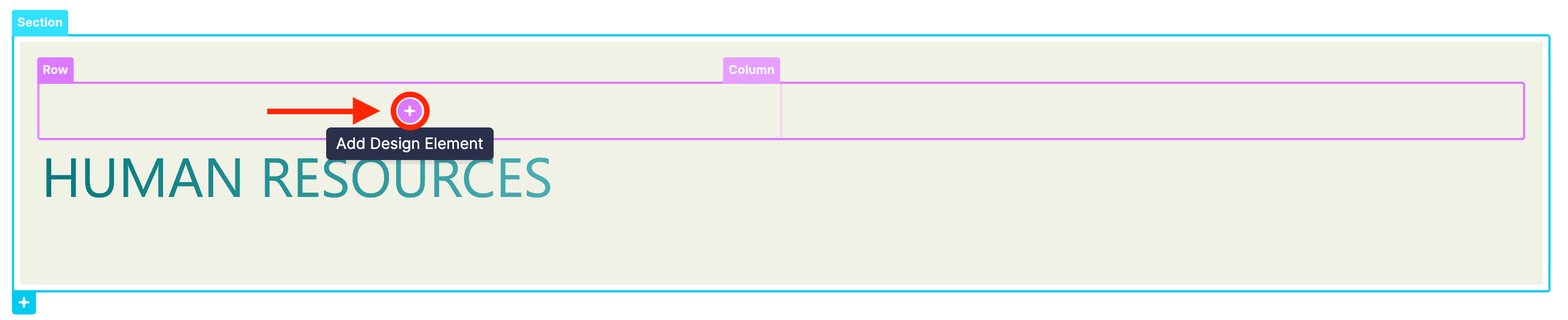
- Use the search box to look for Breadcrumb and click it:
Step 3: Customize the Content
- Go to the Content tab.
- Choose the icons associated with each breadcrumb trail.
NOTETo learn more about the features you can customize for Breadcrumb, check out Breadcrumb Features.
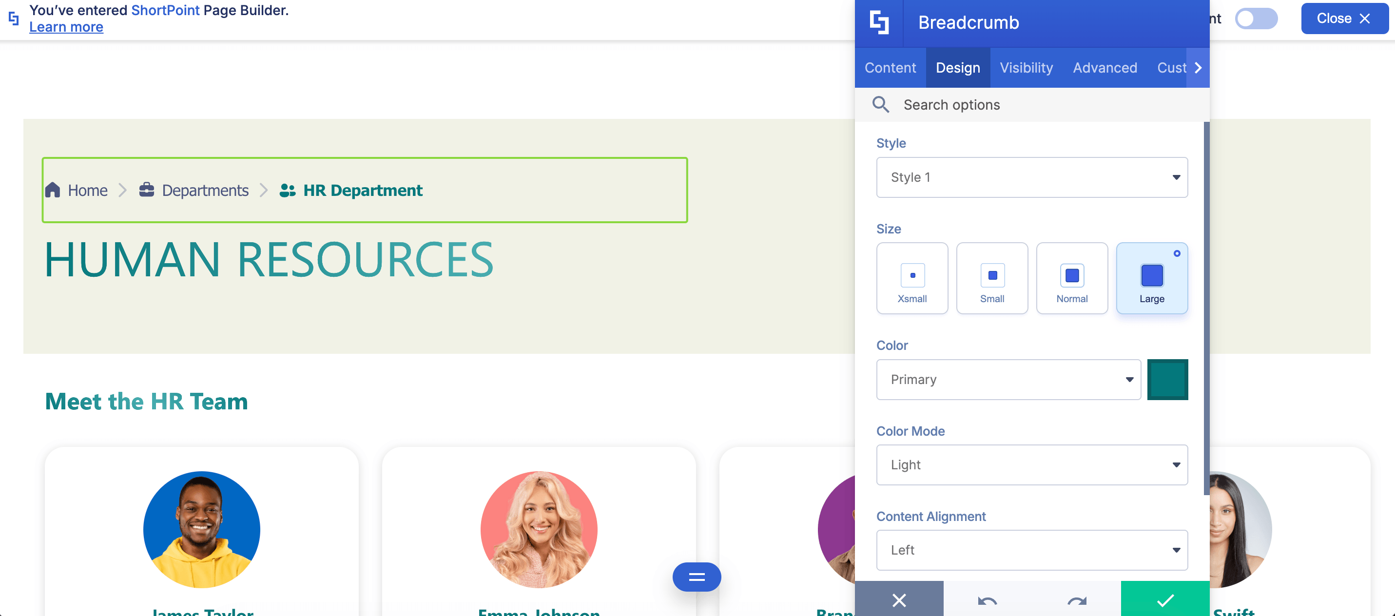
Step 4: Customize the Design
- Go to the Design tab.
- Customize the look of the Breadcrumb according to your preferences.
- Go to the Advanced tab.
- Modify the design even further.
- Once satisfied, click the green check mark.
NOTETo learn more about the features you can customize for Breadcrumb, check out Breadcrumb Features.
Step 5: Save
- Click the eye icon to see your page in real-time:

- Save your changes:

You did it! Your SharePoint site now has a breadcrumb menu. With this intuitive navigation tool, your page viewers will have no trouble finding the page they need.
Breadcrumb Features
Want to perfect your breadcrumb menu? You'll have access to many useful settings in the Breadcrumb Settings window, all designed to help you create your ideal menu presentation.
A. Content Tab
The Content tab is where you can edit the content inside the Breadcrumb Design Element. Here are the options you can tweak:
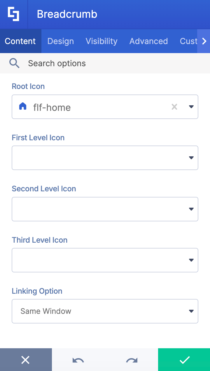
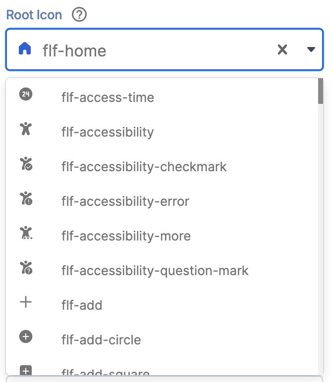 | Root icon | allows you to choose an icon for the root site. |
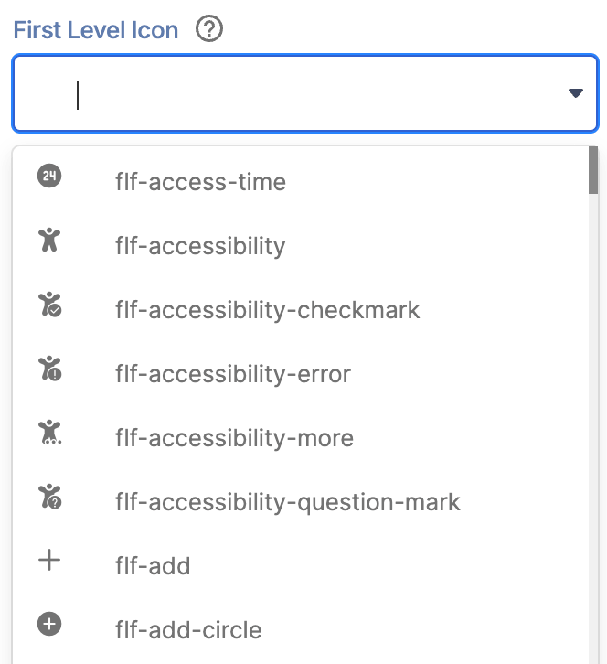 | First Level icon | allows you to choose an icon for the first-level site. |
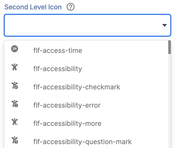 | Second Level icon | allows you to choose an icon for the second-level site. |
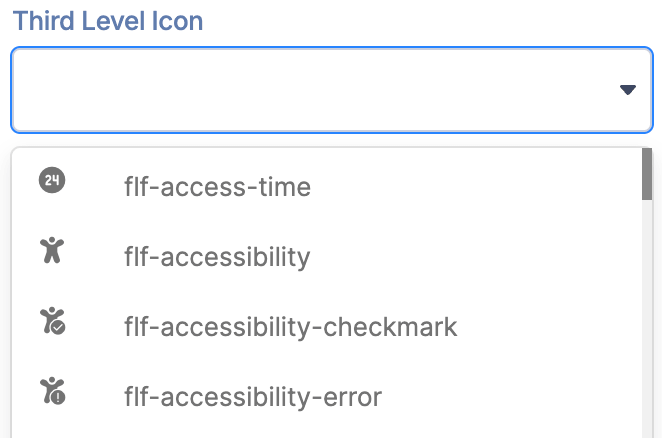 | Third Level icon | allows you to choose an icon for the third-level site. |
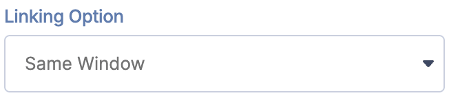 | Linking Option | allows you to choose how the links will be opened. You can choose from same window or new window. |
B. Design Tab
The Design tab is where you get to have fun customizing the look and feel of your Breadcrumb. Here are the options you can modify:
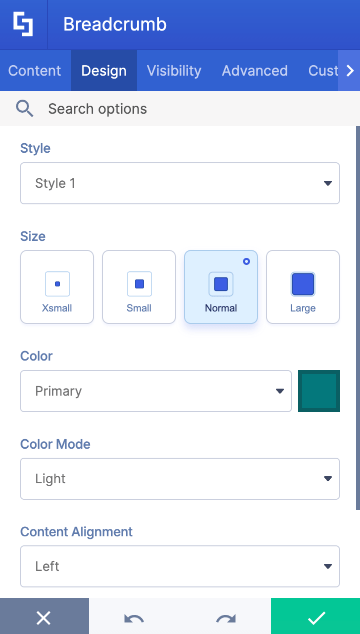
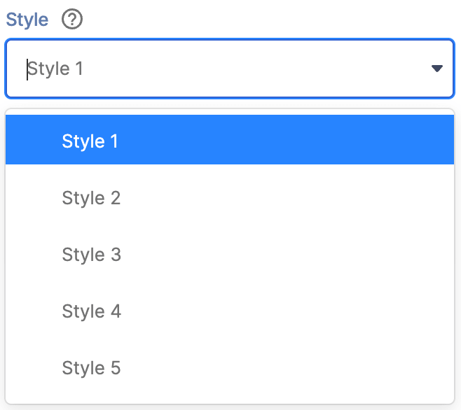 | Style | allows you to choose a Breadcrumb style. You have 5 styles to choose from. Check out Breadcrumb styles to learn more. |
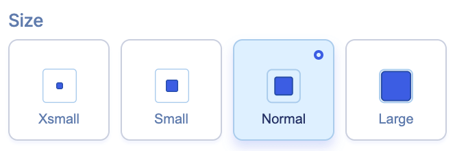 | Size | allows you to specify the size of the Breadcrumb. You can choose from x-small, small, normal, or large. |
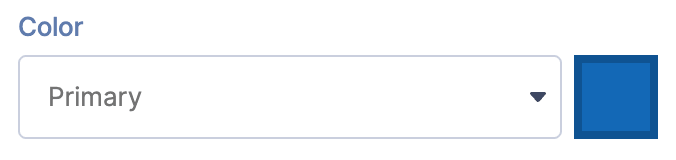 | Color | allows you to customize the primary color of the breadcrumb. |
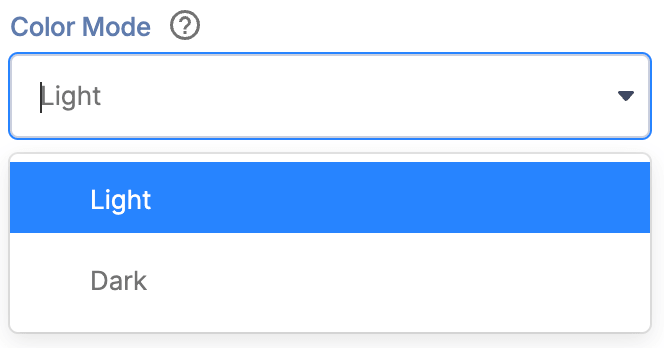 | Color Mode | allows you to choose from Light or Dark Mode. |
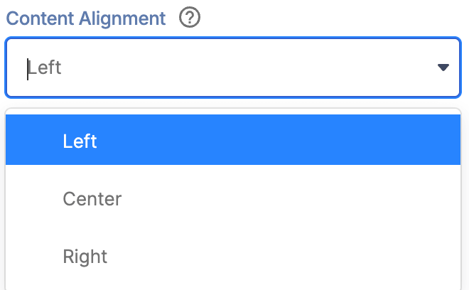 | Content Alignment | allows you to choose the alignment of the text. |
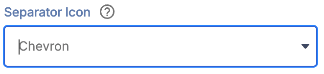 | Separator Icon | allows you to choose the icon to separate each page. |
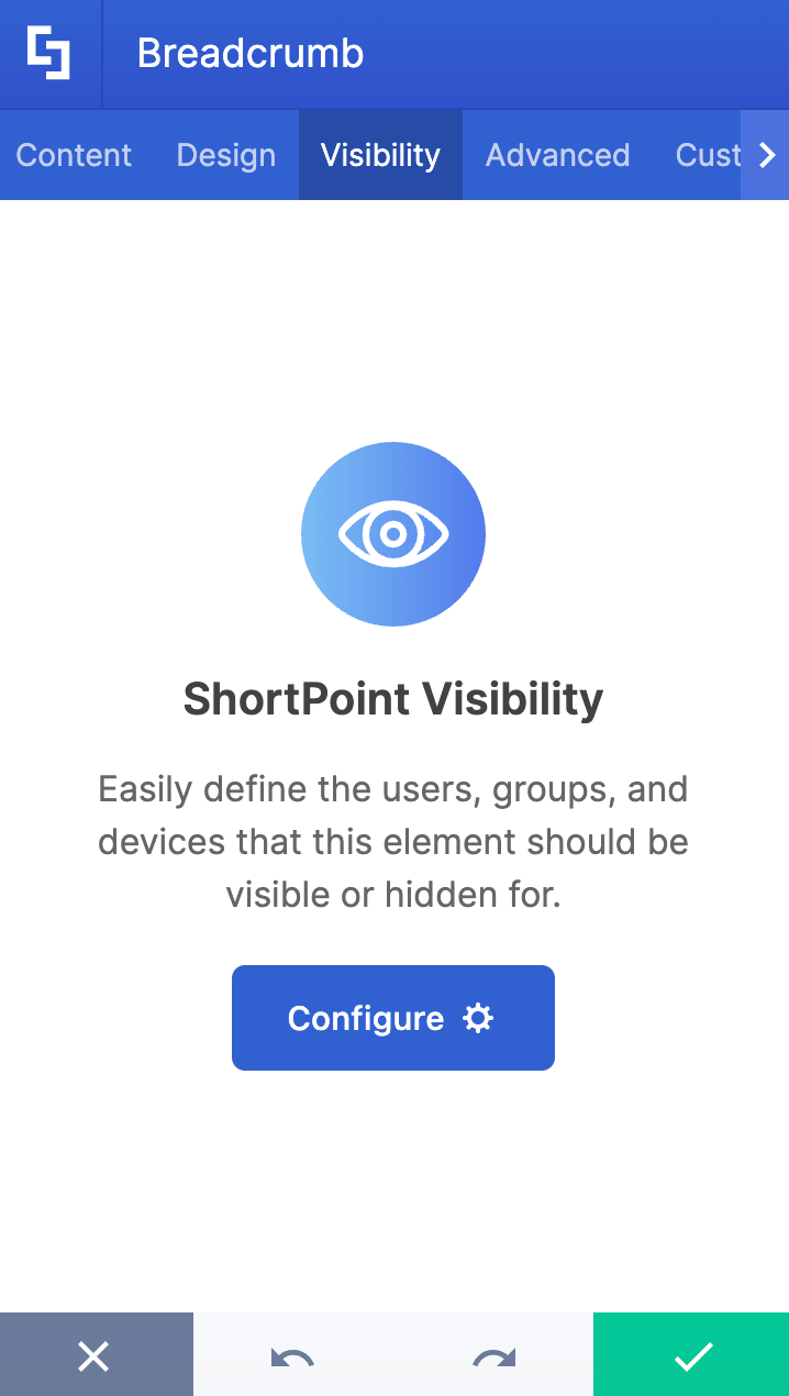
C. Visibility Tab
The Visibility tab allows you to specify who can see the Design Element and what type of devices it can be shown on. For more details, check out How to Use the ShortPoint Visibility Feature for Effective SharePoint Access Management.
D. Advanced Tab
The Advanced tab allows you to customize further how the Breadcrumb looks. These are the options you can change:
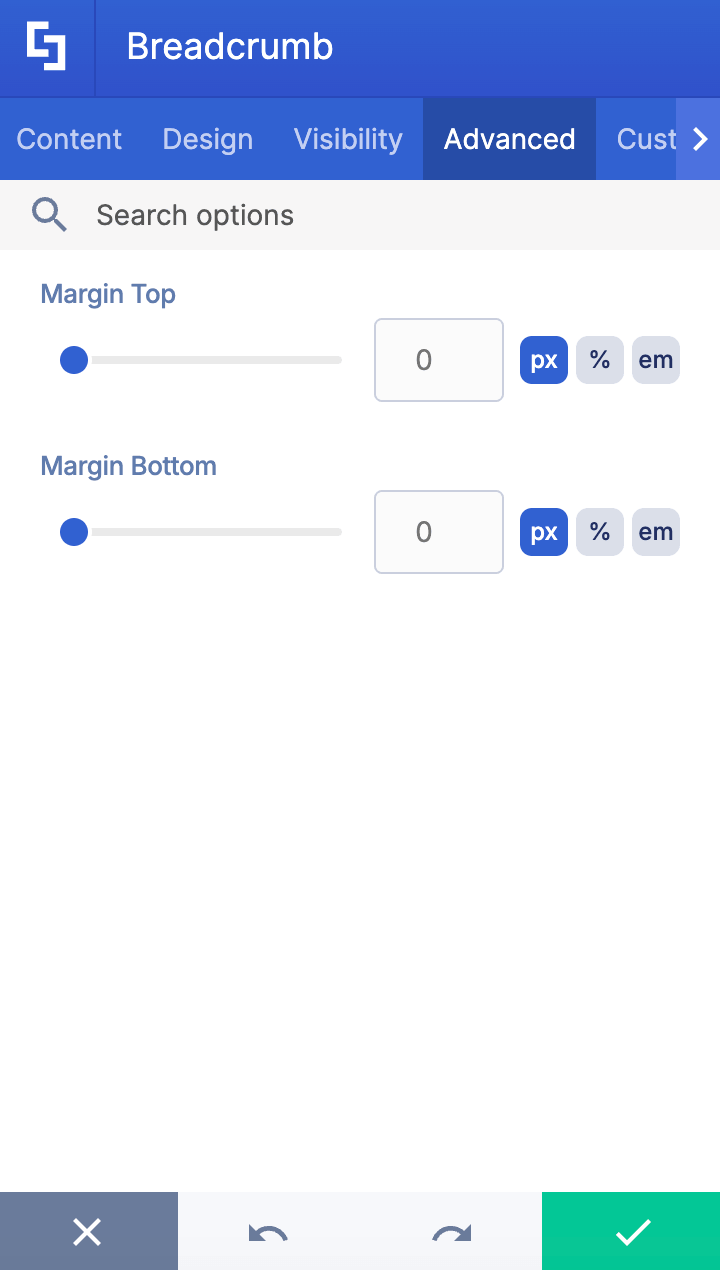
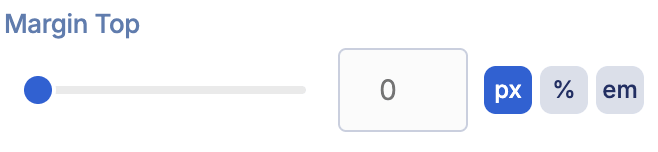 | Margin Top | allows you to adjust the top margin value. |
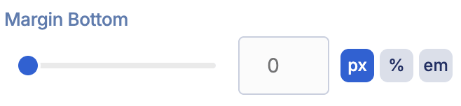 | Margin Bottom | allows you to adjust the bottom margin value. |
E. Custom CSS Tab
This tab lets you add your own custom touch to the Breadcrumb Design Element using custom CSS, HTML, and JavaScript. This gives site owners and designers greater control over how the highlighted text will look.
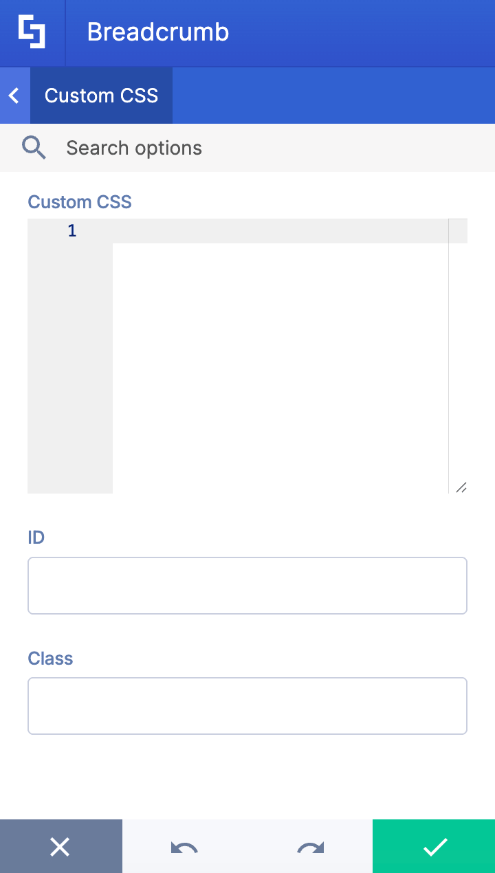
NOTECheck out our support article on How to Insert Custom CSS into a Page Builder Element? (Basic Tutorial) to know more about Custom CSS.
Breadcrumb Styles
The Breadcrumb Design Element has lots of stylistic options to choose from: 5 in total. Here’s a breakdown of each one:
- Style 1 presents a clean, inline design where all breadcrumb items sit on the same visual level.

- Style 2 elevates the current page with a solid teal pill-shaped background that makes it stand out prominently.

- Style 3 is identical to Style 2, except it features a gradient pill background highlighting the current page.

- Style 4 takes a more subtle approach with an outlined pill around the current page.

- Style 5 switches to a vertical stacking layout where each breadcrumb level appears on its own line with the icon positioned above the text.

Practical Use Cases for the Breadcrumb Design Element
The Breadcrumb Design Element offers versatile applications that enhance navigation and user experience across various scenarios. Here are some practical use cases where adding this breadcrumb navigation can significantly benefit your site users:
- Complex Site Hierarchies
For intranets or websites with multiple nested sections, the breadcrumb trail helps users understand their current location within the site hierarchy. This is especially useful for organizations with extensive content libraries or departmental pages, enabling users to quickly jump back to a parent page or home page without confusion.
- Multi-step Processes
In workflows such as onboarding or training modules, the breadcrumb trail acts as a secondary navigation scheme that clearly shows the user's progress and allows easy backtracking to previous steps. This reduces user anxiety and improves overall task completion rates.
Start Designing with the Breadcrumb Design Element
With the Breadcrumb Design Element, organizations can provide a clear navigation path that improves usability, reduces bounce rates, and supports a logical site architecture. This makes it easier for your site visitors to find relevant information and enhances their overall experience on your SharePoint site.
Ready to make breadcrumb navigation work for your team? Setting up your first Breadcrumb takes just a few clicks, and our interactive tutorial makes the process smooth and simple. Just update your ShortPoint SPFx version to version 8.8.4.0 to get started.
New to ShortPoint? We invite you to discover all our features with a FREE 15-day trial, completely commitment-free. Prefer a guided experience? Book a one-on-one demo and let our team walk you through the Breadcrumb Design Element and so much more.
Frequently Asked Questions
What is breadcrumb navigation, and why is it important?
Breadcrumb navigation is a secondary navigation scheme that helps website users track their current location within a site hierarchy through clear and intuitive breadcrumb links. It improves usability by providing a navigation path that allows users to easily backtrack to parent pages or the home page, reducing confusion and enhancing the overall user experience.
How does the Breadcrumb Design Element work?
The Breadcrumb Design Element automatically generates a breadcrumb trail based on your site's current URL and hierarchy. It offers full customization options, including font size, style, colors, and separator icons, allowing you to create a polished breadcrumb navigation menu that fits your intranet's branding and design.
What are the benefits of using breadcrumb navigation on my SharePoint site?
Using breadcrumb navigation helps users understand their current location within the website hierarchy, making it easier to navigate complex sites. It reduces user effort, lowers bounce rates, supports a logical site architecture, and improves productivity by enabling quick access to higher-level pages without relying solely on the primary navigation menu.
Can breadcrumb navigation be customized in SharePoint using ShortPoint?
Yes! The Breadcrumb Design Element provides extensive customization options via the Content, Design, Connect, Visibility, Advanced, and Custom CSS tabs. You can adjust icons for different levels, styling, colors, alignment, shadow effects, and even add custom CSS or JavaScript to tailor the breadcrumb menu exactly to your needs.
Where should breadcrumb navigation be placed on a SharePoint page?
Best practice is to display the breadcrumb trail near the top of the page, typically just below the primary navigation menu and above the page title. This placement ensures it's visible but unobtrusive, providing a seamless user experience without cluttering the interface.
Is breadcrumb navigation suitable for all SharePoint sites?
Breadcrumbs are most effective for sites with complex or multi-level site hierarchies. For smaller sites with a simple structure or few pages, breadcrumbs may not add much value and could potentially confuse users. Always consider your site's logical categories and navigation needs before applying breadcrumb trails.
How can I add breadcrumb navigation to my SharePoint site using ShortPoint?
To add breadcrumbs, update to ShortPoint SPFx version 8.8.4.0 or later, then insert the Breadcrumb Design Element on your desired page. Customize it via the available tabs, save your changes, and the breadcrumb navigation menu will automatically reflect your site's structure, helping users navigate with ease.
Can breadcrumb navigation help with multi-step processes in SharePoint?
Absolutely. Breadcrumbs serve as a secondary navigation scheme that clearly shows users their progress in workflows like onboarding or training modules. This reduces user anxiety by providing a clear overview and allows easy backtracking to previous pages.
Related articles:
- How to Add an Online World Clock to SharePoint Sites Using the World Clock Design Element
- How to Embed Canva into SharePoint Using the Canva Design Element
- How to Create a FlipBox in SharePoint Using the FlipBoxes Design Element
- How to Add Customer Testimonials to SharePoint Using the Testimonials Design Element
- How to Create SharePoint Calendar Using the Calendar Design Element
- How to Create SharePoint Announcements Using the Announcement Design Element
