Want to add creative SharePoint headers to your page? This guide covers everything you need to know about using the Heading Design Element to create visually appealing headers in your SharePoint site. This will help you display beautiful SharePoint site headers in no time, enhancing your site's branding and user experience.

TABLE OF CONTENTS
- Prerequisites
- What Is the Heading Design Element?
- Interactive Tutorial
- Step-by-step Tutorial
- Heading Features
- Practical Use Cases for the Heading Design Element
- Frequently Asked Questions
Prerequisites
- You must have the ShortPoint SPFx version 8.8.0.0 or later installed in your SharePoint environment.
- You must be a ShortPoint Designer with an active license.
What Is the Heading Design Element?
The Heading Design Element is now part of ShortPoint's library, available from SPFx version 8.8.0.0.

With this feature, you can easily build and display creative SharePoint headers on your SharePoint sites. You can customize its content, including title, subtitles, and caption text.
The best part? You can adjust the heading's style, size, colors, and other visual elements to match your site's branding and site theme.
Interactive Tutorial
Click Get Started to easily add SharePoint headers to your page:
NOTETo learn more about the features you can customize for Heading, check out
Heading Features.
Step-by-step Tutorial
Let's get you started with adding Headings to SharePoint. This guide breaks down the process into simple, easy-to-follow steps. After this, you'll be able to create visually appealing SharePoint headers in no time.
Step 1: Edit the ShortPoint Web Part
- Go to the SharePoint page you want to use and click Edit:

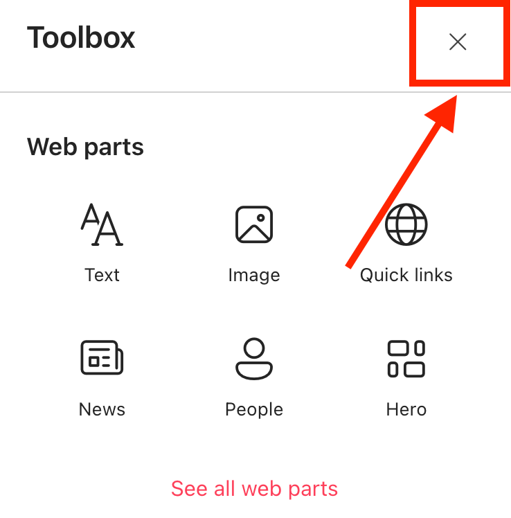
- Close the Toolbox:
- Click the Edit properties icon:

Step 2: Insert the Heading Design Element
- Choose where you want to add the Heading and click the plus icon:

- Use the search box to look for Heading and click it:
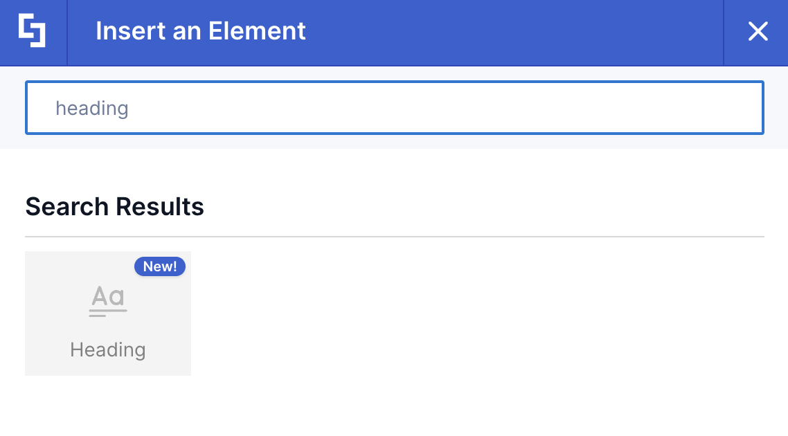
Step 3: Customize the Content
- Go to the Content tab.
- Customize the content of the Heading according to your preferences.
NOTETo learn more about the features you can customize for Heading, check out
Heading Features.
Step 4: Customize the Design
- Go to the Design tab.
- Customize the look of the Heading according to your preferences.
- Go to the Advanced tab.
- Modify the design even further.
- Once satisfied, click the green check mark.
NOTETo learn more about the features you can customize for Heading, check out
Heading Features.
Step 5: Save
- Click the eye icon to see your page in real-time:

- Save your changes:

And that's it! Your Headings are now live in SharePoint Online, boosting the overall appeal of your SharePoint page with a visually appealing header area. This will surely create an immersive experience for both site owners and site viewers.
Heading Features
Looking to customize your Heading? The Heading Settings window provides helpful options that give you full control over how your SharePoint headers will appear on your SharePoint site page.
A. Content Tab
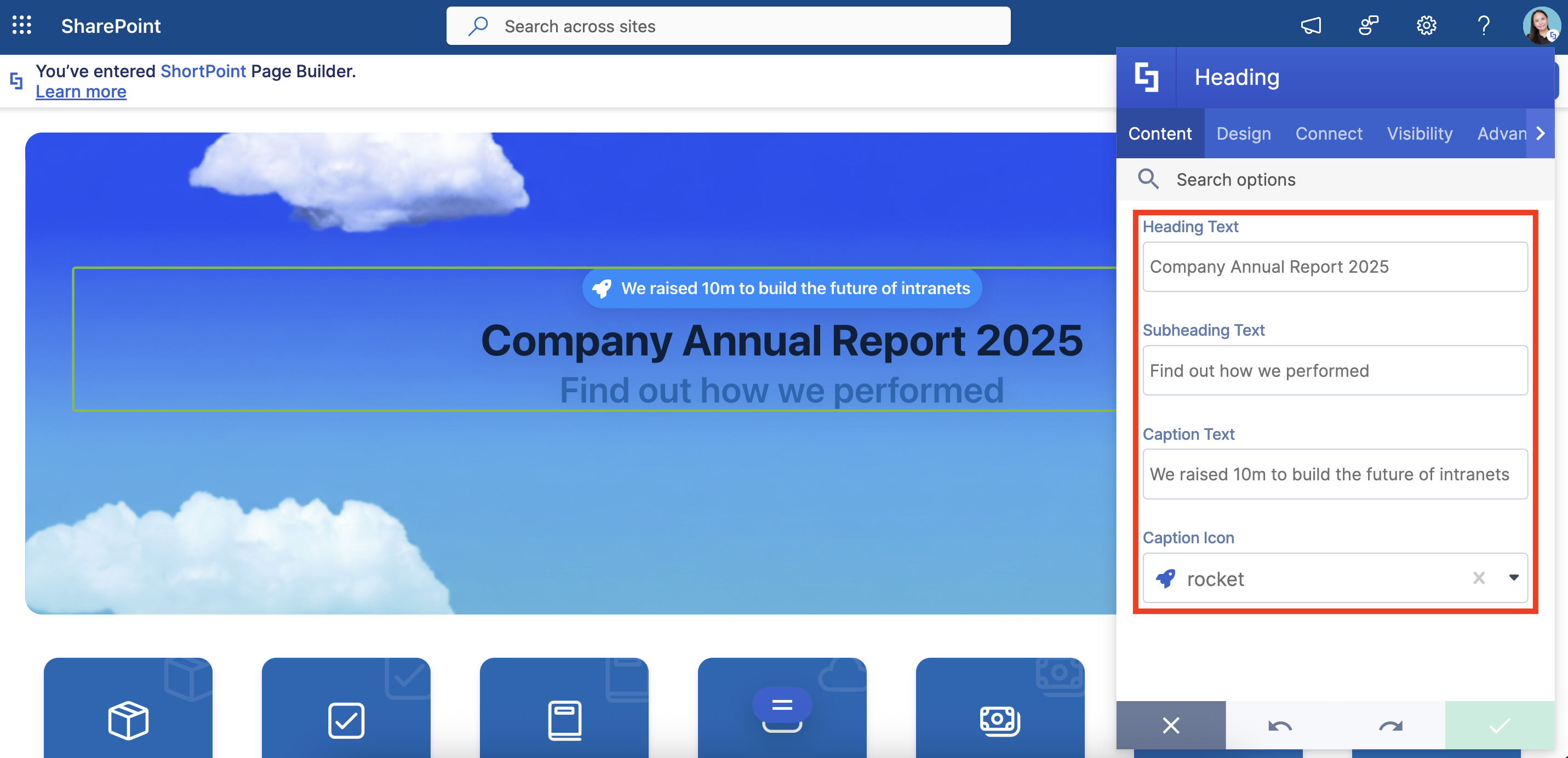
The Content tab is where you can edit the content inside the Heading Design Element. Here are the options you can tweak:
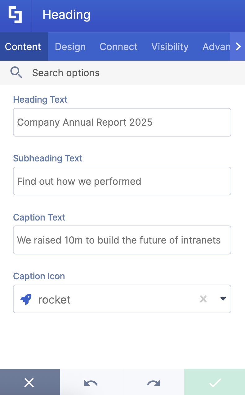
 | Heading Text | allows you to add a title. |
 | Subheading Text | allows you to modify the subtitle. |
 | Caption Text | allows you to write a caption text. |
 | Caption Icon | allows you to choose the icon inside the caption text. |
B. Design Tab
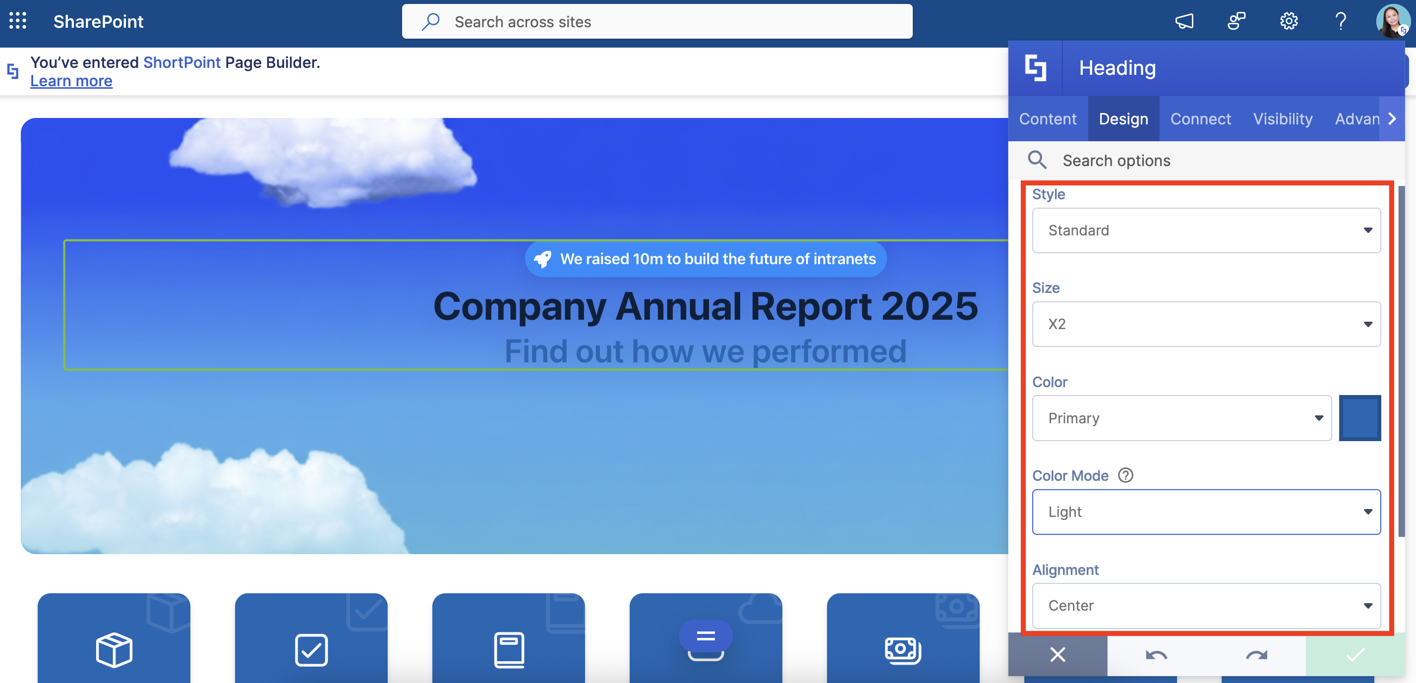
The Design tab is where you get to have fun customizing the look and feel of your SharePoint headers. Here are the options you can modify:
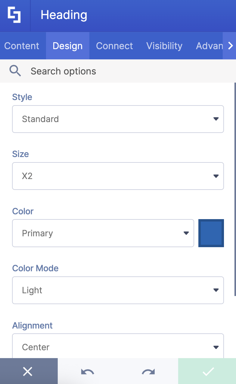
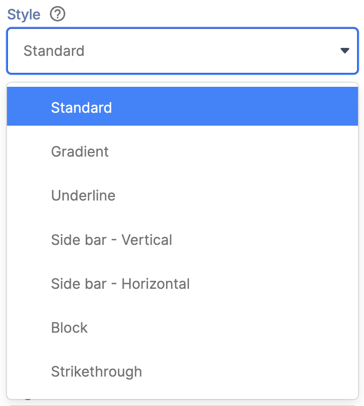 | Style | allows you to choose the heading style you prefer. You can choose from 7 styles. |
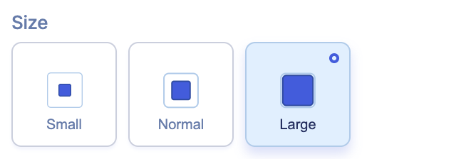 | Size | allows you to adjust the size of the heading. |
 | Color | allows you to change the primary color of the testimonial. You can change the color by [1] typing the HEX code, [2] using the drop-down, or [3] using the color picker. |
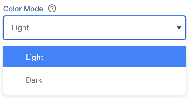 | Color Mode | allows you to choose from light or dark color mode. |
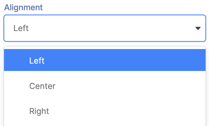 | Alignment | allows you to modify the alignment of the heading. You can choose from Left, Right, or Center. |
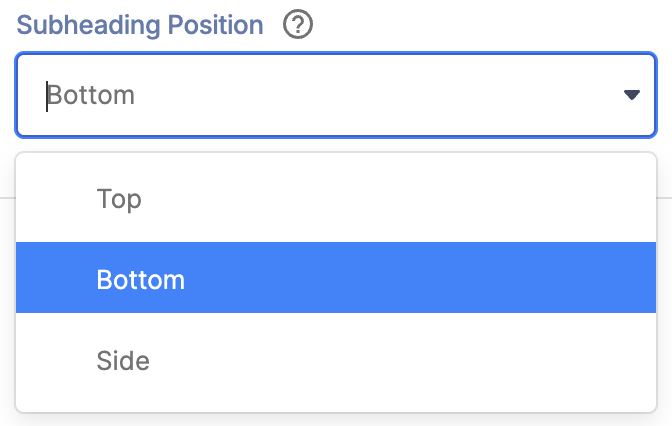 | Subheading position | allows you to specify the location of the subheading. You can choose from Top, Bottom, or Side. |
SHADOWS
 | Shadow Enabled | when enabled, this will add a shadow to the heading. |
 | Vertical Distance | allows you to modify the vertical distance value of the shadow. This option is only available when Shadow Enabled is turned on. |
 | Horizontal Distance | allows you to modify the horizontal distance value of the shadow. This option is only available when Shadow Enabled is turned on. |
 | Blur | allows you to add and control the blur effect for the shadow. This option is only available when Shadow Enabled is turned on. |
 | Color | allows you to choose the color of the shadow. You can change the color by [1] typing the HEX code, [2] using the drop-down, or [3] using the color picker. This option is only available when Shadow Enabled is turned on. |
C. Connect Tab
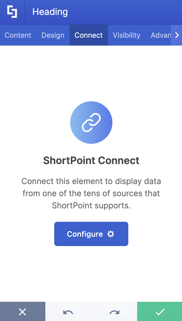
The Connect tab allows you to link the Design Element to SharePoint sources (List, Document Library, News, etc.) and other external sources (Microsoft Graph API, Teams, Outlook, etc.). For more details about ShortPoint Connect, check out Basic Tutorial: How to Establish Seamless SharePoint Connection with ShortPoint Connect.
D. Visibility Tab
The Visibility tab allows you to specify who can see the Design Element and what type of devices it can be shown on. For more details, check out How to Use the ShortPoint Visibility Feature for Effective SharePoint Access Management.
E. Advanced Tab
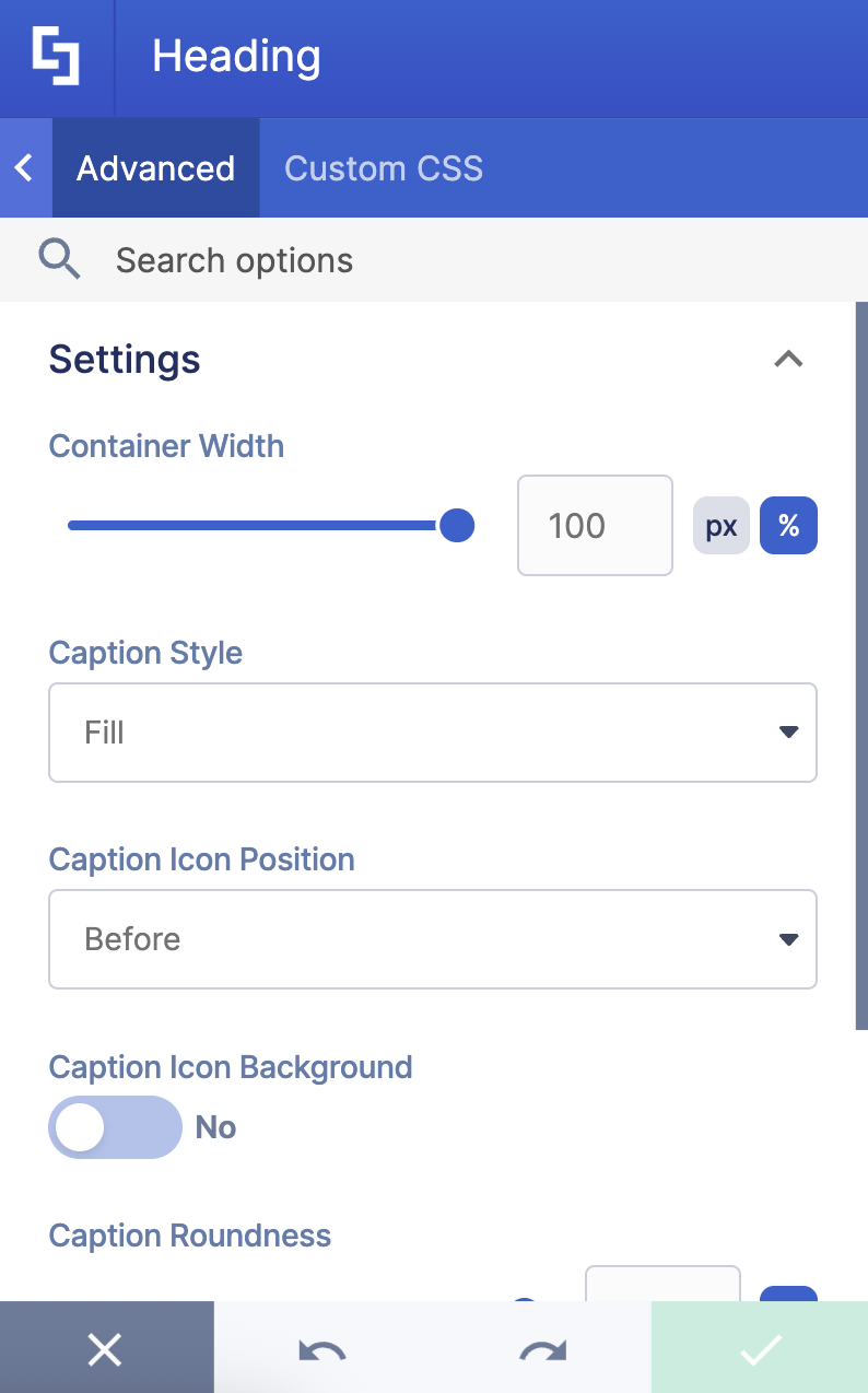
The Advanced tab allows you to further customize the appearance of the SharePoint headers. Below are the options you can modify:
SETTINGS
 | Container Width | allows you to control the size of the container in px or %. |
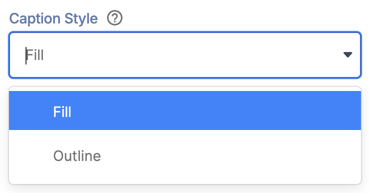 | Caption Style | allows you to choose the style of the caption text. You can choose from Fill or Outline. |
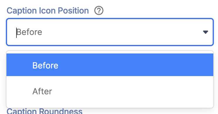 | Caption Icon position | allows you to adjust the location of the icon. |
 | Caption Icon background | when enabled, the icon will have a background. |
 | Caption Roundness | allows you to adjust the roundness value of the icon. This option is only available when Icon background is enabled. |
SPACING
 | Margin Top | allows you to adjust the top margin of the Heading. |
 | Margin Bottom | allows you to adjust the bottom margin of the Heading. |
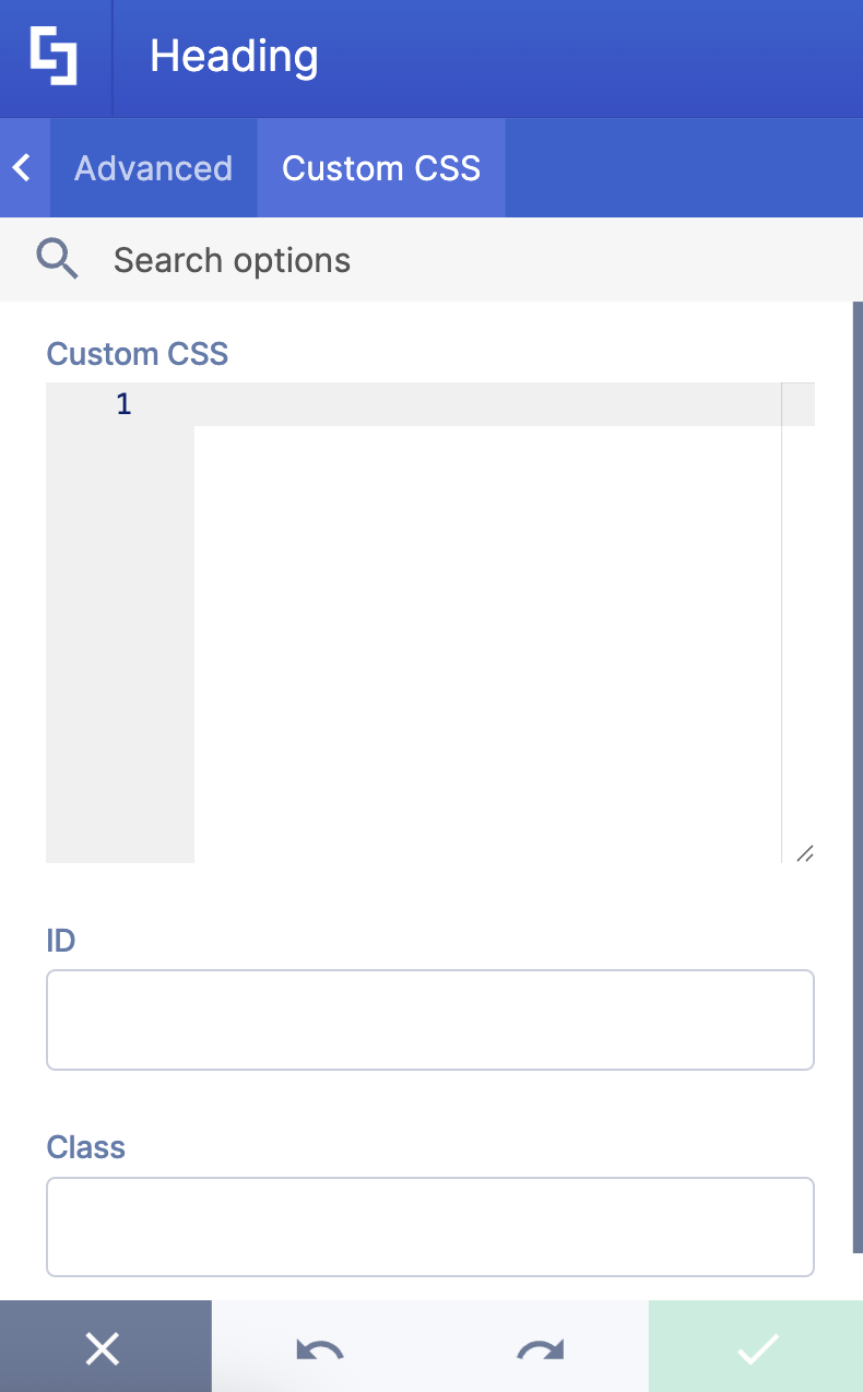
F. Custom CSS Tab
This tab lets you add your own custom touch to the Heading Design Element using custom CSS, HTML, and JavaScript. This gives site owners and designers greater control over how the SharePoint site headers will look.
NOTECheck out our support article on How to Insert Custom CSS into a Page Builder Element? (Basic Tutorial) to know more about Custom CSS.
Practical Use Cases for the Heading Design Element
The Heading Design Element is a versatile tool that can help you enhance your SharePoint site and create a more engaging, on-brand experience. Here are some practical ways you can put it to work:
- Homepage Banners: Create welcoming site headers that greet visitors with your site title, tagline, or mission statement. It's a great way to establish your organization's brand identity from the moment someone lands on your page.
- Team or Department Pages: Customize SharePoint headers to visually distinguish different teams or departments across your intranet. This makes it easier for people to navigate and adds a polished, professional touch to your internal communications.
- Event Announcements: Draw attention to upcoming events or important updates with eye-catching headings, subtitles, and captions. With full control over predefined font families, colors, and alignment, you can make sure your message is both clear and visually appealing.
- Project Pages: Display project names, statuses, or key information prominently at the top of your project pages. This helps team members quickly find what they need and stay oriented.
- Brand Consistency: Use the design tab to align your headings with your site theme and brand colors. This keeps everything looking cohesive throughout your SharePoint site, which really improves the experience for both site owners and site viewers.
These are just a few examples of how the Heading Design Element can help you build attractive SharePoint headers that support your communication goals and make your site easier to navigate.
Frequently Asked Questions
What are ShortPoint Design Elements?
ShortPoint Design Elements are pre-built, customizable content that ShortPoint Designers can insert into SharePoint pages using the ShortPoint Page Builder. This allows advanced design, layout, and functionality without writing any code. There are over 60 Design Elements to choose from, including News Cards, Accordions, Quick Links, Buttons, and so much more.
Can I connect Design Elements to SharePoint data?
Yes, absolutely! ShortPoint Connect allows you to link various Design Elements to multiple data sources, including SharePoint Lists and Libraries, SharePoint Search, or the Microsoft Graph API. By using ShortPoint Connect, the Design Element automatically pulls, formats, and updates content from the specified source, ensuring your pages are dynamic, relevant, and synchronized with your organizational data.
Can I control who sees the Heading Design Element?
Yes, you can control the visibility of the Heading Design Element using the Visibility tab. This allows you to specify exactly which people, groups (including AD/O365 groups), and even which devices (desktop, tablet, or mobile) are able to view the element. This powerful feature is crucial for creating personalized user experiences, ensuring that specific, relevant content is displayed only to the intended audience based on their identity or the device they are using.
Related articles:
- How to Place SharePoint Buttons Next to Each Other Using the Dual Button Design Element
- How to Create a SharePoint Hero Section Using the Hero Caption Design Element
- How to Highlight Words in SharePoint Using the Highlighted Text Design Element
- How to Create a Spinning Text Effect in SharePoint Using the Rotating Text Design Element
- How to Add Lottie Animation in SharePoint Using the Lottie Design Element
How to Create a Timeline in SharePoint Sites Using the Timeline Design Element
 Try ShortPoint now