 Try ShortPoint now
This article will showcase how to add news in SharePoint using the News Cards Design Element.

NOTEThe News Cards Design Element is currently not available for SharePoint classic pages. To use it, you can switch to SharePoint modern pages. TABLE OF CONTENTS
- Prerequisites
- What Is News Cards?
- Video Tutorial
- Interactive Tutorial
- Step-by-step Tutorial
- News Cards Features
Prerequisites
- You must have the ShortPoint SPFx version 8.6.2.0 or later installed in your SharePoint environment.
- You must be a ShortPoint Designer with an active license.
What Is News Cards?
The News Cards Design Element is a fantastic new feature in ShortPoint's Design Element library (available from ShortPoint SPFx version 8.6.2.0 and up)! These sleek content containers make it super easy to display your SharePoint Online news in gorgeous, attention-grabbing boxes that look great and work even better.

The best part? News Cards are incredibly flexible! You can customize what goes inside each card to fit exactly what you need.

And here's the cherry on top: you're in the driver's seat when it comes to design. Tweak colors, play with styles, and adjust layouts until everything looks absolutely perfect with your page's vibe

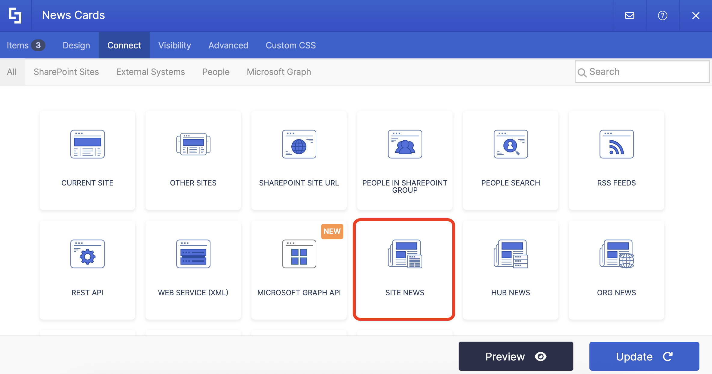
Want to add more news? You can use ShortPoint Connect to display dynamic news content on your SharePoint page. All you have to do is use the Site News connection type. To learn more about this, check out Connection Type: Site News.
Video Tutorial
Watch the video below for a quick guide on how to use News Cards:
Interactive Tutorial
Start the interactive tutorial to learn how to add news in SharePoint:
NOTETo learn more about the features you can customize for News Cards, check out News Cards Features.
Step-by-step Tutorial
Follow the detailed guide below to start using News Cards:
Step 1: Edit the ShortPoint Web Part
- Go to the SharePoint page you want to use and click Edit.

- Close the Toolbox:

- Click the Edit properties icon:

Step 2: Insert the News Cards Design Element
- Choose where you want to add the News Cards and click the plus icon:

- Use the search box to look for News Cards and click it:

Step 3: Edit content
- Go to the Items tab.
- Select the cogwheel icon:

- Customize the content according to your preferences.
- Click the back icon:

- Repeat the same steps if you need to add more items.
NOTEYou can also connect the News Cards to external or internal sources to create dynamic content. To learn how, check out ShortPoint Connect: Basic Tutorial.
Step 4: Customize the Design
- Go to the Design tab.
- Customize the look of the News Cards according to your preferences.
- Once satisfied, click the green check mark.
NOTETo learn more about the features you can customize for News Cards, check out News Cards Features.
Step 5: Save
- Click the eye icon to see your page in real-time:

- Save your changes:

That's it! You can display the latest news in SharePoint. Your users now have easy access to all your SharePoint Online news.
News Cards Features
Below are the options you can find in the News Cards Settings window
A. Items Tab
The Items tab allows you to add new items and organize the content inside the News Cards. It has the following options:

 | Add New | allows you to add a new item. |
 | Drag icon | allows you to rearrange the items. |
 | Duplicate icon | allows you to copy an item. |
 | Cogwheel icon | allows you to edit the content of an item. See the table below to see the options you can find inside. |
 | Trash icon | allows you to remove an item. |
COGWHEEL ICON OPTIONS
 | Author | allows you to add the author of the news. |
 | Date | allows you to add the date the news was published. |
 | Title | allows you to add a title. |
 | Image URL | allows you to add an image to display. You can write the URL or use the file icon to do so. |
 | Image Horizontal Position | allows you to adjust the horizontal position of an image. You can choose from Left, Center, or Right. |
 | Image Vertical Position | allows you to adjust the vertical position of an image. You can choose from Top, Center, or Bottom. |
 | Link Text | allows you to modify the text for the link. |
 | Link | allows you to modify the link of the news. |
 | Linking Option | allows you to specify how the link will be opened. You can choose from the following:
|
B. Design Tab
The Design tab allows you to customize how the News Cards will look. It has the following options:

 | Style | allows you to choose the style of the News Cards. |
 | Size | allows you to choose the size of the News Cards. You can choose from Small, Medium, or Large. |
 | Color | allows you to modify the primary color of the Icon Boxes. You can change the color by [1] adding a hex code, [2] using the drop-down, or [3] using the color picker. |
 | Color Mode | allows you to choose from Light or Dark color mode. |
 | Items Per Row | allows you to adjust the number of items to be shown per row. |
C. Toolbar tab
The Toolbar tab allows you to add Smart Toolbar widgets. These Smart Toolbar widgets can help you search, sort, or filter data in your News Cards:
NOTEThe Toolbar tab is only available for SportPoint SPFx version 8.5.0.0 or later. For more information on the Toolbar tab, check out Getting Started: The Basics of the Smart Toolbar.

D. Metadata tab
This allows you to add metadata tags to organize and categorize your content. You can then filter, search, and group items using these custom labels in the Search & Filter Toolbar. For more details, check out How to Add SharePoint Metadata Tags to Organize Content.

E. Connect Tab
The Connect tab allows you to link the Design Element to SharePoint sources (List, Document Library, News, etc.) and other external sources (Microsoft Graph API, Teams, Outlook, etc.). For more details about ShortPoint Connect, check out Basic Tutorial: How to Establish Seamless SharePoint Connection with ShortPoint Connect.

F. Visibility Tab
The Visibility tab allows you to specify who can see the Design Element and what type of devices it can be shown on. For more details, check out How to Use the ShortPoint Visibility Feature for Effective SharePoint Access Management.

G. Advanced Tab
The Advanced tab allows you to customize the design of the News Cards Design Element even further. It has the following options:

SPACING
 | Margin Top | allows you to adjust the top margin value in px, %, or em. |
 | Margin Right | allows you to adjust the right margin value in px, %, or em. |
 | Margin Bottom | allows you to adjust the bottom margin value in px, %, or em. |
 | Margin Left | allows you to adjust the left margin value in px, %, or em. |
SETTINGS
 | Container Width | allows you to adjust the width of the container. |
 | Space Between Items | allows you to adjust the spacing between items. |
H. Custom CSS Tab
This tab allows you to use your own CSS, HTML, and JavaScript code to customize the News Cards Design Element.
NOTECheck out our support article on How to Insert Custom CSS into a Page Builder Element? (Basic Tutorial) to know more about Custom CSS.

Related articles:
