 Try ShortPoint now
This article will demonstrate how to add image to SharePoint page using the Image Boxes Design Element. Plus, you'll gain insights into all its functions and features.

NOTEThe Image Boxes Design Element is currently not available for SharePoint classic pages. To use it, you can switch to SharePoint modern pages. TABLE OF CONTENTS
- Prerequisites
- What Is an Image Box?
- Video Tutorial
- Interactive Tutorial
- Step-by-step Tutorial
- Image Boxes Features
Prerequisites
- You must have the ShortPoint SPFx version 8.6.2.0 or later installed in your SharePoint environment.
- You must be a ShortPoint Designer with an active license.
What Is an Image Box?
The Image Boxes Design Element is one of the newest additions to ShortPoint's Design Elements library. Available in ShortPoint SPFx version 8.6.2.0 and up, these handy content containers make it easy to display your information alongside stunning SharePoint Online images. You'll love how these beautifully crafted boxes grab attention while keeping everything organized and user-friendly.

Image Boxes offer incredible flexibility when it comes to your content. You can effortlessly tailor the content in each box to fit exactly what you need, offering endless possibilities.

The best part? You can add as many Image Boxes as you want! This makes it super easy to create those engaging, well-organized layouts that really make your content pop and grab your visitors' attention.

And here's another great feature: you're completely in the driver's seat when it comes to design! You can play around with colors, experiment with different styles, and adjust layouts until everything looks absolutely perfect with your page's overall vibe.

Video Tutorial
Watch the video below for a quick guide on how to use Image Boxes:
Interactive Tutorial
Start the interactive tutorial to learn how to add image to SharePoint page:
NOTETo learn more about the features you can customize for Image Boxes, check out Image Boxes Features.
Step-by-step Tutorial
Follow the detailed guide below to start using Image Boxes:
Step 1: Edit the ShortPoint Web Part
- Go to the SharePoint page you want to use and click Edit.

- Close the Toolbox:

- Click the Edit properties icon:

Step 2: Insert the Image Boxes Design Element
- Choose where you want to add the Image Boxes and click the plus icon:

- Use the search box to look for Image Boxes and click it:

Step 3: Edit content
- Go to the Items tab.
- Select the cogwheel icon:

- Customize the content according to your preferences.
- Click the back icon:

- Repeat the same steps for the other items.
NOTEYou can also connect the Image Boxes to external or internal sources to create dynamic content. To learn how, check out ShortPoint Connect: Basic Tutorial.
Step 4: Customize the Design
- Go to the Design tab.
- Customize the look of the Image Boxes according to your preferences.
- Go to the Advanced tab.
- Moodify the design even further.
- Once satisfied, click the green check mark.
NOTETo learn more about the features you can customize for Image Boxes, check out Image Boxes Features.
Step 5: Save
- Click the eye icon to see your page in real-time:

- Save your changes:

That's it! You now know how to add image to SharePoint page. Your users will surely love browsing through your SharePoint Online images.
Image Boxes Features
Below are the options you can find in the Image Boxes Settings window
A. Items Tab
The Items tab allows you to add new items and organize the content inside the Image Boxes. It has the following options:

 | Add New | allows you to add a new item. |
 | Drag icon | allows you to rearrange the items. |
 | Duplicate icon | allows you to copy an item. |
 | Cogwheel icon | allows you to edit the content of an item. See the table below to see the options you can find inside. |
 | Trash icon | allows you to remove an item. |
COGWHEEL ICON OPTIONS
 | Title | allows you to add a title. |
 | Image URL | allows you to choose an image to display. To add an image, you can paste the URL of the image or click the folder icon. |
 | Image Horizontal Position | allows you to change the horizontal position of the image. |
 | Image Vertical Position | allows you to change the vertical position of the image. |
 | Description | allows you to add a description. |
 | Link Label | allows you to modify the link label. By default, it is set to 'Learn More'. |
 | Link | allows you to add a clickable link. |
 | Linking Option | allows you to specify how the link will be opened. You can choose from the following:
|
B. Design Tab
The Design tab allows you to customize how the Image Boxes will look. It has the following options:

 | Style | allows you to choose the style of the Image Boxes. |
 | Color | allows you to modify the primary color of the Image Boxes. You can change the color by [1] adding a hex code, [2] using the drop-down, or [3] using the color picker. |
 | Color Mode | allows you to choose from dark or light color mode. |
 | Apply Random Colors | when applied, random colors will be applied for each Image Box. |
 | Content Alignment | allows you to change the alignment of the content. You can choose from Left, Center, or Right. |
 | Image Height | allows you to customize the height of the images. |
 | Items Per Row | allows you to specify the number of Image Boxes to be shown per row. |
C. Connect Tab
The Connect tab allows you to link the Design Element to SharePoint sources (List, Document Library, News, etc.) and other external sources (Microsoft Graph API, Teams, Outlook, etc.). For more details about ShortPoint Connect, check out Basic Tutorial: How to Establish Seamless SharePoint Connection with ShortPoint Connect.

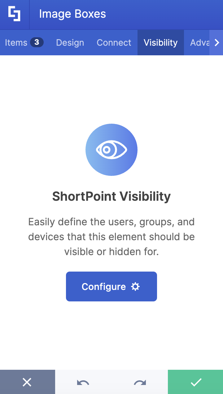
D. Visibility Tab
The Visibility tab allows you to specify who can see the Design Element and what type of devices it can be shown on. For more details, check out How to Use the ShortPoint Visibility Feature for Effective SharePoint Access Management.
E. Advanced Tab
The Advanced tab allows you to customize the design of the Image Boxes Design Element even more. It has the following options:

SETTINGS
 | Container Width | allows you to adjust the width of the container. |
SPACING
 | Margin Top | allows you to adjust the top margin value in px, %, or em. |
 | Margin Right | allows you to adjust the right margin value in px, %, or em. |
 | Margin Bottom | allows you to adjust the bottom margin value in px, %, or em. |
 | Margin Left | allows you to adjust the left margin value in px, %, or em. |
CONTENT
 | Link Label | allows you to modify the link label. By default, it is set to 'Learn More'. |
 | Title Size | allows you to modify the size of the title. |
 | Description Size | allows you to change the size of the description. |
 | Link Size | allows you to modify the size of the link label. |
BACKGROUND SETTINGS
 | Background Color | allows you to modify the background color of the Image Boxes. You can change the color by [1] adding a hex code, [2] using the drop-down, or [3] using the color picker. |
 | Roundness | allows you to adjust the roundness of the Image Boxes' corners. |
COLOR
 | Description Color | allows you to modify the description color of the Image Boxes. You can change the color by [1] adding a hex code, [2] using the drop-down, or [3] using the color picker. |
 | Link Color | allows you to modify the link color of the Image Boxes. You can change the color by [1] adding a hex code, [2] using the drop-down, or [3] using the color picker. |
F. Custom CSS Tab
This tab allows you to use your own CSS, HTML, and JavaScript code to customize the Image Boxes Design Element.
NOTECheck out our support article on How to Insert Custom CSS into a Page Builder Element? (Basic Tutorial) to know more about Custom CSS.

Related articles:
