 Try ShortPoint now
This article will show you how to add SharePoint Online icons using the Icon Boxes Design Element. Follow the steps below to start adding Microsoft SharePoint icons.

NOTEThe Icon Boxes Design Element is currently not available for SharePoint classic pages. To use it, you can switch to SharePoint modern pages. TABLE OF CONTENTS
- Prerequisites
- What Is an Icon Box?
- Video Tutorial
- Interactive Tutorial
- Step-by-step Tutorial
- Icon Boxes Features
Prerequisites
- You must have the ShortPoint SPFx version 8.6.2.0 or later installed in your SharePoint environment.
- You must be a ShortPoint Designer with an active license.
What Is an Icon Box?
The Icon Boxes Design Element is a new and exciting addition to ShortPoint's library of Design Elements, starting from ShortPoint SPFx version 8.6.2.0 or later. These versatile content containers let you showcase Microsoft SharePoint icons with informative content, allowing you to display information in beautifully designed boxes that are both eye-catching and functional.

What makes Icon Boxes truly special is its flexibility. You can easily customize the content inside each box to match your needs, whether you're highlighting company goals, key features, or displaying team information.

To top it off, you can add as many items as you want, creating engaging, organized layouts that help your content shine.

Plus, you have complete control over the design, allowing you to adjust colors, styles, and layouts to complement your page's look and feel perfectly.

Now, you can easily transform plain text into visually appealing, professional-looking content that your users will love to explore.
Video Tutorial
Watch the video below for a quick guide on how to add Icon Boxes:
Interactive Tutorial
Start the interactive tutorial to learn how to add SharePoint Online icons using the Icon Boxes Design Element:
NOTETo learn more about the features you can customize for Icon Boxes, check out Icon Boxes Features.
Step-by-step Tutorial
Follow the detailed guide below to start using Icon Boxes:
Step 1: Edit the ShortPoint Web Part
- Go to the SharePoint page you want to use and click Edit.

- Close the Toolbox:

- Click the Edit properties icon:

Step 2: Insert the Icon Boxes Design Element
- Choose where you want to add the Icon Boxes and click the plus icon:

- Use the search box to look for Icon Boxes and click it:

Step 3: Edit the content
- Go to the Items tab.
- Select the cogwheel icon:

- Customize the content according to your preferences.
- Click the back icon:

- Repeat the same steps if you need to add more items.
NOTEYou can also connect the Icon Boxes to external or internal sources to create dynamic content. To learn how, check out ShortPoint Connect: Basic Tutorial.
Step 4: Customize the Design
- Go to the Design tab.
- Customize the look of the Icon Boxes according to your preferences.
- Go to the Advanced tab.
- Further modify the look of the Design Element.
- Once satisfied, click the green check mark.
NOTETo learn more about the features you can customize for Icon Boxes, check out Icon Boxes Features.
Step 5: Save
- Click the eye icon to see your page in real-time:

- Save your changes:

That's it! You now know how to add SharePoint Online icons using the Icon Boxes Design Element. Enjoy exploring this Design Element on your own SharePoint pages.
Icon Boxes Features
Below are the options you can find in the Icon Boxes Settings window
A. Items Tab
The Items tab allows you to add new items and organize the content inside the Icon Boxes. It has the following options:

 | Add New | allows you to add a new item. |
 | Drag icon | allows you to rearrange the items. |
 | Duplicate icon | allows you to copy an item. |
 | Cogwheel icon | allows you to edit the content of an item. See the table below to see the options you can find inside. |
 | Trash icon | allows you to remove an item. |
COGWHEEL ICON OPTIONS
 | Icon | allows you to choose the icon to be shown. |
 | Title | allows you to add a title. |
 | Description | allows you to add a description. |
 | Link Label | allows you to modify the link label. By default it is set to 'Learn More'. |
 | Link | allows you to add a clickable link. |
 | Linking Option | allows you to specify how the link will be opened. You can choose from the following:
|
B. Design Tab
The Design tab allows you to customize how the Icon Boxes will look. It has the following options:

COLOR
 | Style | allows you to choose the style of the Icon Boxes. |
 | Color | allows you to modify the primary color of the Icon Boxes. You can change the color by [1] adding a hex code, [2] using the drop-down, or [3] using the color picker. |
 | Color Mode | allows you to choose from Light or Dark color mode. |
 | Apply Random Colors | when enabled, random colors will be applied to each Icon Box. |
 | Items Per Row | allows you to specify the number of items you want to be shown per row. |
 | Content Alignment | allows you to change the alignment of the content. You can choose from Left, Center, or Right. |
C. Toolbar tab
The Toolbar tab allows you to add Smart Toolbar widgets. These Smart Toolbar widgets can help you search, sort, or filter data in your Icon Boxes:
NOTEThe Toolbar tab is only available for SportPoint SPFx version 8.5.0.0 or later. For more information on the Toolbar tab, check out Getting Started: The Basics of the Smart Toolbar.

D. Metadata tab
This allows you to add metadata tags to organize and categorize your content. You can then filter, search, and group items using these custom labels in the Search & Filter Toolbar. For more details, check out How to Add SharePoint Metadata Tags to Organize Content.

E. Connect Tab
The Connect tab allows you to link the Design Element to SharePoint sources (List, Document Library, News, etc.) and other external sources (Microsoft Graph API, Teams, Outlook, etc.). For more details about ShortPoint Connect, check out Basic Tutorial: How to Establish Seamless SharePoint Connection with ShortPoint Connect.

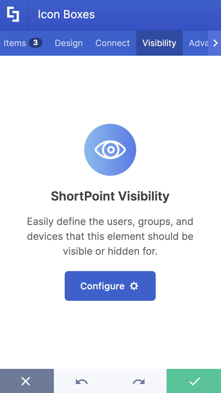
F. Visibility Tab
The Visibility tab allows you to specify who can see the Design Element and what type of devices it can be shown on. For more details, check out How to Use the ShortPoint Visibility Feature for Effective SharePoint Access Management.
G. Advanced Tab
The Advanced tab allows you to customize further the look of the Icon Boxes Design Element. It has the following options:

SPACING
 | Margin Top | allows you to adjust the top margin value in px, %, or em. |
 | Margin Right | allows you to adjust the right margin value in px, %, or em. |
 | Margin Bottom | allows you to adjust the bottom margin value in px, %, or em. |
 | Margin Left | allows you to adjust the left margin value in px, %, or em. |
SETTINGS
 | Container Width | allows you to adjust the size of the container. |
 | Description Color | allows you to modify the description color of the Icon Boxes. You can change the color by [1] adding a hex code, [2] using the drop-down, or [3] using the color picker. |
 | Link Color | allows you to modify the link color of the Icon Boxes. You can change the color by [1] adding a hex code, [2] using the drop-down, or [3] using the color picker. |
 | Icon Color | allows you to modify the icon color of the Icon Boxes. You can change the color by [1] adding a hex code, [2] using the drop-down, or [3] using the color picker. |
CONTENT
 | Title Size | allows you to modify the size of the title. |
 | Description Size | allows you to change the size of the description. |
 | Link Size | allows you to modify the size of the link label. |
BACKGROUND SETTINGS
 | Background Color | allows you to modify the background color of the Icon Boxes. You can change the color by [1] adding a hex code, [2] using the drop-down, or [3] using the color picker. |
 | Roundness | allows you to adjust the roundness of the Icon Boxes' corners. |
 | Icon Background Color | allows you to modify the icon background color. You can change the color by [1] adding a hex code, [2] using the drop-down, or [3] using the color picker. |
 | Icon Background Roundness | allows you to adjust the roundness value of the icon background. |
H. Custom CSS Tab
This tab allows you to use your own CSS, HTML, and JavaScript code to customize the Icon Boxes Design Element.
NOTECheck out our support article on How to Insert Custom CSS into a Page Builder Element? (Basic Tutorial) to know more about Custom CSS.

Related articles:
- How to Customize the Abbreviation Design Element
- How to Customize the Lead Design Element
- How to Customize the Small Design Element
- How to Customize the Search Box Design Element
- How to Customize the Image Boxes Design Element
