 Try ShortPoint now
When a user lands on your SharePoint page, you have only a few seconds to grab their attention before they decide whether to read on or move elsewhere. While high-quality images and sleek layouts help, sometimes the most impactful changes come from classic typography.
This is where the ShortPoint Dropcap Design Element comes in! It is a simple yet powerful tool designed to give your intranet pages a touch of sophistication and visual flair. This article will walk you through everything you need to know about Dropcap, including what it is, how to use it, and how to make the most out of it.

TABLE OF CONTENTS
- Prerequisite
- What is the ShortPoint Dropcap?
- Interactive Tutorial
- Step-by-step Tutorial
- Dropcap Features
- 4 Practical Use Cases for Dropcaps
- Start Designing with the Dropcap Design Element
- Frequently Asked Questions
Prerequisite
- You have the latest version of ShortPoint SPFx installed on your SharePoint environment.
- You are a ShortPoint Designer with an active license.
What is the ShortPoint Dropcap?
At its core, a drop cap letter is a large capital letter used as a decorative element at the beginning of the first paragraph or section. This design choice serves a dual purpose: it marks the beginning of a new section or topic and guides readers through the text block.
ShortPoint brings this classic initial cap aesthetic to SharePoint without requiring a single line of code. Through the Page Builder or the Rich Text Editor, you can instantly create drop caps that transform a standard block of text into professionally styled content. You can customize the color, toggle between a standard or "solid" (background-filled) style, and even apply custom CSS if you want to push the boundaries of your branding.
Interactive Tutorial
Start the interactive tutorial to learn how to customize the Dropcap Design Element:
NOTECheck out Dropcap Features to learn more about customizable features.
Step-by-step Tutorial
Follow the option that best corresponds to your needs:
Option 1: Using the Page Builder
ShortPoint has a library of Design Elements that ShortPoint Designers can add to their page. Follow along to learn how to insert the Dropcap Design Element using this option:
Step 1: Edit the ShortPoint Web Part
- Go to the SharePoint page you want to use and click Edit.

- Click the ShortPoint tag.
- Select the pencil icon.
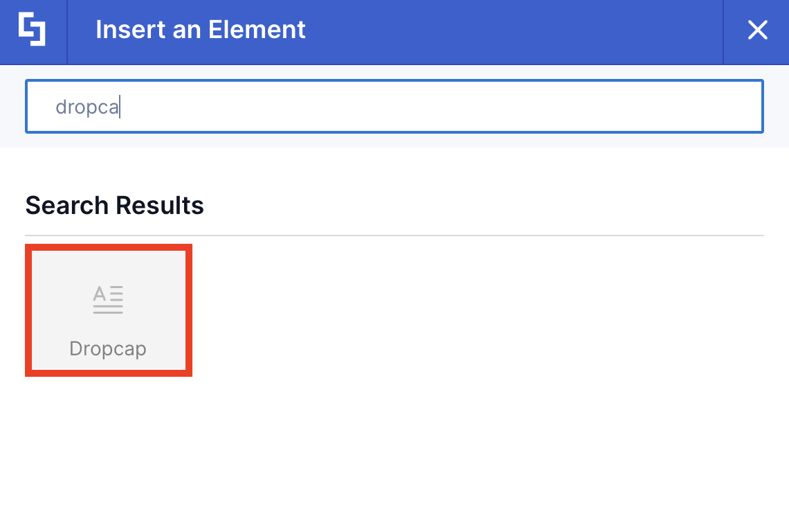
Step 2: Insert the Dropcap Design Element
- Click the plus icon.
- Use the search box to look for Dropcap and click it.
Step 3: Add content
NOTEThe Dropcap Design Element’s main purpose is to place emphasis on the first letter of a sentence or paragraph. In the Dropcap content field, write the first letter of the sentence you want to display. You will then add the rest of the content in Step 5.

- Add a Dropcap content.
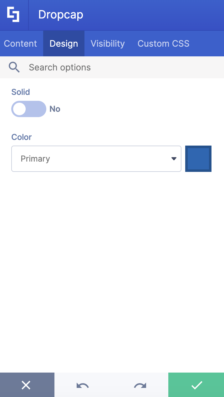
Step 4: Customize the Dropcap’s Design
- Navigate to the Design tab.
- Customize the look of the Dropcap according to your preference.
- Once satisfied, click the green check mark.
NOTECheck out Dropcap Features to learn more about the OOTB options you can customize.
Step 5: Insert the Text Design Element
- Click the plus icon.
- Use the search box to look for Text and click it.
- Add the rest of the content.
- Once done, click the green check mark.
Step 6: Save
- Then, click the eye icon to see your page in real-time.

- Click Save to apply all your changes.

Congratulations! You now have a drop cap letter in SharePoint.
Option 2: Using the Rich Text Editor
Dropcap is an Inline Design Element. This means that you can also insert it into your SharePoint page using the Rich Text Editor. Follow the steps to learn how to access it:
Step 1: Edit the ShortPoint Web Part
- Go to the SharePoint page you want to use and click Edit.

- Click the ShortPoint tag.
- Select the pencil icon.
Step 2: Insert the Dropcap Design Element
NOTEThe Rich Text Editor can be accessed in Design Elements with text editing features. This includes the Text Design Element and content-holder Design Elements like Alert, Tab, Panel, etc.
- Hover over the Text, double-click, and highlight the text you want to turn into a Tooltip.
- Click the ShortPoint icon.

- Select the Show dropcap icon.

Step 3: Customize the Dropcap
- Customize the look of the Dropcap according to your preferences.
- Click Apply.
NOTECheck out Dropcap Features to learn more about the OOTB options you can customize.
Step 4: Save
- Then, click the eye icon to see your page in real-time.

- Click Save to apply all your changes.

That's it! You can now create a drop cap letter in SharePoint. This classic drop capital technique not only adds visual interest but also helps in marking important passages and guiding readers through the first sentence or first word of your text.
Dropcap Features
Below are the options you can find in the Dropcap Settings window and the Rich Text Editor:
Dropcap Settings Window
These are the options you will find if you used Option 1 to add the Dropcap Design Element:
A. Content tab
The Content tab allows you to edit the content inside the Dropcap.

B. Design tab
The Design tab allows you to customize the look of the Dropcap Design Element.

 | Solid | when enabled, the Dropcap will change to Solid style. |
 | Color | allows you to change the color of the Dropcap. You can do so by [1] writing the HEX code, [2] using the drop-down, or [3] using the color picker. |
C. Visibility Tab
The Visibility tab allows you to specify who can see the Design Element and what type of devices it can be shown on. For more details, check out How to Use the ShortPoint Visibility Feature for Effective SharePoint Access Management.

D. Custom CSS Tab
This tab allows you to use your own CSS, HTML, and Javascript code to customize the Dropcap Design Element.
NOTECheck out our support article on How to Insert Custom CSS into a Page Builder Element? (Basic Tutorial) to know more about Custom CSS.

Dropcap Rich Text Editor Options
These are the options you will find if you used Option 2 to add the Dropcap Design Element:

 | Dropcap Content | allows you to modify the content of the Dropcap. |
 | Solid | when enabled, the Dropcap will change to Solid style. |
 | Color | allows you to change the color of the Dropcap. |
4 Practical Use Cases for Dropcaps
How can you use this element effectively on your intranet? Here are four practical ways to implement dropcaps to improve both style and readability:
Executive Announcements and Letters
Internal communications from leadership often need a more formal, "official" feel. Using a dropcap at the start of a CEO’s monthly message or a major company announcement sets a professional tone, making the content feel more like a curated piece.
Onboarding Handbooks and Documentation
Training materials and employee handbooks can often feel dense and overwhelming. By using dropcaps to signify the start of a new module or a major policy section, you create a "visual break" that helps employees navigate the information more easily. It guides the eye to exactly where the new thought begins.
Internal Blogs and News Features
If your company has a culture of storytelling, dropcaps are your best friend. They give your internal blog that "magazine look," encouraging employees to slow down and engage with the content rather than just skimming it.
Landing Page Headlines
Sometimes, a landing page needs a little extra "oomph" to stand out. Use a dropcap in your introductory paragraph to create a focal point. Because you can customize the color to match your brand’s palette, it’s an effortless way to ensure your intranet stays on-brand while looking modern and inviting.
Start Designing with the Dropcap Design Element
Great intranet design isn't just about functionality; it's about creating an environment where employees want to spend time. By adding small, thoughtful touches like the ShortPoint drop cap letter, you move away from "just another SharePoint page" and toward a professional, engaging digital workplace with improved readability and visual appeal.
Ready to give it a try? Head over to your Page Builder and follow the steps in this article. New to ShortPoint? Sign up for a FREE 15-day trial or schedule a demo with one of our experts. They'll be able to assist you with all the functions ShortPoint has to offer.
Frequently Asked Questions
Do I need to be a developer to use the Dropcap element?
Not at all! ShortPoint is designed for "Low-Code/No-Code" users. You can insert a dropcap using a simple "point-and-click" interface. If you can edit a Word document, you can use ShortPoint.
Can I change the color of the dropcap to match my company’s branding?
Yes. In the "Design" tab of the element settings, you can choose colors from your theme, use a color picker, or enter a specific HEX code to ensure a perfect brand match.
Will the dropcap look good on mobile devices?
Absolutely. ShortPoint elements are responsive by default. You can also use the "Visibility" tab to control how the element appears on different devices if you want to fine-tune the mobile experience.
What is the "Solid" option in the settings?
The "Solid" toggle changes the dropcap from a standard letter to a letter inside a colored block. This is great for creating a "badge" effect that makes the start of your paragraph even more prominent.
Related articles:
