 Try ShortPoint now
Let’s be honest: nobody likes landing on a SharePoint page only to be greeted by a massive wall of text. When an intranet page is cluttered, important information gets lost, and users quickly lose interest.
If you are looking for a clean, elegant way to organize heavy content without making your users scroll forever, ShortPoint has a fantastic solution: the Toggles Design Element. It allows you to transform messy data into an organized, interactive, and beautifully styled page that users will actually enjoy navigating. This toggle control enhances interactivity and provides clear visual status indicators to improve the SharePoint experience.
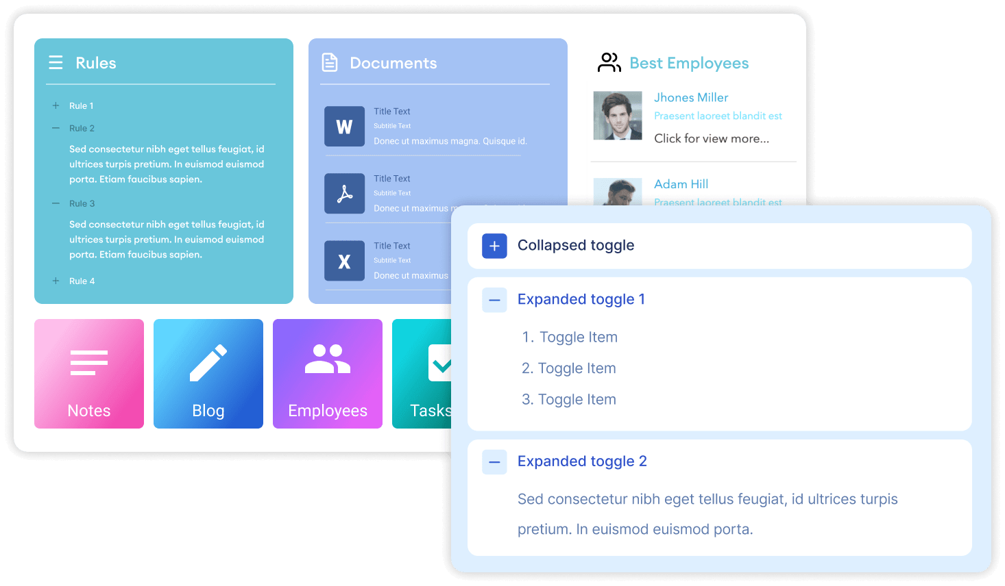
TABLE OF CONTENTS
- Prerequisite
- What is the ShortPoint Toggles Design Element?
- Interactive Tutorial
- Step-by-step Tutorial
- Toggles Features
- Practical Use Cases for Your Intranet
- Start Designing with the Toggles Design Element
- Frequently Asked Questions
Prerequisite
- You have the latest version of ShortPoint SPFx installed on your SharePoint environment.
- You are a ShortPoint Designer with an active license.
What is the ShortPoint Toggles Design Element?
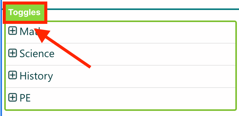
The Toggles Design Element is a ShortPoint Design Element that lets you create collapsible and expandable content sections on your SharePoint interface. Instead of displaying all your text at once, Toggles allow you to hide detailed information under clean, clickable headers. Users can simply click a header to "toggle control" the section open or closed, choosing exactly what they want to read.
What makes ShortPoint’s Toggles unique is their total design flexibility and advanced feature integration. You aren’t restricted to just plain text; Toggles act as content holders. This means you can drop other rich design elements (like images, buttons, lists, or videos) right inside a toggle item. Furthermore, you can customize everything from titles, hover colors, and divider lines to the exact icons used for opening and closing.
For advanced users, it even connects dynamically to your SharePoint lists, document libraries, and so much more.
Interactive Tutorial
Click Get Started to learn how to customize the Toggles Design Element:
NOTECheck out Toggles Features to learn more about the OOTB options you can customize.
Step-by-step Tutorial
Follow the steps below for a detailed guide on how to customize the Toggles Design Element:
Step 1: Edit the ShortPoint Web Part
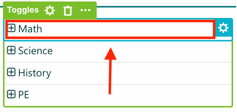
- Go to the SharePoint page you want to use and click Edit.

- Click the ShortPoint tag.
- Select the pencil icon.
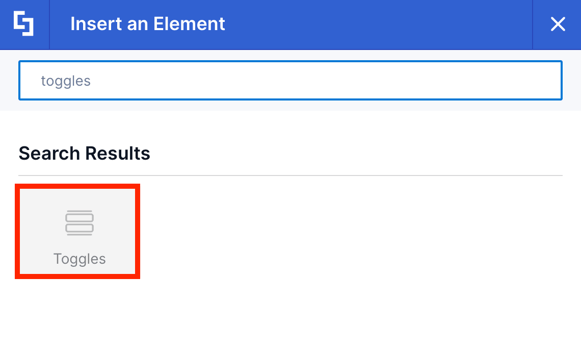
Step 2:Insert the Toggles Design Element
- Click the plus icon.
- Use the search box to look for Toggles and click it.
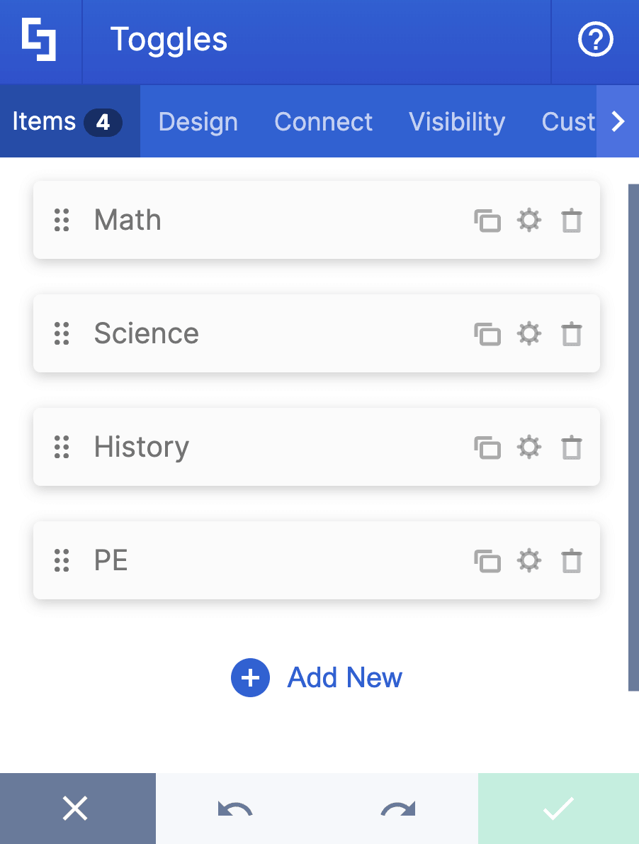
Step 3: Edit the items in the Toggles
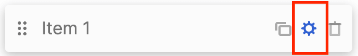
- Navigate to the Items tab.
- Click the cogwheel icon of the first item.
- Add a Title.
- Add Content.
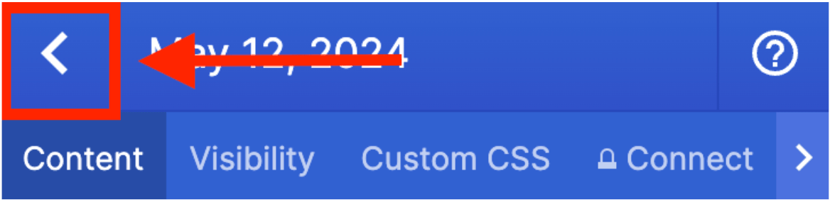
- Click the back icon to edit the other items.
- Repeat the steps above for the other items.
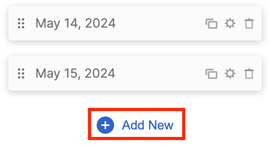
- (Optional) If you want to add another item, click Add New. Then, repeat the same steps above to edit the content of the new item.
NOTEYou can also create dynamic Toggles content. Check out ShortPoint Connect: Basic Tutorial.
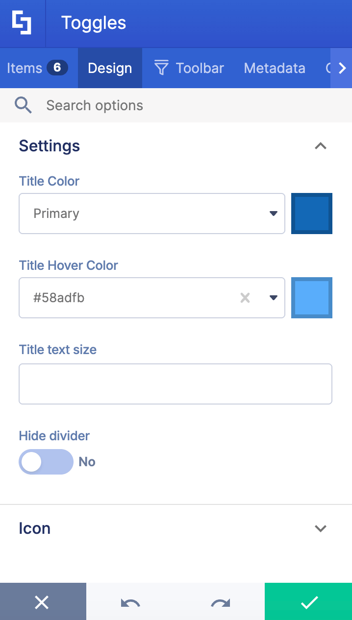
Step 4: Customize the Toggles’ design
- Navigate to the Design tab.
- Customize the Toggles according to your preference.
- Click the green check mark.
NOTECheck out Toggles Features to learn more about the OOTB options you can customize.
Step 5 (Optional): Add Design Element inside Toggles
- Click the Toggles tag.
- Select the item where you want to add content.
- Click the plus icon inside the item.
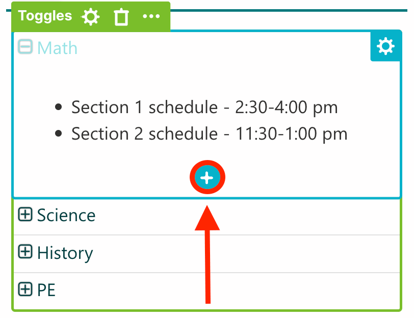
- Use the search bar to look for the Design Element you want to use and click it.
- Customize the selected Design Element according to your preference.
- Once done, click the green check mark.
Step 6: Save
- Then, click the eye icon to see your page in real-time.

- Click Save to apply all your changes.

That's it! You can now add toggle control to your SharePoint sites.
Toggles Features
Below are the options you can find in the Toggles Settings window:
A. Items tab
The Items tab allows you to duplicate, delete, configure content, and add new items. It has the following options:
ITEMS ACTION ICONS
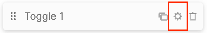 | Cogwheel | opens a new window that allows you to edit the content of each item. See the table below for the cogwheel icon settings. |
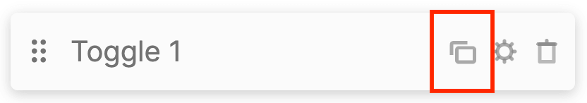 | Duplicate | duplicates the item selected. |
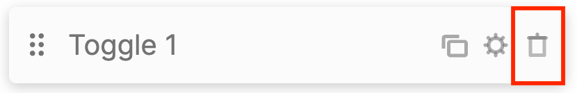 | Trash | deletes the item selected. |
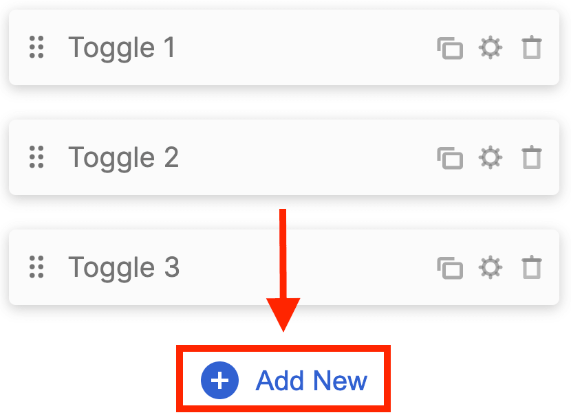 | Add New | adds a new item. |
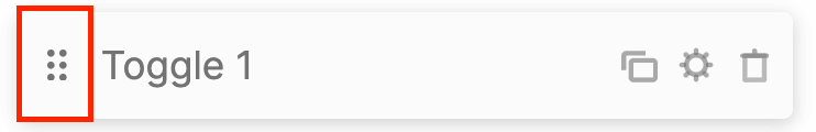 | Drag and Drop | allows you to re-arrange the position of the item. |
COGWHEEL ICON SETTINGS
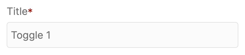 | Title | add item title. |
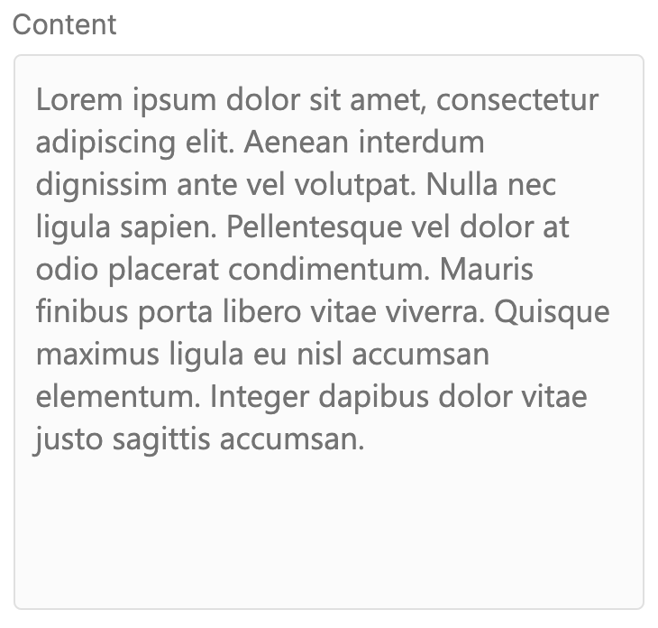 | Content | allows you to add text content inside each toggle. |
B. Design tab
The Design tab allows you to customize the design of the Toggles Design Element. It has the following options:

SETTINGS
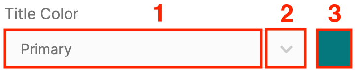 | Title Color | allows you to choose the font color of the Title. You can do so by [1] writing the HEX code, [2] using the drop-down, or [3] using the color picker. |
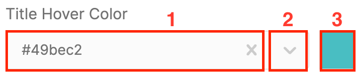 | Title Hover Color | allows you to choose the font color of the Title when a user hovers over it. You can do so by [1] writing the HEX code, [2] using the drop-down, or [3] using the color picker. |
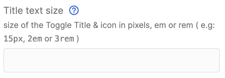 | Title text size | allows you to set the size of the Toggle Title & icon in pixels, em, or rem ( e.g: 15px, 2em, or 3rem). |
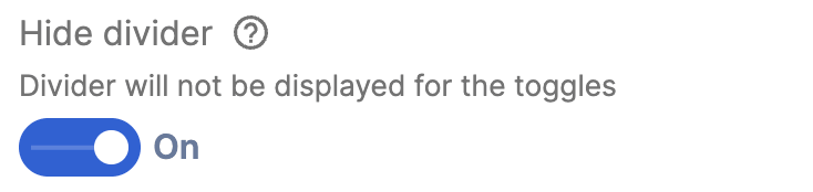 | Hide divider | when enabled, the divider will be hidden. |
ICON
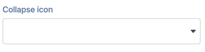 | Collapse icon | allows you to choose the icon to display when the toggle is closed. |
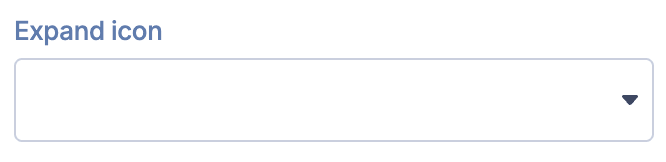 | Expand icon | allows you to choose the icon to display when the toggle is open. |
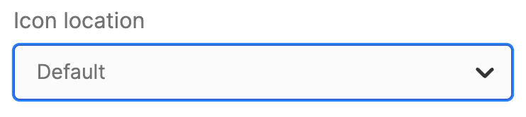 | Icon Location | allows you to choose the location of the icon. You can choose from Left or Right. |
NOTECheck out our Icons page to see all the icons you can add to your SharePoint page.
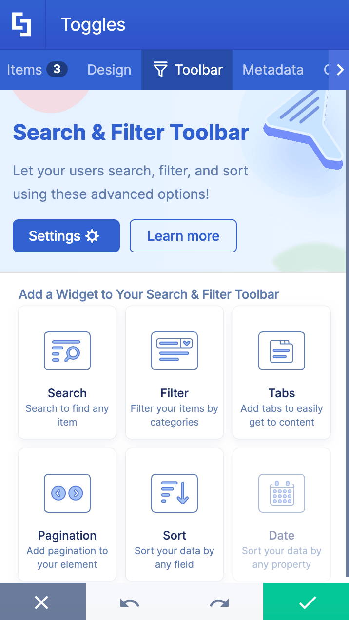
C. Toolbar tab
The Toolbar tab allows you to add Smart Toolbar widgets. These Smart Toolbar widgets can help you search, sort, or filter data in your Toggles:
NOTEThe Toolbar tab is only available for SportPoint SPFx version 8.5.0.0 or later. For more information on the Toolbar tab, check out Getting Started: The Basics of the Smart Toolbar.
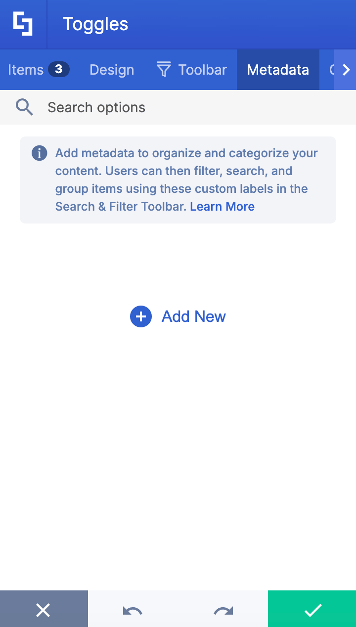
D. Metadata tab
This allows you to add metadata tags to organize and categorize your content. You can then filter, search, and group items using these custom labels in the Search & Filter Toolbar. For more details, check out How to Add SharePoint Metadata Tags to Organize Content.
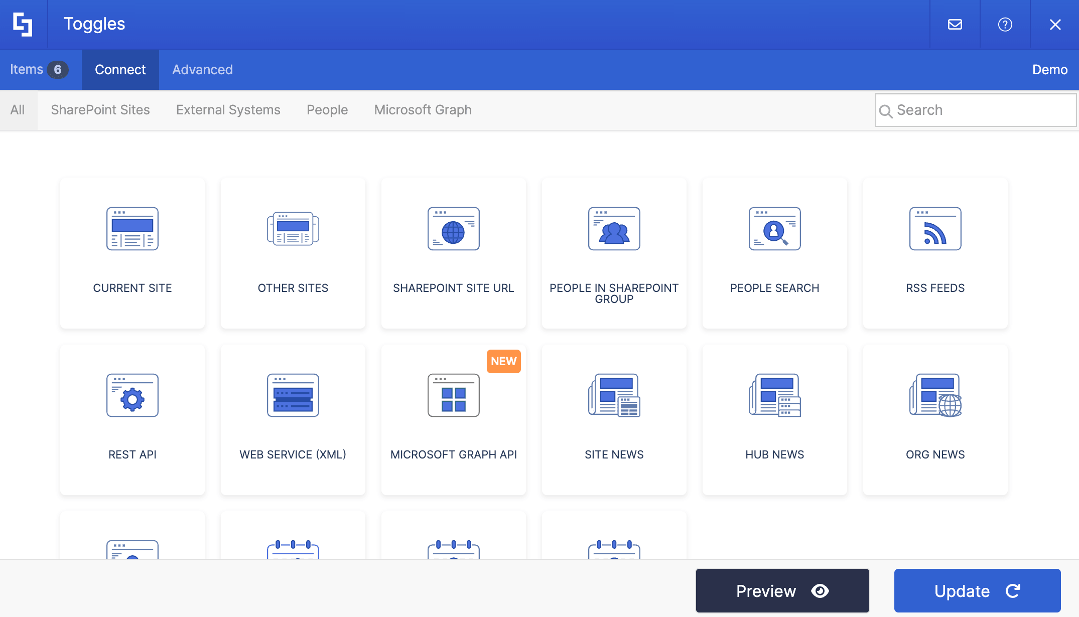
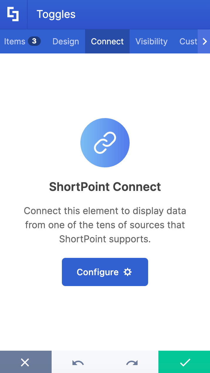
E. Connect Tab
The Connect tab allows you to link the Design Element to SharePoint sources (List, Document Library, News, etc.) and other external sources (Microsoft Graph API, Teams, Outlook, etc.). For more details about ShortPoint Connect, check out Basic Tutorial: How to Establish Seamless SharePoint Connection with ShortPoint Connect.
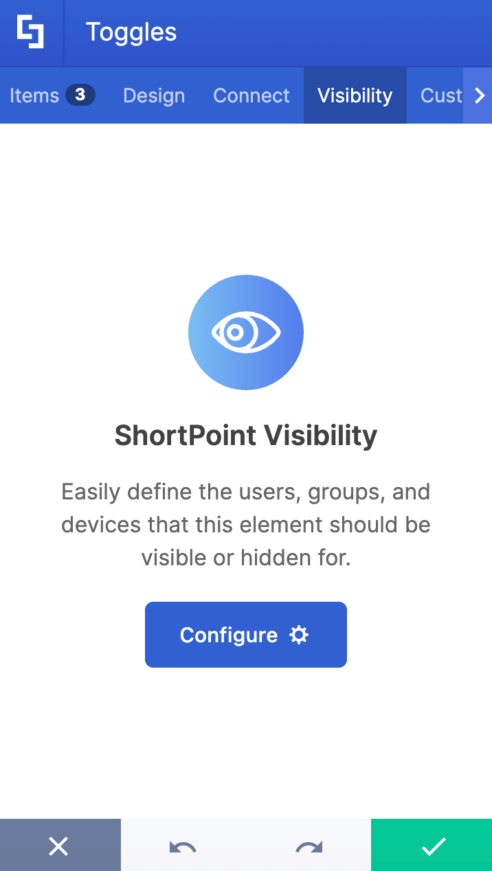
F. Visibility Tab
The Visibility tab allows you to specify who can see the Design Element and what type of devices it can be shown on. For more details, check out How to Use the ShortPoint Visibility Feature for Effective SharePoint Access Management.
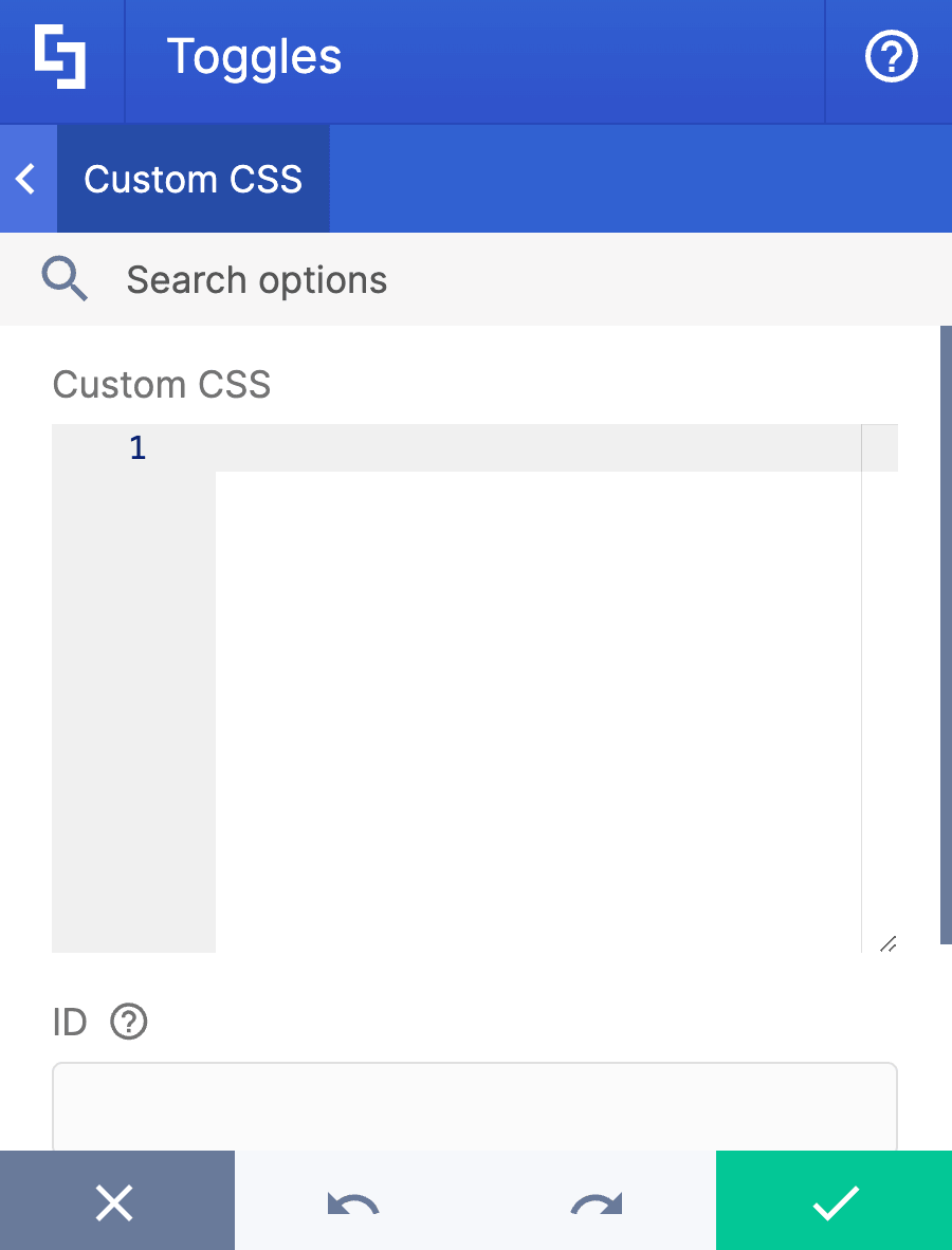
G. Custom CSS Tab
This tab allows you to use your own CSS, HTML, and JavaScript code to customize the Toggles Design Element.
NOTECheck out our support article on How to Insert Custom CSS into a Page Builder Element? (Basic Tutorial) to know more about Custom CSS.
Practical Use Cases for Your Intranet
How can you use Toggles to make your SharePoint site more engaging? Here are four practical, real-world scenarios where the Toggles Design Element shines:
- Frequently Asked Questions (FAQs)
An FAQ page is a staple for any corporate intranet, but a long list of questions and answers can be exhausting to scroll through. By putting your FAQs into Toggles, employees can scan the list of questions rapidly. When they find the question relevant to them, a single click reveals the answer, keeping the rest of the page perfectly neat.
- Policy Manuals and Employee Handbooks
HR pages are notoriously text-heavy. Instead of forcing new hires to scroll through pages of standard operating procedures, parental leave policies, and code of conduct text, organize them by section headings. A "Benefits" toggle can hold health insurance details, while a "Remote Work" toggle houses the equipment policy.
- Software Troubleshooting & IT Guides
Your IT support team likely gets the same technical questions every day. You can build a self-service IT portal using Toggles to break down troubleshooting steps by device or software type (e.g., “How to connect to the office VPN,” “Resetting your Outlook password”). Users can click on their exact issue to reveal step-by-step instructions.
- Project Dashboards and Department Overviews
When sharing updates from different teams or project phases, a single page can get crowded quickly. Toggles allow you to create distinct sections for Phase 1: Planning, Phase 2: Execution, and Phase 3: Review. Team members can effortlessly toggle open the specific phase they are currently collaborating on to view task lists or embedded documents.
Start Designing with the Toggles Design Element
The ShortPoint Toggle Design Element is the perfect way to keep your SharePoint page content clean and engaging. It's the best way to present important information without overwhelming your page viewers.
Already a ShortPoint Designer? Simply follow our interactive tutorial to start adding toggle buttons to your SharePoint sites.
New to ShortPoint? Welcome! We'd be happy to have you with us. You can schedule a one-on-one demo with our experts or get a FREE 15-day trial. Zero commitment required! In no time, you'll be able to get your SharePoint sites up and running with ShortPoint capabilities.
Frequently Asked Questions
Can I add images or buttons inside a Toggle item?
Yes! ShortPoint Toggles are "content-holder" elements. Once you create a toggle item, you can click the plus icon inside it to embed other ShortPoint design elements, such as lists, buttons, or images.
Is it possible to connect Toggles to an external data source?
Absolutely. Through the Connect tab in the settings window, you can seamlessly link your Toggles element to live data sources like SharePoint lists, document libraries, Microsoft Graph API, or Teams. Your toggles will automatically update whenever the source data changes.
Can I change the default '+' and '-' icons to something else?
Yes. Under the Design tab, you have full control over the icons. You can select custom icons for both the "Collapse" (closed) state and the "Expand" (open) state, as well as decide whether the icon sits on the left or the right side of your title.
How do I make one specific toggle item open by default when the page loads?
ShortPoint allows you to configure a default state for your items. Whether you are using static content or dynamically connected data, you can set a designated item to be expanded by default so your audience sees critical information immediately upon landing on the page.
Can I control who sees certain toggle items?
Yes, you can use the Visibility tab. This feature lets you restrict the visibility of the Toggles element based on user permissions or target specific devices (like hiding certain heavy content when a user views the site on a mobile phone).
Related articles:
