 Try ShortPoint now
In this article, we will walk you through how to create buttons in SharePoint 365 using the Button Design Element. At the end, you'll also see a list of all the options you can modify.
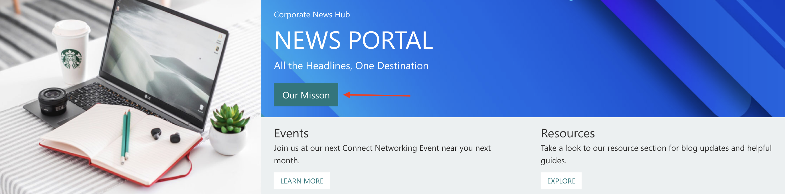
TABLE OF CONTENTS
- Prerequisites
- Interactive Tutorial
- Step-by-step Tutorial
- Button Features
Prerequisites
- You have the latest ShortPoint public version installed for your environment
- You are a ShortPoint Designer with an active license
Interactive Tutorial
Start the interactive tutorial to learn the two ways you can insert the Button Design Element:
NOTECheck out Button Features to learn more about the Button Design Element’s customization options.
Step-by-step Tutorial
There are two ways to insert the Button Design Element. Follow the option that best suits your needs.
Option 1: Using the Library of Design Elements
ShortPoint has a library of Design Elements that ShortPoint Designers can add to their page. Follow along to learn how to insert the Button Design Element using this option:
Step 1: Edit the ShortPoint Web Part
- Go to the SharePoint page you want to use and click Edit:

- Select the ShortPoint tag.
- Select the pencil icon.
Step 2: Insert the Button Design Element
- Click the plus icon to open the library of Design Elements:
- Scroll down to look for Button or use the search bar.
- Select Button.
Step 3: Customize the Content
- Navigate to the Content tab.
- Customize the content according to your needs.
NOTEGet more details about these features in the Button Features section.
Step 4: Customize the Design
- Navigate to the Design tab.
- Customize the design according to your preferences.
- Once done, click the green check mark.
NOTECheck out Button Features to learn more about the Button Design Element’s customization options.
Step 5: Save
- Click the eye icon to see your page in real-time.

- Click Save to apply all your changes.

Option 2: Using the Rich Text Editor
Button is an Inline Design Element. This means that you can also insert it into your SharePoint page using the Rich Text Editor. Follow the steps to learn how to access it:
Step 1: Edit the ShortPoint Web Part
- Go to the SharePoint page you want to use and click Edit:

- Select the ShortPoint tag.
- Select the pencil icon.
Step 2: Insert the Button Design Element
NOTEThe Rich Text Editor can be accessed in Design Elements with text editing features. This includes the Text Design Element and content-holder Design Elements like Alert, Tab, Panel, etc.
- Hover over the Text, double-click, and highlight the text you want to turn into a button.
- Click the ShortPoint icon.

- Select the Show button icon.

Step 3: Customize the Button
- Modify the content and the look of the Button according to your needs.
- Then, click Apply.
NOTECheck out Button Features to learn more about the OOTB options you can customize.
Step 4: Save
- Click the eye icon to see your page in real-time.

- Click Save to apply all your changes.

Congratulations! You now know how to create buttons in SharePoint 365 using the Button Design Element. You can now try this feature in your SharePoint pages.
Button Features
Below are the options you can find in the Button Settings window and the Rich Text Editor:
Button Settings Window
These are the options you will find if you used Option 1 to add the Button Design Element:
A. Content Tab
You can modify the content of the Button Design Element using this tab. Below are the features you can change:

 | Title | modifies the name of the button. |
| Subtitle | modifies the text that will appear below the main title. | |
 | Link | specifies the link address you want the button to redirect to. |
| Icon | specifies the icon beside the title. Check out the ShortPoint Icons page to see all available icons. |


B. Design Tab
You can modify the default design of the element in the Design Tab. Below are the settings you can configure:

 | Color | allows you to choose the color of your button. |
 | Text Color | allows you to choose the color of the text inside the button. |
 | Size | modifies the size of the button. You can choose one of the following sizes: xsmall, small, normal, or large. |
 | Wide | the button width will fit the whole area width. |
 | Roundness | allows you to round the corners of the Button Design Element. You can modify the roundness value by [1] using the blue slider, [2] typing the value in the white box, or [3] using the up or down arrows. You can learn more about the Roundness in Introducing the Roundness Feature: What It Is and How to Use it. |
 | Disabled | allows you to disable the button. |
 | Linking Option | allows you to choose how to open your link including:
|
SHADOW
NOTEIf you want to know more about the Shadow feature, check out How to Apply Shadow Styles for Design Elements.
 | Preset | lists all the shadow styles you can use. |
 | Vertical distance | allows you to adjust the shadow to the left (negative value) or right (positive value) of the element. |
 | Horizontal distance | allows you to adjust the shadow up (negative value) or down (positive value) of the element. |
 | Blur | allows you to control how soft or sharp the shadow appears. The higher the value, the softer the shadow is. |
 | Spread | allows you to expand (positive value) or shrink (negative value) the size of the shadow. |
 | Position | allows you to choose where the shadow will be, inside or outside the box. |
 | Color | allows you to choose the color of the shadow. You can [1] add the HEX code, [2] use the drop-down, or [3] use the color picker to select the color you want to use. |
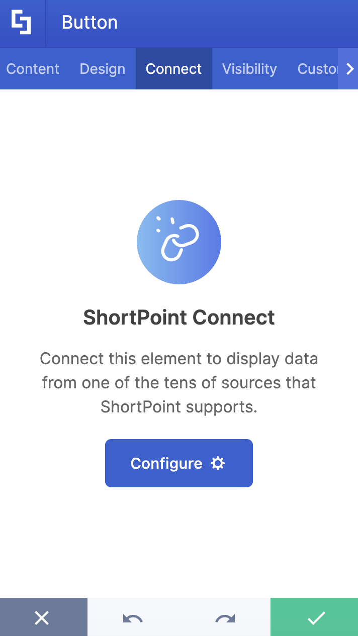
C. Connect Tab
The Connect tab allows you to link the Design Element to SharePoint sources (List, Document Library, News, etc.) and other external sources (Microsoft Graph API, Teams, Outlook, etc.). For more details about ShortPoint Connect, check out Basic Tutorial: How to Establish Seamless SharePoint Connection with ShortPoint Connect.
D. Visibility Tab
The Visibility tab allows you to specify who can see the Design Element and what type of devices it can be shown on. For more details, check out How to Use the ShortPoint Visibility Feature for Effective SharePoint Access Management.

E. Custom CSS Tab
This tab allows you to use your own CSS, HTML, and Javascript code to customize the Button Design Element.
NOTE: Check out our support article on How to Insert Custom CSS into a Page Builder Elemet? (Basic Tutorial) to know more about Custom CSS.

Button Rich Text Editor Options
These are the options you will find if you use Option 2 to add the Button Design Element:

 | Title | allows you to modify the title of the Button. |
 | Subtitle | allows you to modify the description of the Button. |
 | Link | allows you to add the link the Button will redirect to. |
 | Icon | allows you to choose the icon that will appear next to the Button. You can go to our icons page to see the list of icons available for you to use. |
 | Color | allows you to choose the color of your button. You can select a color by [1] typing the #HEX code, [2] using the drop-down, or [3] using the color picker. |
 | Text Color | allows you to choose the color of the text inside the button. You can select a color by [1] typing the #HEX code, [2] using the drop-down, or [3] using the color picker. |
 | Size | modifies the size of the button. You can choose one of the following sizes: xsmall, small, normal, or large. |
 | Wide | the Button width will fit the whole area width. |
 | Roundness | allows you to round the corners of the Button Design Element. You can modify the roundness value by [1] using the blue slider, [2] typing the value in the white box, or [3] using the up or down arrows. You can learn more about the Roundness in Introducing the Roundness Feature: What It Is and How to Use it. |
 | Disabled | allows you to disable the button. |
 | Linking Option | allows you to choose how to open your link:
|
Now you know how to customize the Button Design Element! Start making the most out of this feature on your SharePoint pages.
Related articles:
