 Try ShortPoint now
This article will showcase how to display SharePoint icons using the Icon Design Element.

TABLE OF CONTENTS
- Prerequisite
- Interactive Tutorial
- Step-by-step Tutorial
- Icon Features
Prerequisite
- You have the latest version of ShortPoint SPFx installed on your SharePoint environment.
- You are a ShortPoint Designer with an active license.
Interactive Tutorial
Start the interactive Tutorial to learn the two ways to customize the Icon Design Element:
NOTECheck out Icon Features to learn more about the OOTB options you can customize.
Step-by-step Tutorial
There are two ways to insert the Icon Design Element. Follow the option that suits you:
Option 1: Using the Library of Design Elements
ShortPoint has a library of Design Elements that ShortPoint Designers can add to their page. Follow along to learn how to insert the Icon Design Element using this option:
Step 1: Edit the ShortPoint Web Part
- Go to the SharePoint page you want to use and click Edit.

- Click the ShortPoint tag.
- Select the pencil icon.
Step 2: Insert the Icon Design Element
- Click the plus icon.
- Use the search box to look for Icon and click it.
Step 3: Edit the content
- Click the cross icon to remove the default icon and look for the Icon you want to display.

NOTECheck out our Icons page to see all the icons you can add to your SharePoint page using the Icons Design Element.
- (Optional) Add a Link.
Step 4: Customize the Icon’s design
- Navigate to the Design tab.
- Customize the look of the Icon according to your preference.
- Once satisfied, click the green check mark.
NOTECheck out Icon Features to learn more about the OOTB options you can customize.
Step 5: Save
- Then, click the eye icon to see your page in real-time.

- Click Save to apply all your changes.

Congratulations! You now have SharePoint icons on your page.
Option 2: Using the Rich Text Editor
Icon is an Inline Design Element. This means that you can also insert it into your SharePoint page using the Rich Text Editor. Follow the steps to learn how to access it:
Step 1: Edit the ShortPoint Web Part
- Go to the SharePoint page you want to use and click Edit.

- Click the ShortPoint tag.
- Select the pencil icon.
Step 2: Insert the Icon Design Element
NOTEThe Rich Text Editor can be accessed in Design Elements with text editing features. This includes the Text Design Element and content-holder Design Elements like Alert, Tab, Panel, etc.
- Hover over the Text and double-click.
- Click the ShortPoint icon.

- Select Show icon.

Step 3: Customize the Icon
- Edit the content and look of the Icon.
- Click Apply.
NOTECheck out Icon Features to learn more about the OOTB options you can customize.
Step 4: Save
- Then, click the eye icon to see your page in real-time.

- Click Save to apply all your changes.

That's it! You now have SharePoint icons on your page.
Icon Features
Below are the options you can find in the Icon Settings window and the Rich Text Editor:
Icon Settings Window
These are the options you will find if you used Option 1 to add the Icon Design Element:
A. Content tab
The Content tab allows you to customize the content of the Icon. It has the following options:

 | Icon | allows you to choose from a list of icons available and display it on your page. |
 | Link | allows you to add a link where users will be redirected when they click the icon. |
NOTECheck out our Icons page to see all the icons you can add to your SharePoint page using the Icons Design Element.
B. Design tab
The Design tab allows you to customize the look of the Icon Design Element. It has the following options:
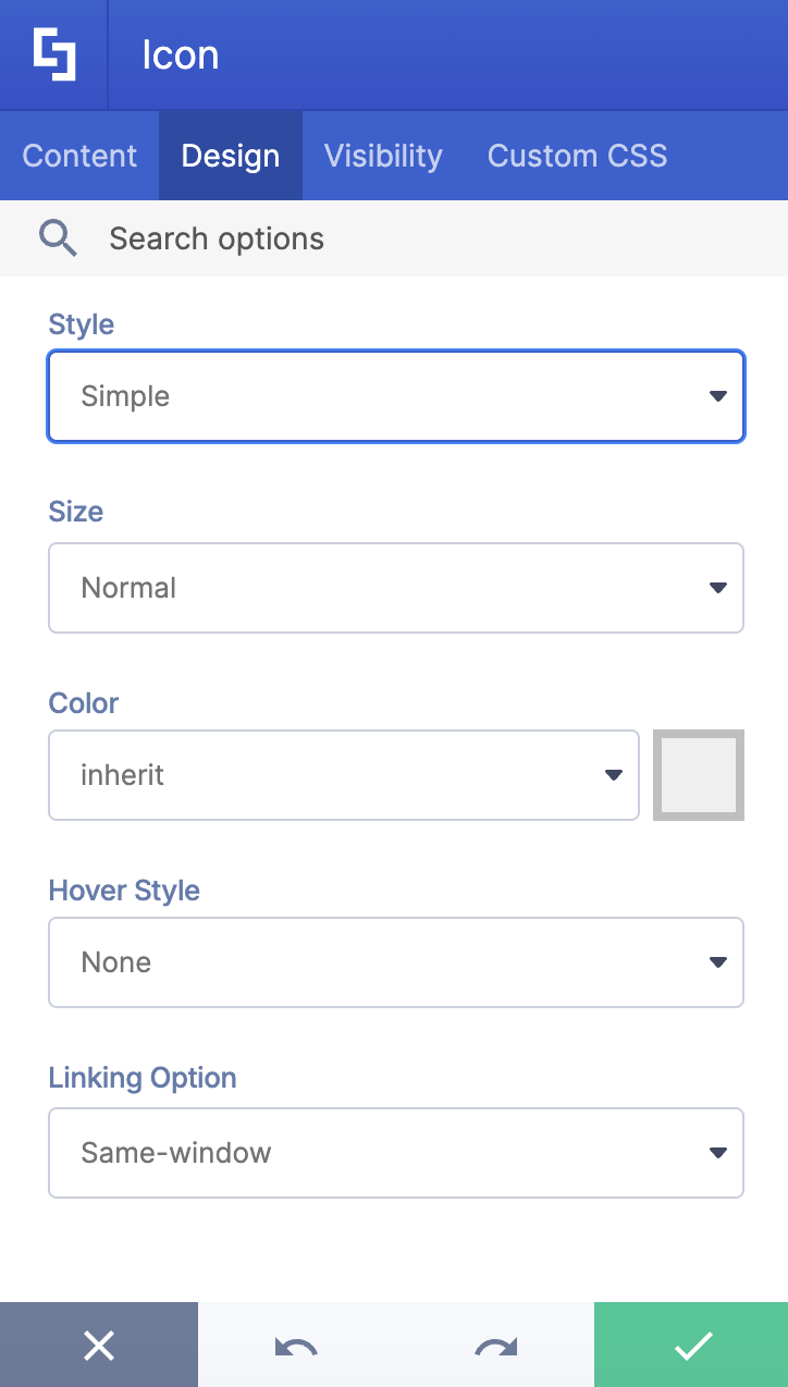
 | Style | allows you to choose the style of the Icon. You can choose from Simple, Square, Circle, Outline-square, or Outline-circle. |
 | Size | allows you to modify the size of the Icon. |
 | Color | allows you to change the color of the Icon. |
 | Hover Style | allows you to modify the animation that will happen when a user hovers over the Icon. |
 | Linking Option | allows you to choose how your link will open. Check out Types of Linking Options to learn more. |
C. Visibility Tab
The Visibility tab allows you to specify who can see the Design Element and what type of devices it can be shown on. For more details, check out How to Use the ShortPoint Visibility Feature for Effective SharePoint Access Management.

D. Custom CSS Tab
This tab allows you to use your own CSS, HTML, and JavaScript code to customize the Icon Design Element.
NOTECheck out our support article on How to Insert Custom CSS into a ShortPoint Design Element (Basic Tutorial) to know more about Custom CSS.

Icon Rich Text Editor Options
These are the options you will find if you used Option 2 to add the Icon Design Element:

 | Icon | allows you to choose from a list of icons available and display it on your page. |
 | Style | allows you to choose the style of the Icon. You can choose from Normal, Square, Circle, Outline-square, or Outline-circle. |
 | Link | allows you to add a link where users will be redirected when they click the icon. |
 | Size | allows you to modify the size of the Icon. |
 | Color | allows you to change the color of the Icon. |
 | Hover Style | allows you to modify the animation that will happen when a user hovers over the Icon. |
 | Linking Option | allows you to choose how your link will open. Check out Types of Linking Options to learn more. |
Related articles:
- How to Customize the YouTube Video Design Element
- How to Customize the Image Carousel Design Element
- How to Customize the Icon List Design Element
