 Try ShortPoint now
In this article, we will walk you through how to add tiles in SharePoint using the Tiles Design Element.
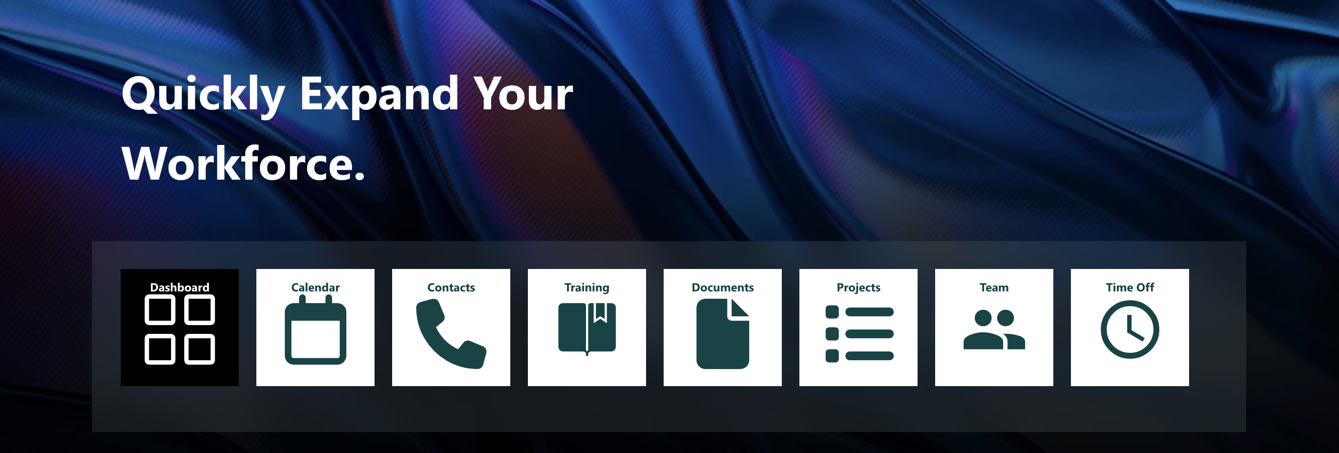
TABLE OF CONTENTS
Prerequisites
- You have the latest ShortPoint public version installed for your environment
- You are a ShortPoint Designer with an active license
Step-by-step Tutorial
Follow the steps below to learn how to customize the Tiles Design Element:
Step 1: Insert the Tiles Design Element
Get Started on the interactive video below to learn how to insert the Tiles Design Element using Live Mode:
NOTE: Check out ShortPoint Basics: How to Insert a Design Element in Live Mode for more details.
Step 2: Add Content to your Tiles
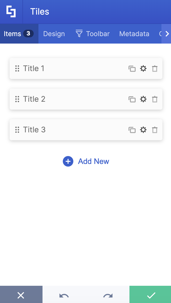
Go to the Items tab and click the cogwheel icon.

Add a Title.

Add a Description.

Add a Link (1) and specify the Linking Option (2).

Then, choose an Icon (1) and/or an Image (2).

Use the back icon to go back to the other tiles and repeat the same steps.

(Optional) Click Add New if you want to add more tiles.

(Optional) Click the Trash icon if you want to delete a tile.

(Optional) Drag and Drop a Tile to change its position.

Step 3: Customize your Tiles
On the Design tab, customize the Tiles’ size, color, and color transparency.

Then, customize the Text Horizontal Alignment, Shape, and Style of your tiles.

NOTE: Learn more about the customization options mentioned above in the Tiles Features section.
Step 4: Insert and Save
Once you are satisfied, click the green check mark.

Click Save.

Then, click Republish.

Congratulations! You now know how to add tiles in SharePoint. Enjoy customizing the Tiles Design Element on your SharePoint sites.
Tiles Features
There are many ways to customize the features of the Tiles Design Element. In the settings window, you will find the following tabs:
A. Items Tab
The Items tab allows you to duplicate, delete, configure the content, and add new tiles. Each tile has the following action items:
TILES ACTION ICONS
 | Duplicate | duplicates the tile selected. |
 | Cogwheel | opens a new window that allows you to edit the content of each tile. See the table below for the cogwheel icon settings. |
 | Trash | deletes the tile selected. |
 | Add New | adds new tile. |
 | Drag and Drop | allows you to re-arrange the position of the tiles. |
COGWHEEL ICON SETTINGS
 | Title | specify the title of your tile. |
 | Description | add a description to your tile. |
 | Link | specify the URL where you want to redirect users. |
 | Linking Option | specify the behavior of the link including:
|
 | Icon | choose from a list of icons. You can check out all supported icons here. |
 | Image | add a background image for the tile. |
B. Design Tab
You can modify the default design of the element in the Design Tab. Below are the settings you can configure:

SETTINGS
 | Size | customize the size of your tile. You can choose from Small, Medium, Large, and Huge. |
 | Color | specifies the color of the tile. All ShortPoint Colors are supported. |
 | Color Transparency | adjust the transparency of the tile color. |
 | Text Horizontal Alignment | specifies the alignment of text. You can choose from Default, Left, Center, and Right. |
 | Shape | change the shape of the tile. You can choose from Default, Wide, Square, and Tall. |
 | Roundness | allows you to round the corners of the Tiles Design Element. You can modify the roundness value by [1] using the blue slider, [2] typing the value in the white box, or [3] using the up or down arrows. You can learn more about the Roundness feature in Introducing the Roundness Feature: What It Is and How to Use it. |
 | Linking Options | allows you to choose how links will be opened. Check out Types of Linking Options to learn more. |
IMAGE SETTINGS
 | Image Placement | customize the placement of the background image. You can choose from:
|
 | Enable advanced image settings | enables advanced image settings. |
 | Image Horizontal Position | adjusts the horizontal position of the image (Default, Center, Left, and Right). |
 | Image Vertical Position | adjusts the vertical position of the image (Default, Top, Center, and Bottom). |
 | Image Repeat | repeats the image (Default, Repeat, Don’t Repeat, Repeat Horizontally, and Repeat Vertically). |
C. Toolbar tab
The Toolbar tab allows you to add Smart Toolbar widgets. These Smart Toolbar widgets can help you search, sort, or filter data in your Tiles
NOTEThe Toolbar tab is only available in SportPoint SPFx version 8.5.0.0 . For more information on the Toolbar tab, check out Getting Started: The Basics of the Smart Toolbar.

D. Metadata tab
This allows you to add metadata tags to organize and categorize your content. You can then filter, search, and group items using these custom labels in the Search & Filter Toolbar. For more details, check out How to Add SharePoint Metadata Tags to Organize Content.

E. Connect Tab
The Connect tab allows you to link the Design Element to SharePoint sources (List, Document Library, News, etc.) and other external sources (Microsoft Graph API, Teams, Outlook, etc.). For more details about ShortPoint Connect, check out Basic Tutorial: How to Establish Seamless SharePoint Connection with ShortPoint Connect.

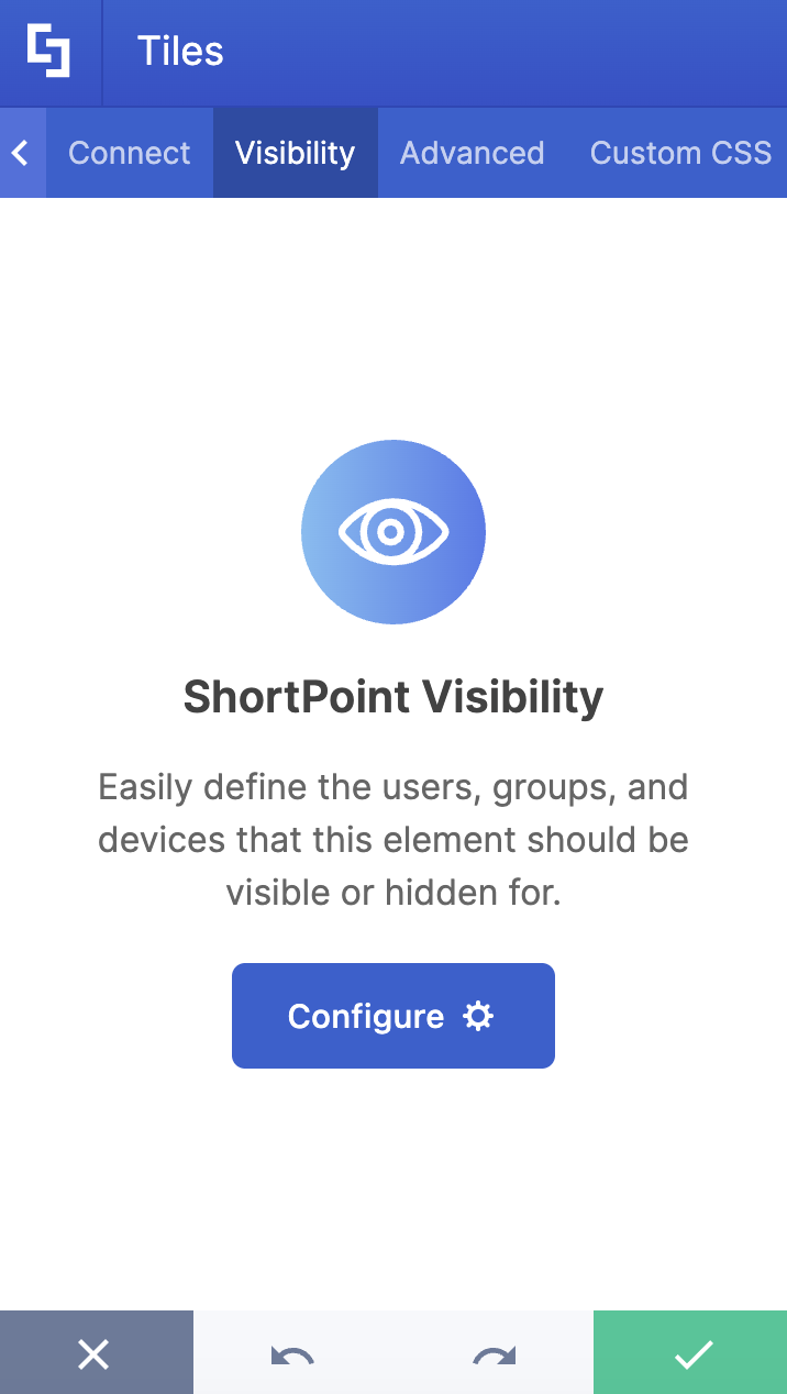
F. Visibility Tab
The Visibility tab allows you to specify who can see the Design Element and what type of devices it can be shown on. For more details, check out How to Use the ShortPoint Visibility Feature for Effective SharePoint Access Management.
G. Advanced Tab
This tab allows you to further customize the Tiles Design Element. Below are the options available:

MISCELLANEOUS
 | Icon Color | customizes the color of the icon. |
 | Spacing between tiles | adjusts the spacing between each tile. |
 | Make Tiles Responsive | when enabled, the Tiles will fit the width of the container. |
 | Tiles layout | choose the layout of the tile (Default, Grid, and Masonry). |
TILE TEXT
 | Text Color | specifies the color of your text. |
 | Text Size | specifies the size of your text. |
CUSTOM SIZE
 | Height | adjusts the height of your tile. |
 | Width | adjusts the width of your tile. |
SPECIAL EFFECTS
 | Blur effect | adds a blurred effect to your tile (Default, None, Light, Medium, Strong) |
H. Custom CSS Tab
This tab allows you to use your own CSS, HTML, and Javascript code to customize the Tiles Design Element.
NOTE: Check out our support article on How to Insert Custom CSS into a Page Builder Element? (Basic Tutorial) to know more about Custom CSS.

Related Articles
- Introduction to Tiles Design Element
- How to Customize the Tiles Design Element in Grid Mode
- How to Insert a ShortPoint Design Element in Live Mode
